A great scent can still die on the shelf if the bottle looks generic or feels flimsy. Customers judge fast. Design fixes that.
Perfume bottle design matters as much as fragrance because it shapes first impressions, protects the formula, and builds a recognizable brand cue that drives purchase and repurchase.

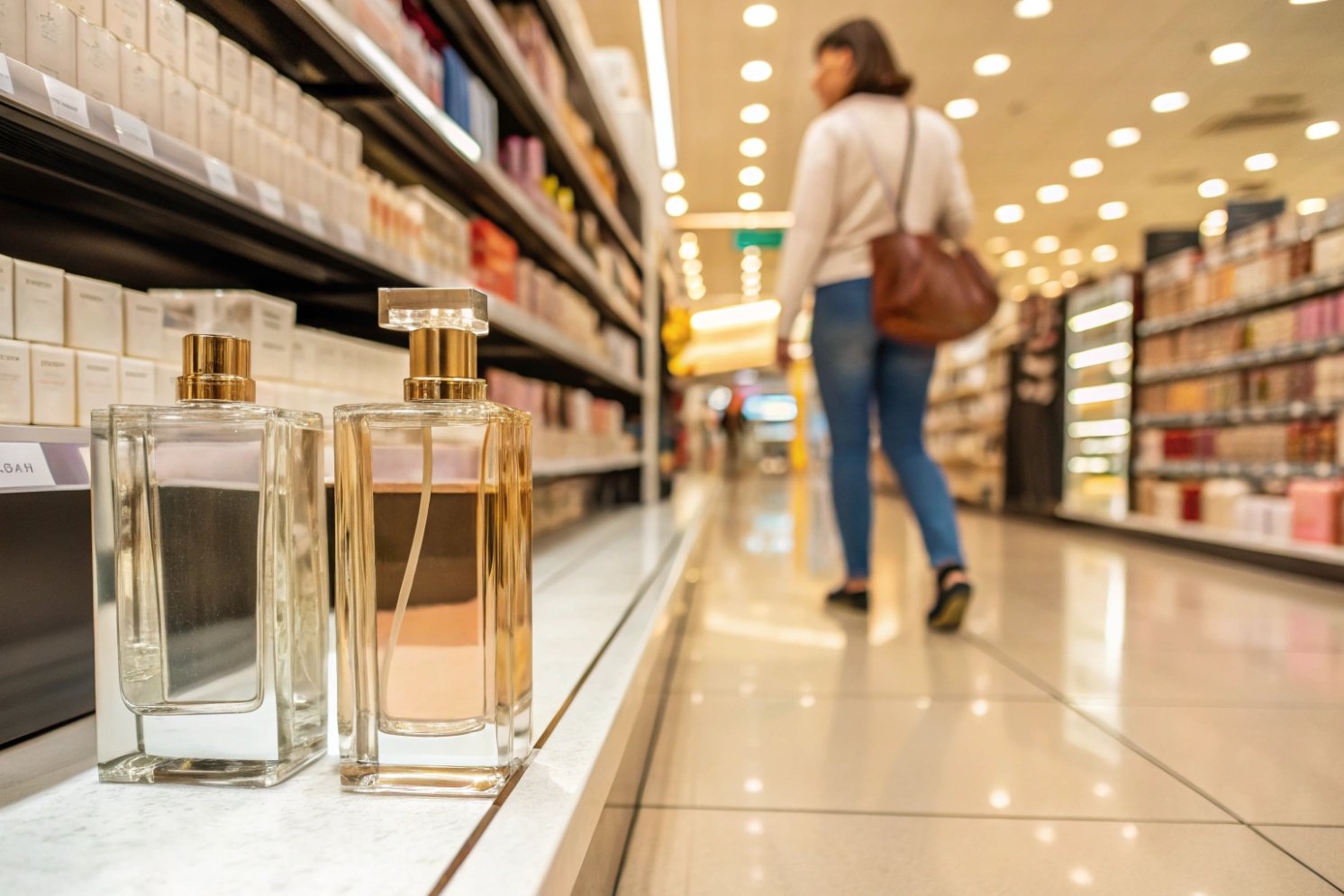
Bottle design is the “silent salesperson”
In real retail, most shoppers do not start with a blotter strip. They start with their eyes. The bottle has one job before the scent is tested: earn the right to be picked up. Form, color, and finish do that work in seconds. A sharp silhouette can signal “modern.” A thick base can signal “serious.” A clean label panel can signal “confident.” These signals set a price expectation before the first spray, which is exactly what sensory marketing 1 explains at a deeper level.
Protection is part of the design brief
Fragrance is volatile by nature. That is what makes it beautiful, and that is also what makes it fragile. A bottle is not only a sculpture. It is a barrier system. Glass color and coatings can reduce light exposure, and photodegradation of fragrance ingredients 2 is a real reason “pretty on shelf” must also mean “stable in light.” Tight sealing and good component compatibility reduce oxygen ingress and leakage, and practices like container closure integrity testing 3 are how serious teams prevent slow weeps that damage trust. A sprayer that delivers a consistent mist also helps the formula perform the way the perfumer intended, because dosage shapes perception.
Design and scent must tell one story
When bottle and fragrance speak different languages, the brand feels confused. A heavy, dark, angular bottle paired with a light, sparkling scent can still work, but only if the story explains why. Without that story, shoppers feel mismatch and walk away. I have seen launches where the formula was strong, yet the bottle felt “off,” and the product never recovered in reviews.
| Design cue | What the hand and eye feel | What it signals | What happens if ignored |
|---|---|---|---|
| ry is the “silent salesperson” | stable, premium | higher price tier | “cheap” first impression |
| Glass clarity or tint | clean, controlled | quality and protection | scent degrades faster |
| Cap click and fit | precise closure | craftsmanship | leaks and complaints |
| Sprayer output | fine and even mist | luxury experience | waste and frustration |
| Signature silhouette | easy to recognize | brand memory | lost in a crowded shelf |
The bottle turns an invisible scent into something customers can judge, remember, and share. That is why design is not decoration. It is strategy.
A perfume does not compete in a lab. It competes in a crowded, noisy market. The next step is to break down the specific design levers that shape buying behavior.
How Do Form, Weight, and Tactility Shape First Impressions?
A perfume can smell amazing, yet customers never test it because the bottle looks light, slippery, or hard to hold. That failure happens before the first spray.
Form, weight, and tactility shape first impressions by telling the brain “this is premium” or “this is risky” through grip comfort, balance, surface feel, and sound.
Form guides the first touch
A shopper’s hand makes a decision before the nose does. The bottle’s shoulder shape, waist, and center of gravity decide whether it feels secure. When a bottle is top-heavy, people grip harder. That adds tension. Tension reduces pleasure. A stable shape invites a relaxed pick-up, and a relaxed pick-up invites a test.
Weight communicates value, but must match real use
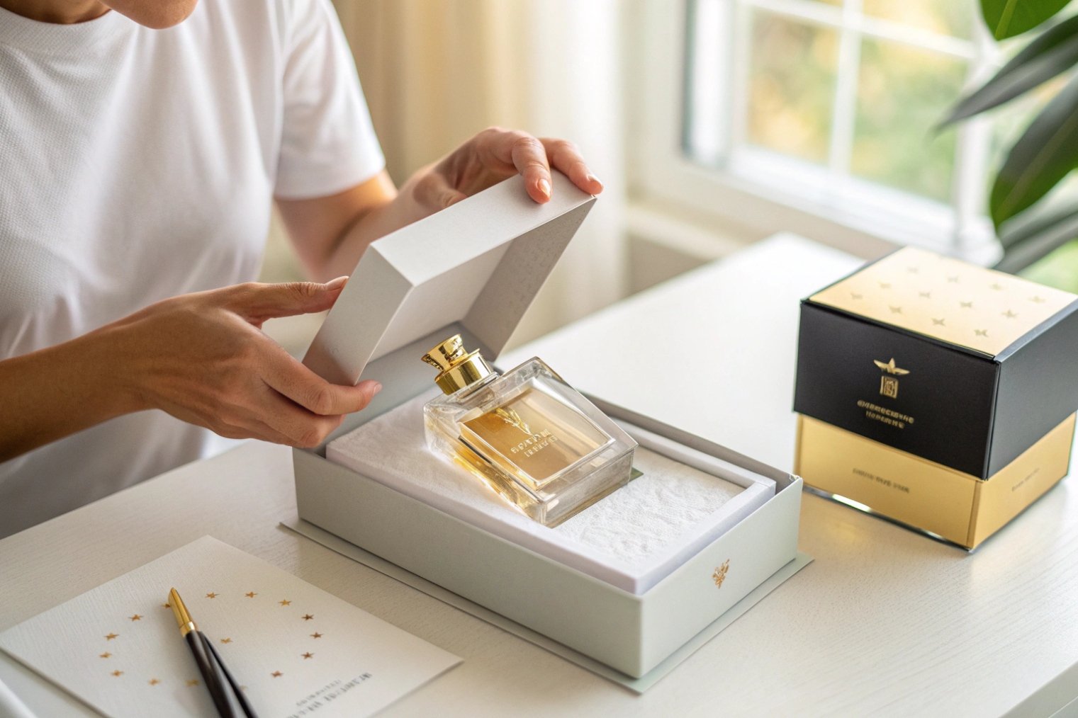
Heavier is often read as more premium. Still, weight has to be honest and functional. If the bottle is too heavy for daily use, it becomes annoying. If it is heavy in the wrong place, it tips. A smart approach is balanced mass: a solid base for stability, and a comfortable body for grip. This is also where secondary packaging matters. A gift box can add “luxury weight” without making the bottle frustrating.
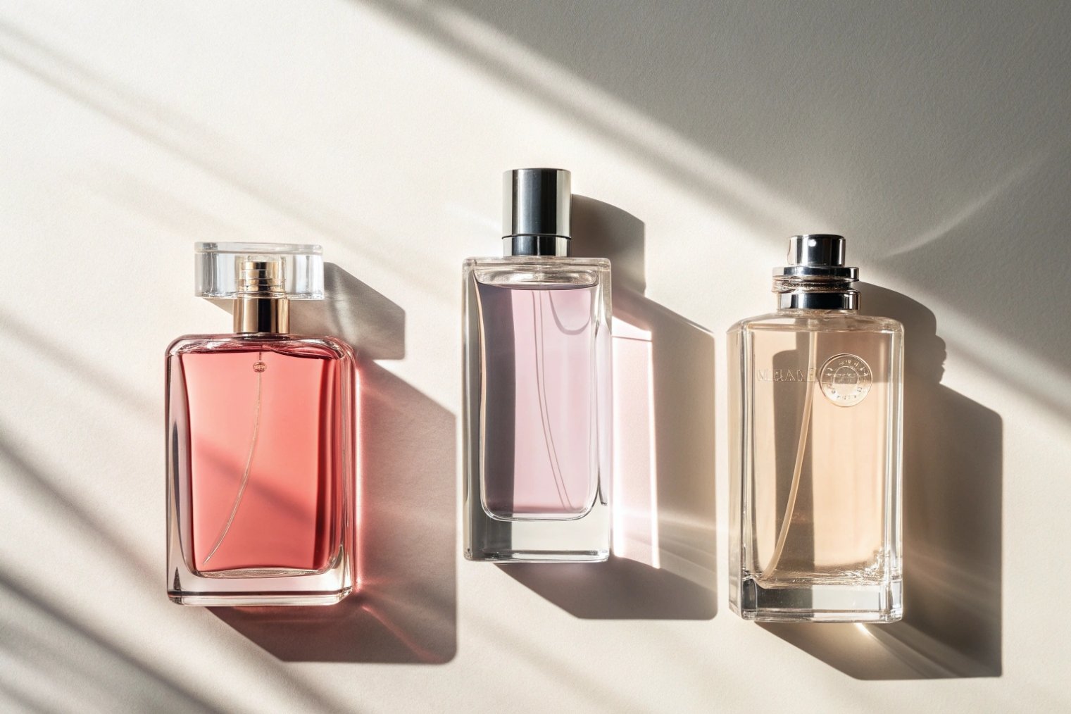
Tactility creates emotion and memory
Texture is a shortcut to emotion. Frosted glass feels calm and soft. Polished glass feels sharp and bright. A lacquered matte surface can feel modern. A micro-etched logo can feel intimate. These cues become memory triggers, and research on multisensory packaging 4 helps explain why touch and expectation shape what people feel about the product.
| Lever | What shoppers notice first | What it changes | How to specify it |
|---|---|---|---|
| Balance | “safe to hold” | pick-up rate | center-of-gravity targets |
| Base thickness | “serious product” | price expectation | base weight range |
| Surface finish | “touchable” | time-in-hand | gloss/matte targets |
| Edge radius | “comfortable” | user comfort | minimum corner radius |
| Cap sound | “precise click” | perceived quality | closure fit tolerance |
Form, weight, and tactility are not art-only decisions. They are conversion decisions.
Can Packaging Raise Willingness to Pay and Repeat Purchase?
A scent can be loved, but people still hesitate to pay premium prices if the bottle and box feel ordinary. They also hesitate to buy again if the daily use feels annoying.
Packaging can raise willingness to pay and repeat purchase by lifting perceived luxury, protecting scent integrity, and making daily use satisfying through reliable spray, secure closure, and giftable presentation.
Perceived luxury supports price, not just ego
Premium pricing needs support. Customers look for proof. Heavy glass, clean seams, tight tolerances, and metal accents can act as proof. These details tell shoppers that the brand invested in the whole product, not only the juice. That creates trust. Trust reduces price resistance, and findings like simple packaging design increased willingness to pay 5 show how packaging signals can move price perception.
Daily usability drives repurchase more than most teams expect
A bottle is used many times. Small annoyances stack up. A cap that feels loose, a sprayer that spits, or a label that peels can ruin the experience. The fragrance stays the same, but the user mood changes. That mood shapes whether the buyer returns to the brand. Many repeat purchases are not about finding a better scent. They are about returning to a product that felt good to use.
Perfume is often bought as a gift. Packaging that looks iconic, photographs well, and feels “presentable” raises conversion in gifting seasons. A photogenic bottle also gets shared. That earned visibility can extend reach beyond paid ads, especially when the bottle silhouette is recognizable even in a quick video clip.
| Packaging element | How it raises willingness to pay | How it supports repurchase | Risk if weak |
|---|---|---|---|
| Premium materials | signals higher tier | reduces regret | price feels “too high” |
| Reliable atomizer | feels controlled and even | makes daily use smooth | poor reviews and returns |
| Tight seals | protects volatile notes | keeps scent consistent | oxidation and leakage |
| Gift box system | feels complete | increases pride of ownership | less gifting conversion |
| Refill options | lowers waste and cost-per-wear | encourages loyalty | sustainability gap |
Packaging does not replace a good formula. It protects it, proves it, and makes it easier to buy again.
How Does Bottle Architecture Build Brand Distinctiveness?
Many fragrances fight for the same attention with similar bottles, similar caps, and similar gold accents. In that crowd, a brand becomes forgettable.
Bottle architecture builds distinctiveness by creating a repeatable signature in silhouette, proportions, cap geometry, and tactile finishes that customers can recognize without reading the label.
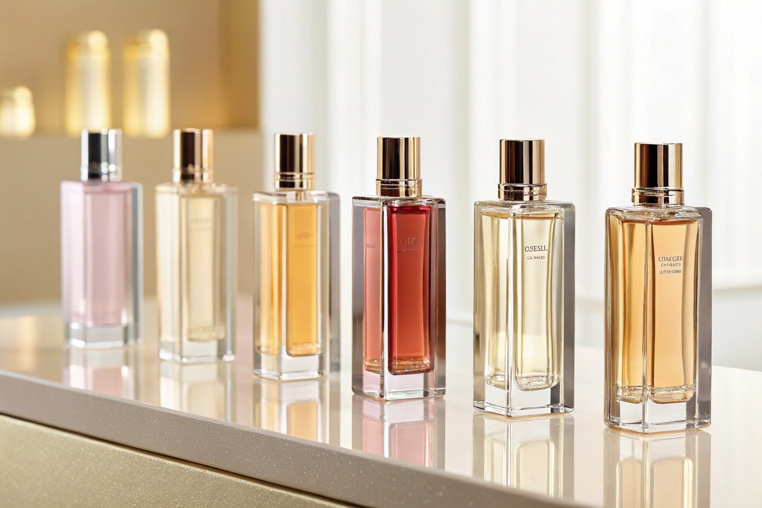
Architecture means “structure that stays consistent”
A signature bottle is not only a custom shape. It is a system of proportions that the brand can reuse across a line. The shoulder angle, the base thickness, the neck height, and the cap ratio can become a “brand language.” This language lets new flankers feel related, even when the scent changes. Over time, that signature can even become trade dress for product packaging 6 when it is distinctive and consistently used.
Distinctiveness is built from constraints, not random creativity
The easiest way to look special is to do something extreme. That is also the easiest way to create breakage and high scrap rates. Luxury brands win with controlled distinctiveness. They choose one or two bold architectural moves, then keep the rest stable. That could be a unique heel, a faceted shoulder, or a cap that becomes the brand icon.
Tactile brand cues beat visual noise
On shelf, many bottles look similar at a distance. In-hand, texture changes the game. A raised logo, a frosted band, a micro-engraved pattern, or a precise cap click can act like a “tactile logo.” That is hard to copy well. It also makes the user feel the brand every day.
| Architecture choice | What it helps customers do | What it costs | How to keep it scalable |
|---|---|---|---|
| Signature silhouette | recognize from far | tooling complexity | define a core profile |
| Consistent proportions | link the full line | design discipline | ratio rules for new SKUs |
| Unique cap geometry | identify in photos | closure development | standard neck finish control |
| Tactile detail | remember by touch | decoration steps | choose durable processes |
| Modular refill system | commit long-term | higher engineering | design for easy assembly |
Architecture is brand memory made physical. When it is done right, the bottle becomes a visual shortcut for trust.
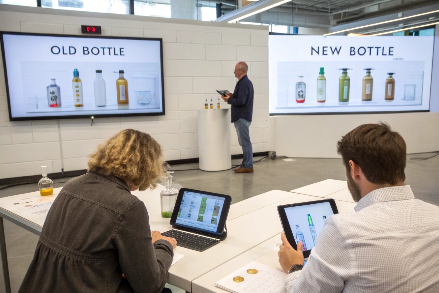
What Testing Proves Design Boosts Conversion at Shelf?
Teams often argue about design with opinions. That is expensive. Luxury decisions should be supported by tests that connect design to sales behavior.
Testing proves design boosts conversion when it measures real shopper behavior, like pick-up rate, time-in-hand, add-to-cart, and repurchase, under conditions that match retail and shipping reality.
Start with behavioral metrics, not taste debates
Design success can be measured. In retail, the first metric is “pick-up rate.” If the bottle is not picked up, the scent will not be tested. The next metric is “test rate,” then “purchase intent.” Online, the metrics shift to “scroll stop,” “product page depth,” “add-to-cart,” and “return rate.” These are not perfect, but they are better than internal opinions.
Use A/B testing that isolates one variable
A clean test changes one thing at a time. For example, keep the bottle shape the same and test two cap designs. Or keep the cap the same and test frosted versus clear. Many teams test too many changes together and learn nothing. When one variable moves, the result can be tied to a clear design lever—and teams often use ecommerce A/B testing 7 to validate which visuals and messages actually lift add-to-cart.
Prove durability and usability with engineering tests
Luxury must survive shipping and daily use. Transit testing and abrasion testing reduce chargebacks and returns. Atomizer testing confirms dose consistency. Leak testing protects brand trust. These tests do not directly “prove conversion,” but they protect the experience that drives repeat purchase.
| Test type | What it measures | Simple setup | What good looks like |
|---|---|---|---|
| Shelf pick-up study | attention and curiosity | mock shelf + eye tracking or counts | higher pick-up and test rate |
| In-hand preference test | tactility and comfort | blind handling sessions | longer time-in-hand |
| A/B retail pilot | real conversion | split stores or shelves | higher sales per facing |
| E-commerce A/B | digital conversion | two PDP image sets | higher add-to-cart |
| Atomizer output test | user experience | spray weight and pattern checks | consistent fine mist |
| Leak and torque test | returns risk | torque meter + vacuum test | stable seal across lots |
| Transit test | breakage risk | drop/vibration approach | low damage rate |
Testing turns design into a business decision. It also gives the team language that both creatives and operators can respect.
Conclusion
A fragrance lives in the air, but it sells through the bottle. Strong design shapes first impressions, protects the scent, builds memory, and proves value through testing.
Footnotes
-
Academic overview of sensory marketing: how sight, touch, and sound shape product judgments. ↩ ↩
-
Evidence that some fragrance ingredients degrade under air/light, supporting protective bottle choices. ↩ ↩
-
Explains container-closure integrity testing methods for detecting micro-leaks that let oxygen in. ↩ ↩
-
Peer-reviewed findings on how multisensory packaging cues influence perception and behavior. ↩ ↩
-
Research showing simpler packaging can increase consumers’ willingness to pay. ↩ ↩
-
USPTO guidance on trade dress and protecting distinctive product packaging shapes. ↩ ↩
-
Practical A/B testing guide for measuring which page visuals and messages increase conversions. ↩ ↩


