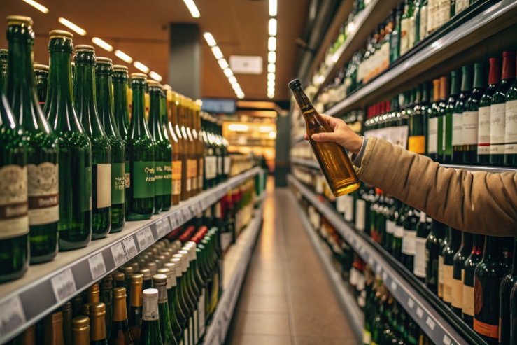
Bright retail lights can turn a fresh wine dull before the cork ever gets pulled. Then the buyer blames the producer, not the shelf.
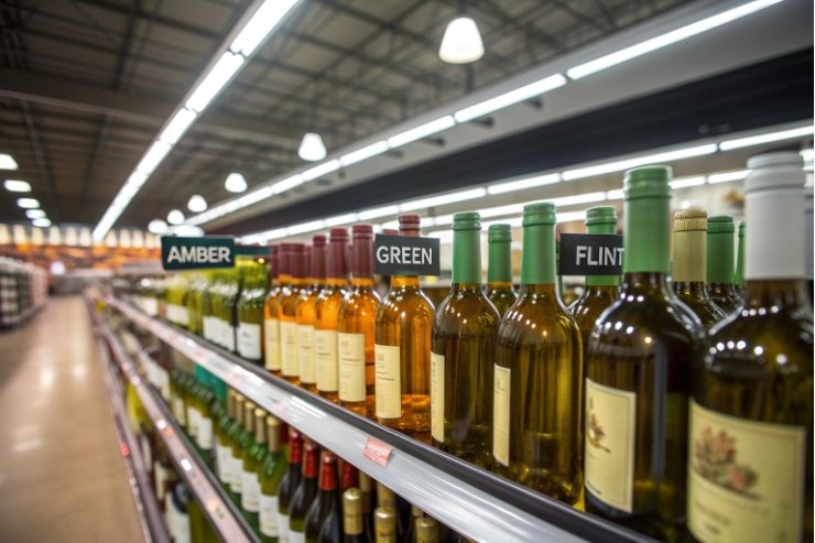
Wine goes into brown (amber) glass because it blocks most UV and blue-violet light, which lowers “light-struck” aromas during storage and display. Amber also signals protection, hides small visual flaws, and often supports higher recycled-glass content with less visible shade drift.

Bottle color is not a decoration. Bottle color is a barrier. It works with storage habits, cartons, and shelf lighting. When those pieces match, the wine tastes the same in more places and for longer.
How much UV and visible light does amber block versus green or flint?
A clear bottle looks beautiful, but it can act like a window. A green bottle helps, but not every green is “dark enough.” Amber is often chosen because the protection is more predictable.
Amber usually blocks far more UV and blue-violet light than green, and much more than flint. In practical terms, amber often cuts “harmful UV-violet” transmission to around 1% or below, while flint can transmit tens of percent.
What matters more than color names
The word “green” is not a spec. Bottle thickness, iron content, sulfur compounds, and the exact shade all change transmission. Two “greens” can behave very differently under the same store lighting. I treat bottle color as a measured performance, not a label.
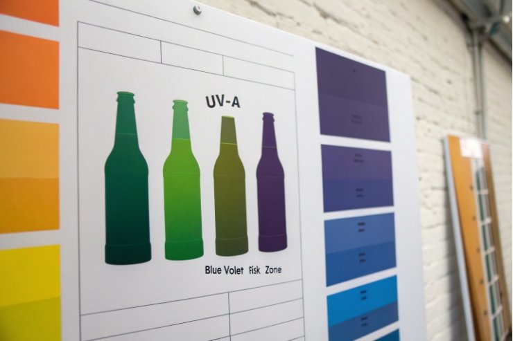
The cleanest way to compare colors is to compare transmission in the UV-A and UVB radiation ranges 1 and the blue-violet region. Those wavelengths carry more energy and drive faster reactions in wine. Many wine problems show up in the 320–450 nm area, which covers UV-A into violet-blue.
Real numbers from measured transmission
Measured transmission work (including in situ measurement of light transmission into wine bottles 2) shows a big gap between colors:
- Flint (clear) bottles can transmit up to ~35% of harmful UV-violet light in real-use measurements.
- Bluish-green bottles can transmit up to ~8%.
- Light amber bottles can transmit up to ~1.2%.
- Dark amber bottles can transmit up to ~0.2%.
This is why amber feels like insurance. It reduces risk even when the store lighting, warehouse habits, or delivery route are not controlled.
A practical comparison table
These are useful “order of magnitude” expectations for wine packaging decisions. Exact values still depend on thickness and the exact glass recipe.
| Bottle color | Typical UV-violet transmission (real-world style ranges) | What it means on shelf | Who benefits most |
|---|---|---|---|
| Flint (clear) | High (often “tens of %”) | Fastest light exposure | Rosé sold by color, fast turn |
| Green | Medium (varies by shade) | Some shielding, not complete | Many reds, classic positioning |
| Amber (brown) | Low to very low (often ~1% or below) | Strong shielding | Delicate whites, export, long display |
The decision rule I use
If the wine will sit under bright lights for weeks, or travel far, amber gives the most predictable protection. If the brand needs the wine color to sell, flint can still work, but only with added protection steps.
Does amber reduce light-struck aromas during storage?
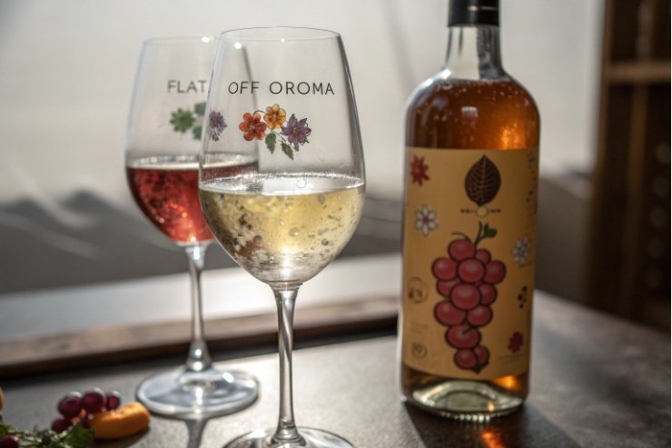
Light damage is sneaky. The wine can still look fine, yet the aroma shifts. Buyers call it “flat” or “off,” and the brand takes the hit.
Yes. Amber reduces the risk of light-struck aromas because it blocks the wavelengths that trigger them. It does not stop oxygen ingress, but it can slow light-driven aroma faults during display and storage.
What “light-struck” is in wine
Light can excite compounds in wine (including riboflavin 3 and other light-sensitive components). Those excited compounds can react and form sulfur-containing aroma compounds that smell wrong at tiny levels. The exact descriptors vary, but the experience is consistent: the wine loses its clean fruit and gains a “bad cabinet” character that does not belong.
This is also why beer moved toward amber long ago. Beer’s “skunky” story is famous, but wine has its own version. White wines and rosés are often more at risk because they have less natural pigment and phenolic shielding than many reds.
Time-to-damage is shorter than most people think
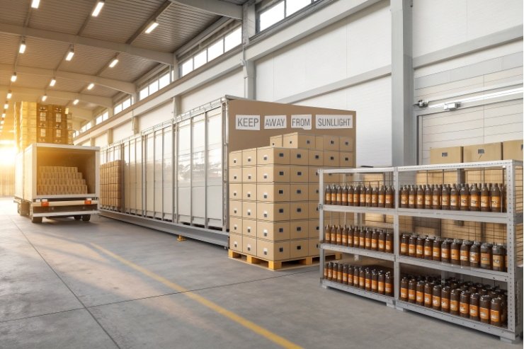
Direct sun is the worst case, and it happens more than brands want to admit. Windows near display tables, sunny tasting rooms, outdoor events, and warm delivery docks all count. Under sunlight, a clear bottle can show damage quickly. Under store LEDs and fluorescents, the risk still exists, just slower.
A simple habit helps more than any marketing claim: keep light-sensitive wines away from windows and strong spotlights. When the retail environment is unknown, amber makes that habit less critical.
Why amber helps even when the closure is perfect
Cork or screw caps (wine closures) 4 control oxygen movement. Light strike is different. It can happen even with a perfect seal. That is why I treat bottle color as a “second stability system,” beside closure performance. If a wine program depends on delicate aromatics, color choice matters as much as oxygen targets.
Where amber is not enough by itself
Amber reduces light exposure, but it does not fix heat abuse. A hot warehouse can still push aroma loss. It also does not stop oxygen pickup during bottling. So amber should sit inside a full stability plan: good bottling oxygen control, good distribution habits, and smart secondary packaging.
| Risk factor | What amber helps | What amber cannot fix | What to add |
|---|---|---|---|
| Bright shelf lighting | Strongly reduces light energy entering bottle | Does not control heat | Cartons, shelf placement rules |
| Window sunlight | Big reduction, especially with dark amber | Still risky with long exposure | Full cartons or opaque sleeves |
| Long export routes | Reduces light exposure across handoffs | Does not stop vibration/heat | Strong cartons + pallet standards |
| Delicate aromatic whites | Helps preserve aroma profile | Oxygen ingress still matters | Closure spec + low O₂ filling |
When do cartons and sleeves supplement color protection?
A bottle color is a passive barrier. A carton is an active shield. When the route is rough or the shelf is bright, cartons and sleeves do real work.
Cartons and sleeves should supplement bottle color when exposure time is long, lighting is harsh, or the wine style is extra sensitive. They matter most for flint bottles, but they also add safety for green and amber.
When color is not enough
Some channels create constant light stress:
- airport retail with strong lighting,
- bars with bright backlighting,
- supermarket end-caps near windows,
- and long warehouse holds before distribution.
In those cases, even green can be “not enough,” especially for aromatic whites. Amber buys time, but cartons and sleeves can cut the remaining risk to near zero by blocking light almost completely.
The most common add-on options
1) Full cartons with dividers
This is the most direct fix. It blocks light during shipping and storage. It also reduces rub and breakage.
2) Neck-to-base paper wraps (sleeves)
Sleeves protect a portion of the bottle from light. They also protect against scuffs. Some brands treat sleeves as both protection and design.
3) Opaque shrink or printed wraps
These can look premium and protect well, but they must be tested for scuffing, glue compatibility, and recycling rules in the target market.
4) UV-blocking label zones
A large front-and-back label can block light from the biggest exposure area. This works well when the label design is already wide.
A simple routing rule
If the brand uses flint because the wine color sells, I recommend at least one extra barrier: carton, sleeve, or dense label coverage. If the brand uses amber and ships export, cartons still help because they protect from both light and logistics damage. A bottle can arrive unbroken yet look ruined if it is scuffed.
What I avoid
I avoid partial protection that looks safe but fails in practice. A tiny neck label does not protect a flint bottle. A loose sleeve that slides can look cheap and create customer complaints. Protection should be consistent, not decorative.
| Bottle choice | Typical add-on need | Best add-on | Why it works |
|---|---|---|---|
| Flint | High | Full cartons or sleeves | Cuts the biggest light risk |
| Green | Medium | Cartons for long routes | Helps when shelf time is unknown |
| Amber | Low to medium | Cartons for export or premium cosmetics | Adds stability and keeps surfaces clean |
Do consumers associate amber with higher quality?
People buy with their eyes first. The bottle gives a promise before the label gets read. Color is part of that promise.
Many consumers read amber as “protected and serious,” so it can support a higher-quality cue. Still, the cue depends on the market, the wine style, and the label design.
Amber is less common in mainstream wine aisles than green or flint. That alone creates difference. It can also signal “cellar logic,” because darker glass is linked with aging and protection. Some buyers connect amber with craft packaging from beer, bitters, and specialty foods. That connection can help wines that position as artisanal, low-intervention, or meant for careful storage.
Amber also hides small flaws. That matters more than people admit. Tartrate crystals, light sediment, and tiny scuffs look less dramatic in amber than in flint. A bottle that looks clean feels higher quality to many shoppers.
When amber can feel “wrong”
Amber can also create confusion if the brand story does not match. A very modern rosé brand that sells color may lose its main hook in amber. In some places, amber can feel like beer, kombucha, or even pharmacy packaging. This risk rises when the label is minimal and the bottle is lightweight. The buyer may not read “premium.” The buyer may read “non-wine.”
How to make amber work as a quality signal
The label and closure should support the message:
- classic typography and paper texture feel “cellar.”
- foil accents and clean emboss feel “premium.”
- strong capsule design makes amber look intentional.
- a well-balanced bottle weight supports quality perception, but it should not become wasteful.
I also like amber for brands that want a single bottle color across several SKUs. That consistency makes the range look organized and serious.
| Shopper cue | What amber tends to communicate | How to reinforce it | Who should be careful |
|---|---|---|---|
| Dark protective tone | Preservation, stability | Story about freshness and protection | Rosé brands sold by color |
| Warm brown tint | Heritage, craft | Natural label materials, cork cue | Ultra-modern “clean” brands |
| Less visible wine color | Focus on taste, not look | Strong back-label detail | Buyers who want to see color |
Do recycling streams and PCR content favor amber bottles?
Sustainability goals are real now. Buyers ask about recycled content. Brands want lower emissions. The bottle color choice can either help or complicate that plan.
Often yes. Amber can tolerate higher PCR variation without looking “dirty,” and amber cullet streams can be robust in many regions, but local recycling systems and supply contracts decide the real advantage.
Why color matters in recycled glass
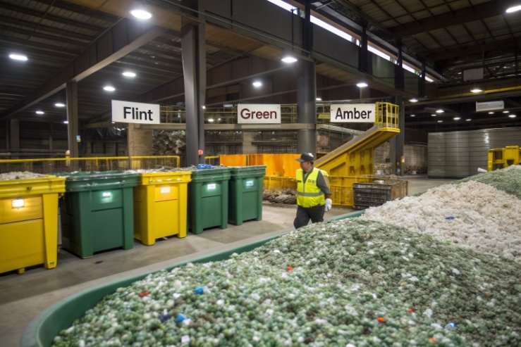
Recycled glass (cullet) is not perfectly uniform. Small color shifts and trace contaminants show up most in flint. Flint needs strict sorting and often needs more control to keep a clean, water-white look. Green also needs sorting, but it can hide more variation than flint. Amber hides variation best because the target color is darker. That means a brand can often push higher PCR without customers noticing small shade drift.
If you manage shade consistency with a defined CIELAB color space 5 target and a realistic acceptance band for ΔE (color difference) 6, amber usually makes the job easier than flint.
Recycling streams are regional, not universal
In some markets, amber recycling is strong because beer and food jars create steady amber supply. In other markets, wine green dominates the stream. That affects price, availability, and lead times for PCR. This is why bottle color should be aligned with the local cullet reality of the production region. A perfect sustainability plan on paper can fail if the cullet supply is unstable.
PCR, ΔE control, and brand consistency
Higher PCR can increase color variation. For premium wine, color consistency still matters. Amber makes it easier to hold a tight look while using more recycled content. That supports both sustainability claims and shelf consistency. Still, a brand should set measurable targets and acceptance bands. If ΔE drift becomes too visible, the pack looks inconsistent and buyers assume quality drift, even when the wine is identical.
Darker glass hides minor scuffs and small inclusions better. That can reduce cosmetic scrap rates in certain programs. Lower scrap means less waste and better yield, which supports sustainability in a practical way, not only in marketing language—especially when you understand how post-consumer recycled glass cullet 7 feeds back into new containers.
| Goal | Amber advantage | Green position | Flint challenge |
|---|---|---|---|
| High PCR content with stable look | Strong | Medium | Harder |
| Masking small scuffs/sediment | Strong | Medium | Weak |
| Highest cullet value stream | Medium | Medium | Often highest value but strict |
| Brand shade consistency | Easier | Manageable | Tight control needed |
Conclusion
Amber bottles protect wine from UV and blue-violet light, lower light-struck aroma risk, and often feel more “serious.” Use cartons or sleeves when shelf exposure is long or uncontrolled.
Footnotes
-
EPA overview of UVA/UVB exposure and why shorter wavelengths are more damaging. ↩︎ ↩
-
Data on bottle-color light transmission and shelf-life calculations. ↩︎ ↩
-
Background on riboflavin as a photosensitizer linked to light-struck aromas. ↩︎ ↩
-
Explains screw-cap wine closures and where they’re commonly used. ↩︎ ↩
-
Quick reference for the CIELAB model used to quantify bottle shade consistency. ↩︎ ↩
-
Defines ΔE color difference metrics used to set acceptable color drift. ↩︎ ↩
-
Learn what cullet is and why it matters for recycled-content glass and stable bottle color. ↩︎ ↩


