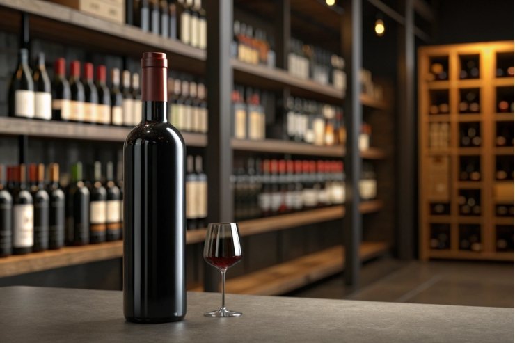
Most people accept the tall, slim wine bottle as “just the way it is” and never ask why. But that shape quietly solves storage, service, branding, and category signaling at once.
Wine bottles are tall and slender because this geometry stores efficiently, helps sediment settle, improves pouring control, gives designers a generous label canvas, and acts as a visual code for style and origin on the shelf—especially when you compare common wine bottle shapes 1.

When you design or choose a bottle, you are not just picking something pretty. You are choosing how the bottle behaves in racking, how cleanly it pours, how far it can be seen in a retail aisle, and what it tells people about the wine inside.
Do slender profiles aid sediment control and pouring?
If a bottle is mostly a cylinder, does a little diameter change really matter? With still wine, especially age-worthy reds and traditional-method sparkling, it matters more than most people think.
Yes. A slender profile with a defined shoulder helps sediment settle in a predictable place, keeps it away from the neck, and allows more controlled, elegant pouring at the table or into a decanter.
How shape helps sediment behave
As wine ages, tannins and pigments slowly fall out of solution. Where that sediment lands depends on how you store and pour, and what counts as normal sediment in wine 2. A tall, slim bottle with a clear shoulder and relatively small base diameter has some real advantages.
When the bottle lies on its side in the cellar, sediment settles in a band along the lower sidewall. Because the diameter is not huge, that band is fairly tight. When you stand the bottle up before service, that band slides down toward the punt and collects in a compact layer.
Once you start to pour, the shoulder acts as a gentle barrier. It slows the swirl of liquid near the bottom, so sediment tends to stay put until the last moment, when you can stop pouring or switch to a decanter. This gives you more clean glasses before the cloudy last bit—one reason slow, controlled decanting wine 3 is a standard ritual for older reds.
Compare this to a very wide, low bottle. Sediment spreads in a thinner, wider layer. When you tilt that shape, more of that layer moves at once, so it is harder to pour clear wine without dragging sediment into every glass.
Here is a simple way to see it:
| Feature | Wide, squat bottle | Tall, slender wine bottle |
|---|---|---|
| Sediment spread | Wide, shallow disc | Compact band then small “pile” |
| Pour control | Sediment moves sooner | Sediment stays put longer |
| Decanting margin | Small timing window | Longer window to stop before sediment |
| Visual elegance when pouring | Often awkward grip | Easy grip on neck and base |
Pouring ergonomics and guest perception
The slender shape also gives better leverage. Your hand can wrap around the lower neck or high shoulder, while the other hand supports the base. This gives a smooth lever arc and more precise control over flow speed.
At the table, that matters. A tall, graceful bottle pouring in a thin, steady stream looks composed. Guests notice this even if they cannot describe exactly why. A bottle that feels too stubby or heavy near the base can make the pour look clumsy, especially when the bottle is nearly full.
Long necks also give a clear target for capsules and foils, making the opening ritual feel more refined. For sparkling wines made via traditional-method sparkling 4 with wire cages and mushroom corks, that extra neck height also gives enough room for fingers and thumb to control the release.
So yes, the slender profile is not just an aesthetic habit. It is a tool for controlling both sediment and the whole pouring experience.
How do height and shoulders optimize label real estate?
If you lay most wine bottles flat on a table, it is obvious: there is a long stretch of clean glass in the middle. That space is not accidental.
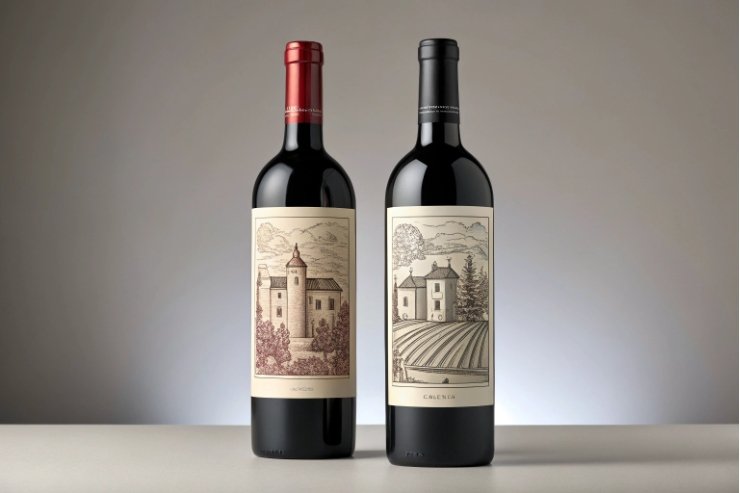
Tall bodies and defined shoulders give brands a generous, well-proportioned label panel, so designers can place branding, origin, and legal details clearly without crowding or strange proportions.
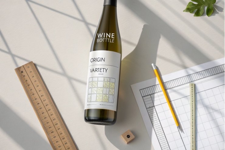
The bottle as a vertical canvas
When you stand a bottle on a shelf, what the shopper sees first is the vertical rectangle formed by the body. This becomes a natural “frame” for the front label. A tall, slender rectangle is one of the easiest shapes to design for:
- It supports a clear hierarchy: brand at top, origin and variety in the middle, details at the bottom.
- It gives enough height to breathe, even with mandatory text.
- It works well with simple, centered layouts that read as premium.
If the body were too short, labels would need to be either tiny or wrapped around too low toward the punt, which looks odd and can wrinkle on conveyors. If it were very wide, labels might be forced into strange proportions that are harder to print without distortion.
Shoulders and label placement
Shoulders (the transition between neck and body) matter for label geometry. On a typical Bordeaux bottle with strong, high shoulders, the flat panel under the shoulder is very clear. Label dies can be sized so that:
- The top edge sits just below the shoulder radius.
- The bottom edge stops high enough above the punt and curve.
This zone is almost perfectly flat and ideal for automatic labeling. On Burgundy bottles with more sloping shoulders, the flat zone is a bit shorter, but still generous enough for most front labels.
For tall, flute-style bottles (Riesling, Alsace), designers often choose slimmer, taller labels to echo the bottle. You still get enough height for brand and region, but the label leaves more glass visible. That combination reads as elegant and often slightly more premium.
Here is a simple comparison:
| Bottle family | Shoulder style | Label panel feel | Design opportunity | |
|---|---|---|---|---|
| Bordeaux | High, angular | Tall, clear rectangle | Classic layouts, châteaux, firm hierarchy | |
| Burgundy | Sloping, gentle | Slightly shorter panel | Softer, minimalist, terroir-focused | |
| Flute (Riesling/Alsace) | Very long body, narrow | Slim column | Vertical logos, minimal text, lots of glass |
Making room for back labels and regulations
Behind the scenes, tall bottles also help with legal compliance. You can pair a more expressive front label with a substantial back label that carries:
- Alcohol content, volume, and origin statements.
- Allergen warnings and importer info.
- Sustainability marks, QR codes, and vintage notes.
Because the body has enough surface area, printers can use more forgiving back-label shapes. Auto-applied labels have more room to self-correct, which reduces skewed placement and bubbling.
In short, height and shoulder design give branding and regulatory teams space to do their jobs without turning the label into a crowded text block. That is why tall, slender bottles dominate serious wine shelves worldwide.
Does shape improve case-pack and shelf blocking?
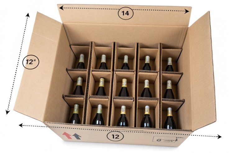
At first glance, case-pack patterns feel like something only logistics teams care about. But your bottle shape directly affects how many units fit in a carton and how strong your presence looks on a retailer’s shelf.
Yes. Tall, slender bottles pack efficiently in standard 6- and 12-bottle cases, stack well on pallets, and create strong vertical “blocks” on shelf that help a wine range stand out and guide shoppers along a lineup.
Case and pallet efficiency
Most wine cases and pallets are designed for standard 750 ml bottles with typical heights and diameters. The tall, slender form allows:
- Six or twelve bottles to nest tightly with necks alternating.
- Cartons to remain a manageable weight for manual handling.
- Pallets to stack evenly without strange voids or wasted volume.
If bottles were much shorter and wider, case footprints would grow. That would reduce the number of cases per pallet and increase transport cost per liter. Alternatively, cases would have to hold fewer bottles, which raises packaging and handling cost per unit.
The tall geometry also helps with internal strength. When bottles are aligned in a case, load transfers down through the glass in a fairly straight path. Shoulders and punts help distribute pressure. This allows stacking several layers without crushing, as long as caseboard quality is good.
Shelf blocking and visual impact
On shelf, retailers think in “blocks”. A line of tall, similar bottles creates a continuous vertical band that:
- Is easy for shoppers to scan with their eyes.
- Makes one brand or category look more substantial.
- Helps staff plan facings and stock rotation.
If your brand uses a very different height from neighbors, it may stand out. But if it is too short, it risks being visually hidden. If it is much taller, it may not fit all shelves, or staff may push it into less ideal locations.
By staying within the usual height range, but playing with shoulder shape, label color, and capsule style, you can get both compliance and distinction. The shelf still looks neat, and your brand still catches attention.
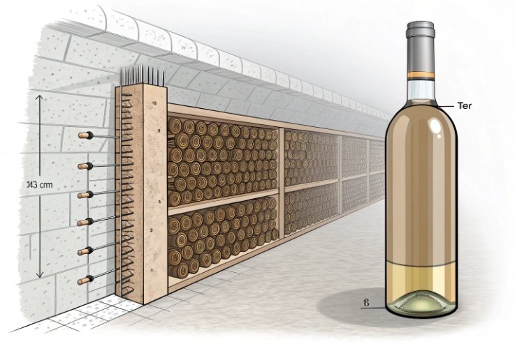
Transport and cellar footprint
In cellars and fridges, tall, slender bottles also allow denser racking. Custom and off-the-shelf wine racks are almost always designed around standard lengths and diameters. When you stick to these proportions:
- Bottles slide smoothly in and out of racks.
- You can store more wine per meter of wall.
- Mixed collections look harmonious, not chaotic.
Short, wide bottles can be charming, but they break this harmony and make storage less efficient. That is one reason why you see more experimentation in limited runs and far less in high-volume, core wines.
So yes, beyond aesthetics, the tall, slender shape is an efficient answer to the logistics of moving, stacking, and showing wine at scale—especially when you standardize around standard 750 ml bottles 5 and real-world warehouse pallet formats 6.
When do Bourgogne forms beat Bordeaux silhouettes?
If all tall bottles are efficient, why bother with different shoulder styles at all? The choice between Bordeaux and Bourgogne shapes is not random decoration.
Bourgogne forms beat Bordeaux silhouettes when you want to signal softness, terroir, or artisanal character, especially for Pinot Noir, Chardonnay, and similar varieties, while Bordeaux works better for structured, classic blends and more angular brand stories.
Shape as a shortcut to style
Most regular wine drinkers recognize Bordeaux and Burgundy shapes even if they do not know those names.
- Bordeaux bottles have high, strong shoulders and relatively straight sides.
- Bourgogne bottles have sloping shoulders and a more curved, continuous body.
These shapes have deep historical roots. Today, they serve as shortcuts:
- Bordeaux shapes hint at more structured reds (Cabernet, Merlot, blends) and some whites.
- Bourgogne shapes hint at Pinot Noir, Chardonnay, and other Burgundian or Burgundian-inspired wines.
When you align your bottle choice with this expectation, you reduce friction. A shopper looking for a “Pinot-like” wine will gravitate toward Bourgogne silhouettes even without reading every label.
Emotional cues and brand positioning
Shape also carries emotion. Bordeaux bottles feel upright, formal, almost architectural. Bourgogne bottles feel more organic and flowing.
So:
- A brand that wants to look classic, chateau-driven, or “serious” often picks Bordeaux.
- A brand that wants to look artisan, vineyard-led, or more minimal often picks Bourgogne.
For richer, textural whites, Bourgogne glass can make the bottle feel generous and gastronomic. For firm, age-worthy reds, Bordeaux glass quietly says “structure and backbone”.
Here is how I like to frame it:
| Bottle family | Visual feel | Wine message |
|---|---|---|
| Bordeaux | Upright, angular | Structured, classic, cellaring focus |
| Bourgogne | Soft, rounded | Elegant, terroir-driven, gastronomic |
| Flute | Slim, elongated | Aromatic, fresh, often off-dry whites |
Practical trade-offs
There are some practical differences too:
- Bourgogne bottles usually have a slightly larger body diameter. Cases may be a bit wider or taller to keep the same volume.
- Label panels are slightly shorter, which can push designers toward tighter, more centered layouts.
- The transition into the shoulder is more gradual, which changes how sediment behaves and how the bottle rests in some racks.
None of these are blockers. But they are real considerations when you scale.
So when do Bourgogne forms “beat” Bordeaux silhouettes? When your grape varieties, style, and brand story lean closer to Burgundy’s world than to classic Left Bank structure, and when you want your bottle to whisper that story before anyone reads the label.
Conclusion
Wine bottles are tall and slender because this one form quietly solves physics, logistics, and storytelling, while subtle changes in shoulders and silhouette help each style speak its own language on the shelf—and the basics of a well-run wine cellar 7 are designed around those standard proportions.
Footnotes
-
Visual guide to major wine bottle shapes and what they typically signal about grape, region, and style. ↩ ↩
-
Explains what sediment is, why it forms, and why it’s usually normal in aged or minimally filtered wines. ↩ ↩
-
Practical decanting technique for keeping sediment out of the glass and improving service for older wines. ↩ ↩
-
Overview of bottle-fermented sparkling production and why neck/shape matter for pressure and handling. ↩ ↩
-
Reference list of common wine bottle sizes, including the standard 750 ml format used in most global distribution. ↩ ↩
-
Real pallet case-layer examples that show how standardized bottle footprints drive warehouse stacking efficiency. ↩ ↩
-
Storage fundamentals (temperature, humidity, light control) that explain why cellar systems assume standard bottle dimensions. ↩ ↩


