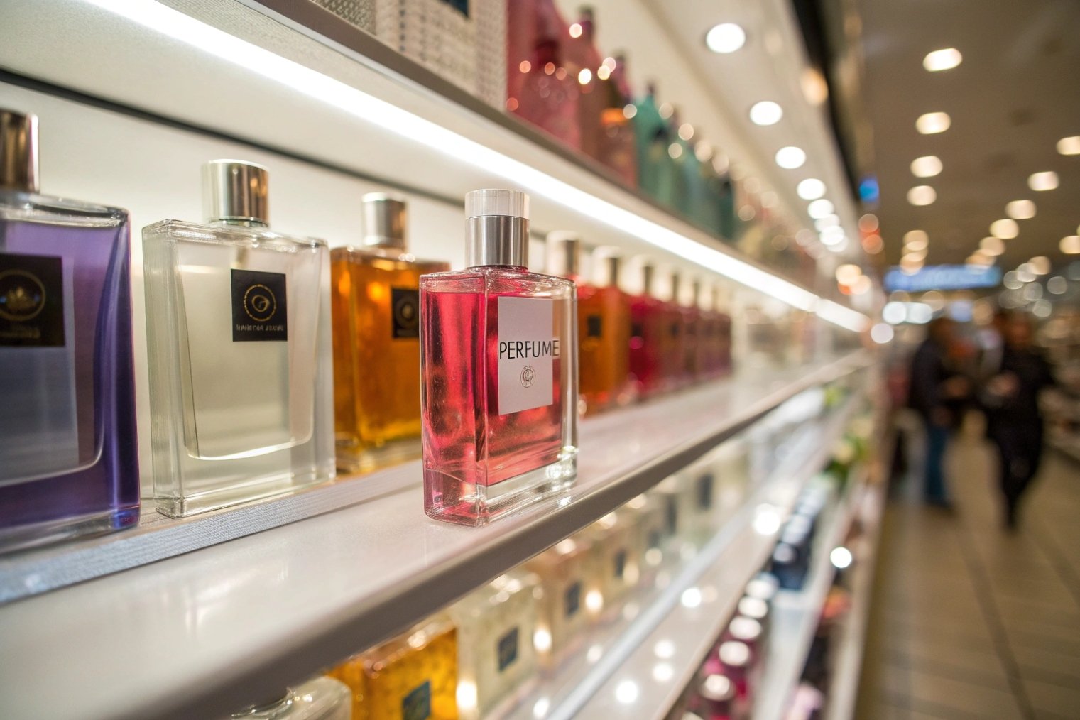
Minimalist perfume bottles sit quietly on shelf, yet they keep winning space in every new season. They feel calm, premium, and permanent in a market full of short-lived noise.
Minimalist glass perfume bottles stay timeless because they let the juice, glass clarity, and proportions speak for themselves, work across markets and seasons, reduce complexity in production, and still create a strong, quiet luxury signal.

When decoration steps back, details like weight, clarity, and silhouette move to the front. This is where a bottle stops being “simple” and starts feeling like deliberate, confident minimalist design 1. The same discipline can lift brand value for years, not just one launch cycle.
Does restrained decoration highlight glass clarity and juice color?
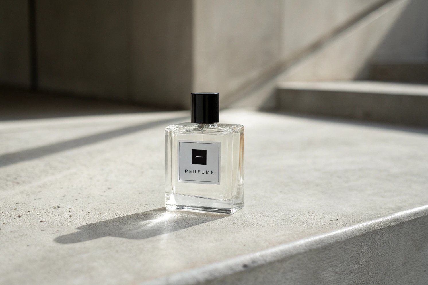
Minimal decoration removes visual noise. This draws the eye to the glass itself, the colour of the fragrance, and the balance of the silhouette instead of a long list of effects.
Yes. When decoration is restrained, the clarity of the glass and the natural juice colour become the main visual story, which signals purity, quality, and confidence in the formula rather than in surface tricks.
How minimalism lets the “juice” do the talking
A clear, well-made glass bottle with little decoration behaves almost like a lab vessel and a luxury object at the same time. This mix is powerful. It suggests honesty and precision. When the customer looks through the glass, they see:
- The hue and depth of the fragrance
- The filling level
- Any bubbles or haze
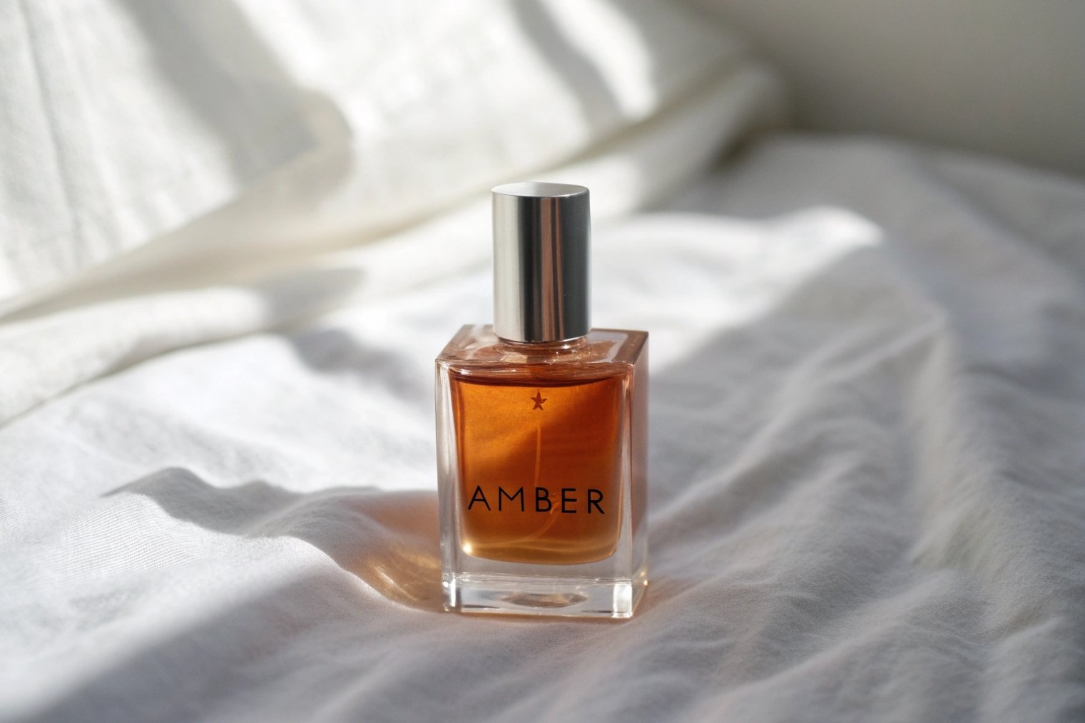
So the liquid itself becomes part of the design. Warm amber tones, soft rose shades, or light green notes can each set a mood without extra graphics—especially when you understand color psychology 2. Clear or lightly tinted glass also photographs very well, especially on clean backgrounds, which is why product photography 3 matters so much for e-commerce and social media visuals.
At the same time, minimal decoration makes small details non-negotiable. Glass quality must be high. Wall thickness should look even. The label must sit straight. Any flaw is visible. This pushes overall quality up.
A simple comparison makes the effect clear:
| Design style | First thing the eye sees | Message to the consumer |
|---|---|---|
| Heavy ornament, many colours | Decoration, logo, cap | “Look at me, I am complex” |
| Minimal, clear glass | Juice colour, glass clarity | “Look at the fragrance, trust the formula” |
For brands that focus on clean formulas, high concentration, or “skin scent” stories, this approach fits very well. The bottle looks like it has nothing to hide. That quiet confidence reads as luxury.
How does minimalism stay relevant across seasons and markets?
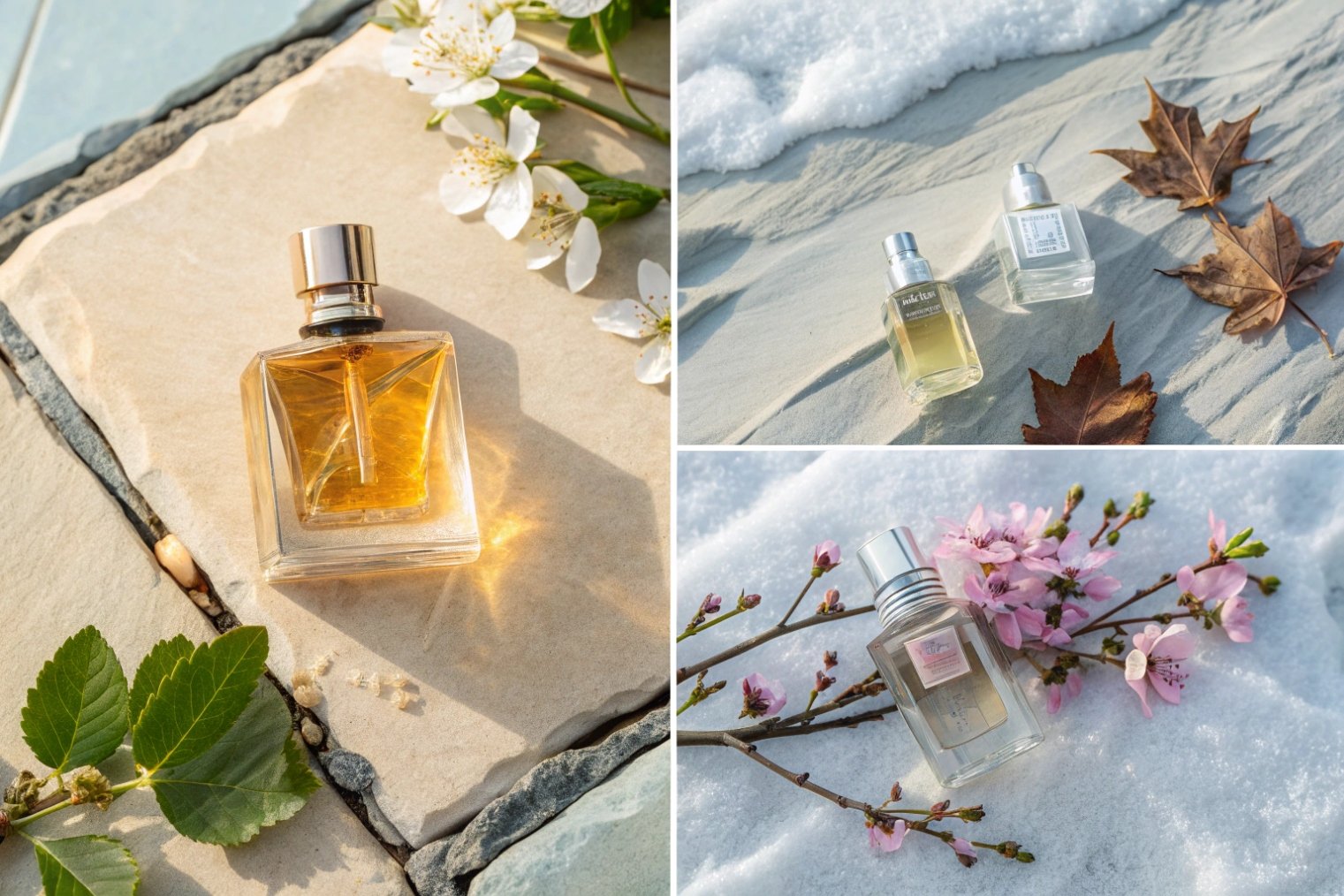
Trends change every year. Yet the same simple rectangle or soft rounded bottle can live on a shelf for ten years and still feel current.
Minimalism stays relevant because it avoids loud fashion cues, uses neutral forms and colours, and lets brand codes live in small, flexible details that you can tune by market or season.
Seasonless design and global reach
Minimalist glass bottles usually rely on stable elements:
- Clean geometry (rectangles, cylinders, gentle curves)
- Neutral or soft colour palettes
- Simple, well-spaced typography
These elements do not “expire” with a single season. A calm bottle can hold a fresh summer scent, a warm winter scent, or a limited edition with only small changes to labels or caps.
This also helps with global roll-outs. Markets may read bright colours and extreme shapes very differently, but they usually read restraint the same way: sophisticated, modern, and respectful. A neutral shape with clear branding travels well between Europe, North America, the Middle East, and Asia, which is a core advantage in global marketing 4 and multi-market launches.
A simple map of what minimalism supports:
| Brand need | How minimalism helps |
|---|---|
| Long product life | Form does not look “dated” after a few years |
| Multi-market launches | Neutral codes feel premium in many cultures |
| Unisex or gender-fluid lines | Bottle does not lean strongly “masculine” or “feminine” |
| Fast seasonal flankers | Colour or label swaps, same structure |
Flexible brand codes inside a simple frame
Minimal does not mean generic. Instead, it pushes brand personality into a few very clear signals:
- The exact proportion between height and width
- The thickness of the glass base
- The shape and weight of the cap
- The type style and layout of the label or print
Once these rules are set, you can refresh graphics, add new notes, or launch flankers without changing the core silhouette. Customers still recognise the line at a glance. That recognition is what carries your brand through many seasons while keeping design work and risk under control.
Can simpler forms reduce tooling, assembly, and scrap rates?
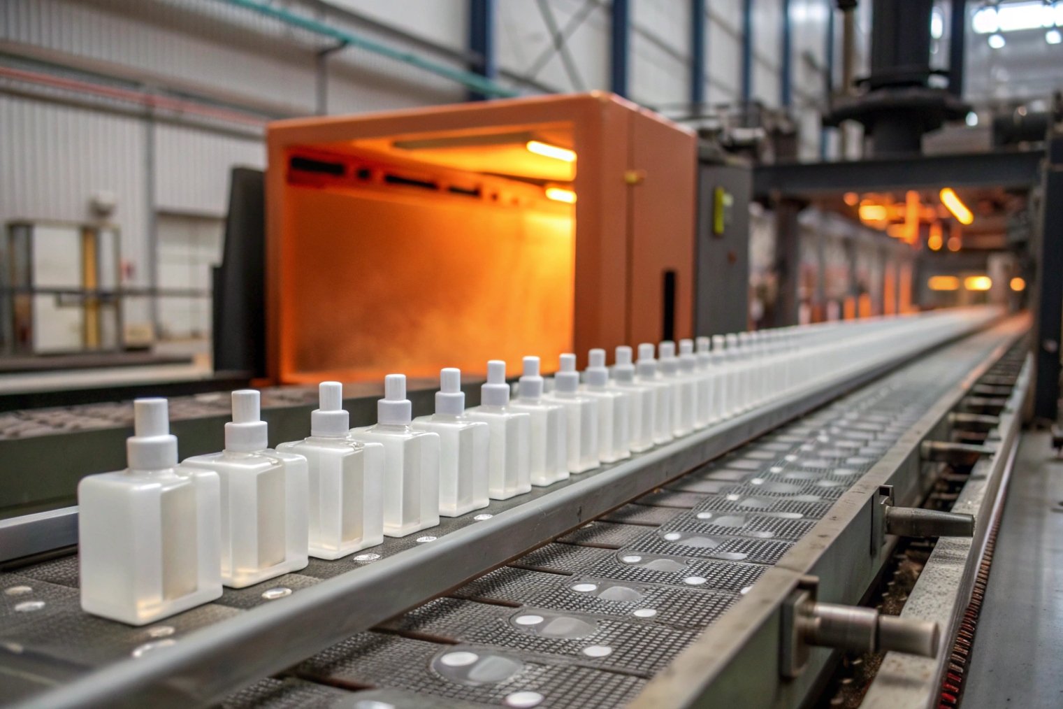
On the factory side, every curve, step, and extra part carries a cost. Minimal design, when done well, is friendly to machines as well as to the eye.
Yes. Straightforward bottle forms and fewer decoration parts usually mean easier molding, fewer assembly steps, lower defect rates, and better yields, which all support margins at scale.
Manufacturing advantages of minimal shapes
From a production perspective, simple geometries are easier to form and control. They help with:
- More stable glass distribution in the mold
- Less risk of thin spots at corners or shoulders
- Easier glass annealing 5 and better stress balance
This reduces breakage during both production and transport. It also makes quality checks simpler, because critical areas are fewer and clearer—especially with disciplined quality control 6 around neck finish, sealing surface, and cosmetic view areas.
A typical comparison:
| Feature | Complex, “loud” bottle | Minimal, simple bottle |
|---|---|---|
| Mold complexity | High, many steps and undercuts | Low–medium, clean parting lines |
| Dimensional tolerance | Harder to hold evenly | Easier to hold across the run |
| Decoration surfaces | Uneven, more masking and alignment | Large flat or gently curved panels |
| Scrap risk | Higher, more chances for visual defects | Lower, fewer places for issues to hide |
With a minimal bottle, you often need only one or two main decorations: maybe a front print and a subtle coating. This means fewer passes on machines, fewer opportunities for misalignment, and lower labour time.
Fewer components, fewer headaches
Minimalist perfume packs also tend to avoid dozens of loose parts. A typical set might be:
- One glass bottle
- One standard or slightly customised pump
- One cap (possibly with a simple insert)
- One clean outer box with a board insert
Compared with heavy, multi-layer designs, this reduces:
- Assembly time and error rates
- Risk of rattle, chipping, or coating damage during packing
- Storage and handling complexity for spare parts
Less complexity also helps with changeovers. The same simple bottle can run with different caps or pumps on the line without fully re-engineering the process. That speeds up launches and reduces the cost of trying new ideas.
How can minimal designs still stand out on crowded shelves?
The main fear with minimalism is that it will look “too simple” next to louder neighbours. But quiet design can stand out if it controls proportion, negative space, and a few strong brand signals.
Minimal designs stand out by using strong silhouettes, precise proportions, bold negative space, and a few clear brand codes like cap shape, label layout, or signature colour instead of busy graphics.
Using silence as contrast
On a crowded shelf, many bottles compete with bright colours, heavy gradients, and complex ornaments. A calm, solid form with very controlled decoration can actually attract attention by contrast. The eye rests on the simple shape as a “pause” in the noise.
Three powerful levers:
- Silhouette: A strong rectangle, a tall cylinder, or a soft square that reads clearly even from a distance.
- Negative space: Plenty of clear glass or empty label space around the logo. This is classic negative space 7 strategy that makes the brand mark feel more important.
- One strong element: A unique cap, a specific label ratio, or a single accent colour that repeats across all SKUs.
Here is how the strategy looks when you compare:
| Design strategy | Visual effect on shelf |
|---|---|
| Many small details | Busy, can blur with neighbours |
| One clear, minimal idea | Calm focal point, easy to recognise |
Building memory through small, repeatable codes
Minimalism needs discipline. Instead of ten ideas on one bottle, you pick two or three and repeat them everywhere. For example:
- The cap always carries a certain metal band or specific height.
- The label always has the same margins and logo position.
- The glass always keeps a recognisable shoulder shape.
Over time, these quiet decisions build memory. A customer can recognise your bottle from a side view in a store, or from a small thumbnail online, before they can even read the name. This is how a minimal object still becomes iconic: not through volume, but through clear, repeated signals.
Conclusion
Minimalist glass perfume bottles turn restraint into a long-term asset, highlighting the fragrance, keeping costs and waste under control, and creating a quiet, recognisable luxury language that can grow with your brand.
Footnotes
-
Minimalism principles explain why restrained forms feel intentional and premium long-term. ↩ ↩
-
Learn how color psychology shapes perceived warmth, purity, and mood from juice hue and packaging palette. ↩ ↩
-
See product photography basics for why clear glass and controlled reflections perform better in online listings. ↩ ↩
-
Overview of global marketing and why neutral design codes travel well across regions and retail cultures. ↩ ↩
-
Explains glass annealing and how stress control reduces breakage and improves yields in production. ↩ ↩
-
Quality control fundamentals for setting inspection points, defect categories, and acceptance criteria on premium packaging. ↩ ↩
-
Negative space concepts show how restraint and margins make logos feel stronger on crowded shelves. ↩ ↩


