Many brands want to look sustainable, but not every “green” package really cuts energy, waste, and product loss the way it should.
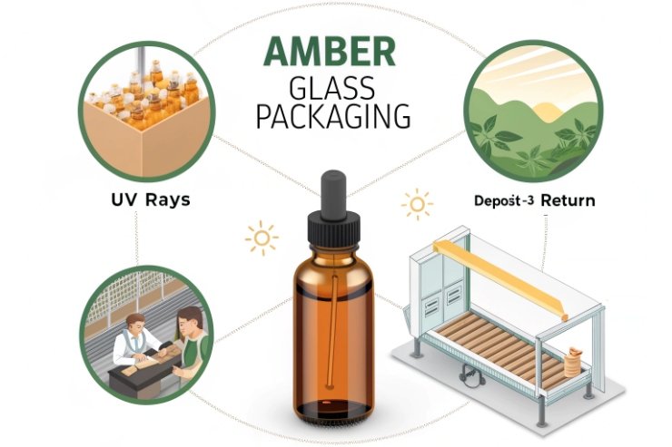
Amber glass bottles are eco-friendly because they accept high recycled cullet, block UV that causes product waste, work in reuse and deposit systems, and stay endlessly recyclable while serving sensitive SKUs like oils, tonics, beer, and pharmaceuticals.

When a brand chooses amber, it is not just picking a color. It is choosing a different material flow: more high recycled cullet 1, lower furnace energy, better product stability, and a visual cue that feels natural, safe, and premium at the same time.
Do high-cullet rates and recyclability favor amber streams?
Many teams talk about “recyclable” packs, but the real question is how much recycled content they can actually use at scale.
Amber glass streams favor eco goals because they can absorb high cullet percentages, melt at lower energy than fresh batch, and still remain endlessly recyclable with stable color and strength.
How amber turns post-consumer glass into a resource
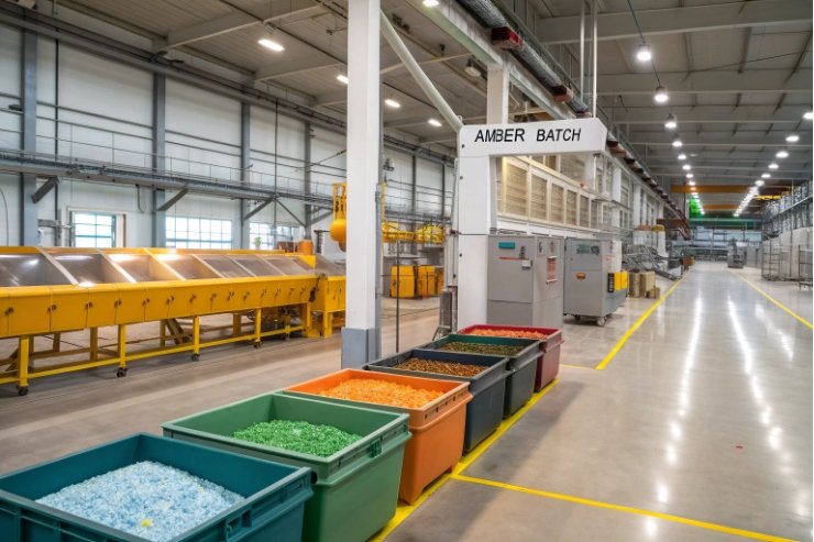
In production, cullet is not a buzzword. It is a key raw material. Amber is especially helpful because it can accept a broad mix of recycled glass colors without ruining the final shade. That gives recyclers more freedom and keeps more glass out of landfill.
Compared with flint, amber can tolerate higher levels of green or mixed cullet. The furnace can run with a cullet ratio that often goes well above half of the batch. More cullet means less virgin sand, soda ash, and limestone, and less extraction impact upstream. It also improves melting efficiency because cullet softens faster than raw batch.
From an energy view, each extra ton of cullet cuts fuel use and CO₂ emissions per bottle. That change is small at a single pallet scale but very large over years of production. For brands under pressure from EPR schemes and carbon reporting, this really matters. Amber is one of the easiest glass colors for us to push cullet content higher without sacrificing performance.
On top of that, amber bottles remain endlessly recyclable glass 2. When they finally leave a refill or single-use cycle, they go straight back into the cullet stream. The color does not degrade with each melting step. There is no “downcycling” into a lower-grade product the way many plastics face.
So from a lifecycle angle, amber supports three wins at once: it takes in more post-consumer cullet, it reduces energy per ton during melting, and it returns to the loop without losing strength or quality.
Which SKUs—oils, tonics, beer—need UV protection?
Not every product needs tinted glass. But some liquids suffer badly under light. They go flat, turn bitter, fade in color, or lose active strength long before the label date.
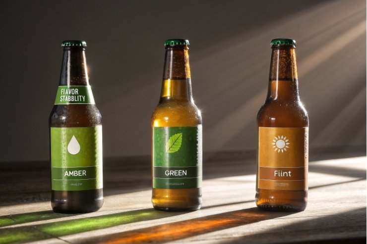
Amber glass is vital for SKUs like edible oils, essential oils, tonics, syrups, beer, kombucha, and pharmaceuticals where UV and blue light trigger oxidation, off-flavors, or active-ingredient loss.
Matching light protection to product sensitivity
Amber glass filters out most UV below around 450 nm and a portion of short-wave visible light. This sounds technical, but the effect is simple: fewer photons reach sensitive molecules in the liquid. Less energy means fewer photo-oxidation reactions, which means slower flavor and potency loss.
Different SKUs have different risk levels:
| Product type | Light sensitivity | Amber benefit |
|---|---|---|
| Beer and kombucha | Very high (skunking) | Blocks UV that forms light-struck off-notes |
| Edible oils (olive, nut) | High (rancidity) | Slows oxidation, keeps flavor and color stable |
| Essential oils | Very high (volatiles) | Protects aromatics and active compounds |
| Tonics, syrups | Medium to high | Preserves botanicals, colors, sweet notes |
| Pharma / nutraceutical | Very high (actives) | Helps maintain label potency over shelf life |
For beer, amber is already the standard in many markets. It dramatically reduces “lightstruck” character compared with flint, because UV exposure can drive MBT formation and related faults described in research on lightstruck beer reactions 3. For kombucha and fermented tonics, amber cuts both flavor drift and vitamin loss.
Edible and cosmetic oils also benefit. Polyunsaturated fats and delicate aromatics in cold-pressed oils break down quickly in strong light. Amber slows this process so the oil reaches the consumer closer to its fresh profile. Essential oils and aromatherapy blends are even more sensitive; they are basically pure volatile chemistry in a bottle. That is why amber or other dark shades dominate this category.
Pharma and nutraceutical SKUs often specify amber by regulation or internal quality standards. Many active ingredients are UV labile, which is why stability programs reference the ICH Q1B photostability testing guideline 4. Amber glass reduces the need for heavy over-boxing and can support more open merchandising without compromising stability.
So when a brand chooses amber for a light-sensitive SKU, it is not just a style choice. It is a shelf-life and waste-reduction tool. Fewer damaged units and fewer returns are part of the eco story too, because wasted product is also wasted energy and CO₂.
Can amber support natural and clinical brand cues at the same time?
Some marketers worry that amber looks too “apothecary” for beauty or too “natural” for clinical ranges. In practice, amber is one of the most flexible color platforms we work with.
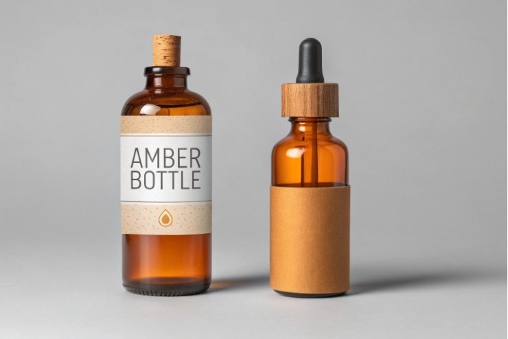
Amber glass can express both natural and clinical cues by adjusting shape, decoration, and closure: apothecary forms for wellness, clean cylinders for pharmacy, and refined shoulders for premium cosmetics or beverages.
Building a natural, low-waste look
For natural and organic brands, amber almost sells itself. It already appears in herbal apothecaries, aromatherapy lines, and refill stores, so customers read it as:
- Plant-based
- Low-additive
- Closer to “traditional” craft production
Design choices that push this feeling:
- Simple apothecary shapes with rounded shoulders.
- Uncoated amber glass with clear, honest texture.
- Kraft, cotton, or uncoated paper labels with restrained color.
- Wooden caps, brushed aluminum, or black PP closures.
Because amber signals protection, it also supports formulas with “less preservative” or “no synthetic color” claims. The pack and the story line up. That reduces cognitive dissonance and makes the eco message feel credible.
Dialing amber toward clinical and precise
Amber can also look very clinical. Pharma bottles prove this every day. To move in that direction, we often combine:
- Straight-sided cylinders or pharma rounds with tight geometry.
- Crisp white or silver typography on clear or minimal labels.
- High-precision droppers, pumps, or child-resistant caps.
- Clean decoration like fine-line grids, dosage scales, or QR codes.
In this skin, amber reads like a lab tool: protective, controlled, and tested. That is ideal for active skincare (retinol, vitamin C), medical CBD formats, or nutraceutical drops. The color tells the consumer “we are guarding what is inside” in a clinical way, not just an earthy way.
Balancing both cues on one shelf
Many portfolios want both feelings. For example, a herbal skincare line with a wellness serum and a dermatologist-backed active. Because amber is so adaptable, it is possible to keep one glass color across the range and “swing” the mood with:
| Element | Natural direction | Clinical direction |
|---|---|---|
| Shape | Apothecary, rounded shoulders | Straight cylinders, sharp shoulders |
| Label stock | Textured, off-white, kraft | Smooth, bright white or clear |
| Typography | Soft serif or script accents | Simple sans-serif, clear hierarchy |
| Closures | Wood, bamboo, matte black | White, silver, CRC or precise droppers |
This unified amber base supports supply-chain efficiency and deposit return systems 5 while giving marketing the visual language they need for each SKU.
So yes, amber can be soft and natural or clean and clinical. With the right glass form and finish, it does both without losing its technical advantages.
What ΔE and color specs keep amber batches consistent?
Eco claims lose power when bottles on the same shelf look visibly different. Shade drift makes the product look cheap, even if the glass itself is sustainable.
Color consistency in amber is controlled with Lab measurements and ΔE tolerances between batches; tight specs (for example ΔE ≤ 1.0–1.5 against a master standard) keep production runs visually uniform while still accepting high recycled content.
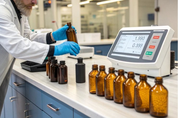
How we measure amber, not just “eye check” it
Human eyes are good but not enough for industrial consistency. For amber, we usually define a target color in CIE L*a*b* color space 6. Then we measure samples from each melt or forming run with a spectrophotometer, following best practice around spectrophotometer calibration standards 7.
The difference between the sample and the target is expressed as ΔE color difference 1. Lower ΔE means closer color match. This gives us an objective way to say “these two pallets are the same amber” rather than trusting memory or light conditions in the QC room.
Typical ranges:
| Application | Suggested ΔE range vs standard | Visual result |
|---|---|---|
| Mass beer / soft drinks | ≤ 2.0–2.5 | Very similar on shelf |
| Premium cosmetics / H&B | ≤ 1.0–1.5 | Almost indistinguishable to the eye |
| Pharma / nutraceutical | ≤ 1.0–1.5 | Very tight, supports trust and dosing |
Tighter ΔE specs require closer control of cullet mix, batch recipe, and furnace conditions. That is why agreeing the tolerance with the brand team at the start is important. It sets realistic expectations for both visual identity and cullet levels.
Balancing recycled content with shade control
High cullet rates are great for eco metrics, but cullet is not perfectly uniform. Mixed post-consumer streams can shift amber toward slightly greener or browner tones if we do not correct the recipe.
To keep both goals in line, we:
- Sort cullet by color as tightly as available infrastructure allows.
- Adjust metal oxide dosing (like iron, sulfur, and others) in the batch.
- Monitor furnace oxygen and temperature to avoid unexpected shifts.
- Run regular in-line and lab color checks to catch drift early.
When a brand wants very tight ΔE and very high cullet at the same time, we usually propose a short industrial trial. This allows both teams to see real data: what color stability looks like at, for example, 70% cullet, and where the safe operating window sits.
Why color tolerance is part of brand and eco planning
If color jumps from run to run, labels, caps, and secondary packaging will not match as the design intent. That hurts shelf impact and premium cues. In some channels, it also raises questions: “Did the formula change?”, “Is this from another supplier?”
By locking in ΔE specs, we protect:
- Brand identity: bottles align with the color language used in web, print, and POS.
- Quality perception: customers sense a stable, controlled process.
- Sustainability messaging: a consistent amber hue shows a reliable cullet program, not ad-hoc glass sourcing.
So color control is not just a cosmetic detail. It is part of the technical backbone that lets amber carry both eco and premium stories without conflict.
Conclusion
Amber glass bottles are eco-friendly because they accept more recycled cullet, extend shelf life for light-sensitive SKUs, adapt to both natural and clinical branding, and hold tight color specs that keep every batch looking and performing like a stable, long-term packaging choice.
Footnotes
-
Explains how cullet and ΔE measurement support lower emissions and consistent amber shade. ↩ ↩ ↩
-
Shows glass recycling benefits and why glass can be recycled repeatedly without losing quality. ↩ ↩
-
Research overview of light-driven beer off-flavors, supporting why UV protection reduces product waste. ↩ ↩
-
Official guideline for testing light sensitivity of drug products and packaging choices like amber glass. ↩ ↩
-
Practical guide explaining how deposit systems improve collection rates and enable reuse/recycling loops. ↩ ↩
-
Defines the Lab* system used to specify and control amber color objectively across batches. ↩ ↩
-
Best practices for accurate color measurement so QC can catch shade drift early. ↩ ↩


