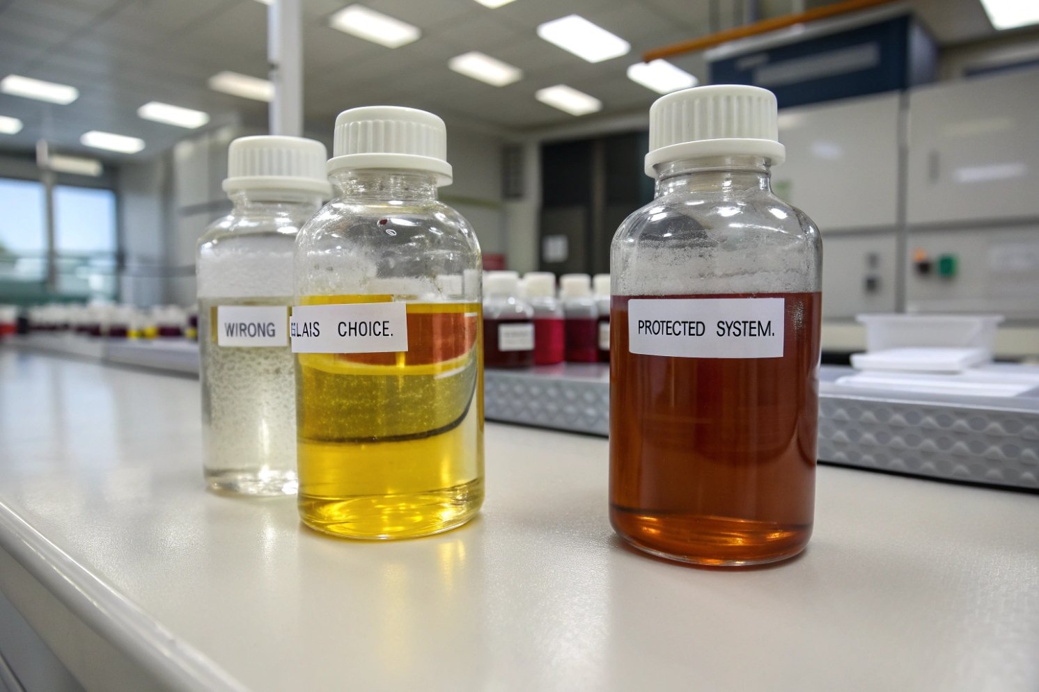
Too many good formulas fail because light slowly breaks them down. The label still looks fine, but the product inside changes before the customer finishes it.
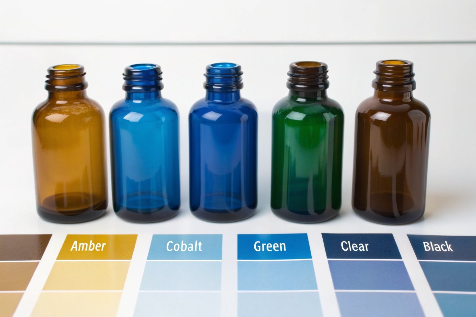
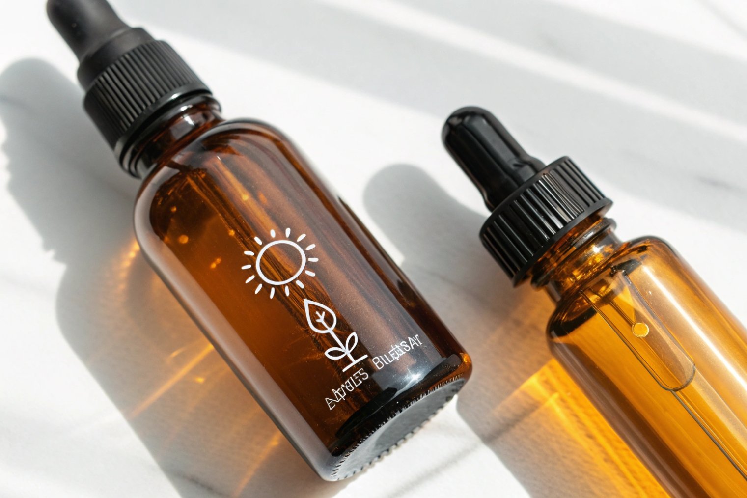
Amber, cobalt blue, green, clear, and opaque glass all exist, but amber is the common standard for strong UV and blue-light blocking, while clear needs extra barriers and proof testing.

Light damage is about wavelength, not “brightness”
Light-sensitive does not mean the product hates all light. Most problems start in specific bands, mainly UV and the short-wave visible range (blue/violet). Many actives break faster under these wavelengths. Some oils oxidize faster when light adds energy to the system. Some vitamins and APIs lose potency in weeks if the package is wrong.
Color choice is a packaging decision, but it is also a risk decision. A bottle can be “dark” and still pass too much blue light. A bottle can be “pretty” and still fail photostability. For this reason, the word “amber” or “cobalt” is not enough. The real question is: how much light passes through at each wavelength, at the wall thickness that will be used in mass production?
In my work with B2B buyers, the best projects start with two simple steps. The first step is to classify the formulation: high risk, medium risk, or low risk for light. The second step is to match that risk to a package that has measurable performance, not marketing language.
Below is a practical map for common colors. It is not a legal spec. It is a sourcing guide that helps narrow choices before testing.
| Glass Color | UV Protection | Blue/Visible Protection | Typical Fit | Main Trade-Off |
|---|---|---|---|---|
| Amber (brown) | Strong | Strong (especially blue) | Pharmaceuticals, essential oils, sensitive serums | Less product visibility |
| Cobalt blue | Medium | Medium | Premium cosmetics, some oils, branding-first SKUs | Often weaker than amber overall |
| Green (dark) | Medium-low | Medium-low | Moderate sensitivity, traditional look | Protection varies by shade |
| Clear (flint) | Low | Low | Low sensitivity or short exposure | Needs extra barriers |
| Opaque/opal (milk) | Very strong | Very strong | Very light-sensitive or long shelf life | No visibility |
Most buyers want one “best” color. Real packaging is more personal than that. It depends on the active, the shelf life, the market, and how the product will sit on shelves or in bathrooms.
The next sections answer the four questions that usually decide the final choice.
A color decision is simple on paper. It gets real when a buyer has to defend stability, cost, and brand look at the same time.
Which glass color provides the best UV and visible-light protection for pharmaceuticals, essential oils, and serums?
Light protection has to match the product, not the category name. A “serum” can be stable, or it can be fragile like a drug.
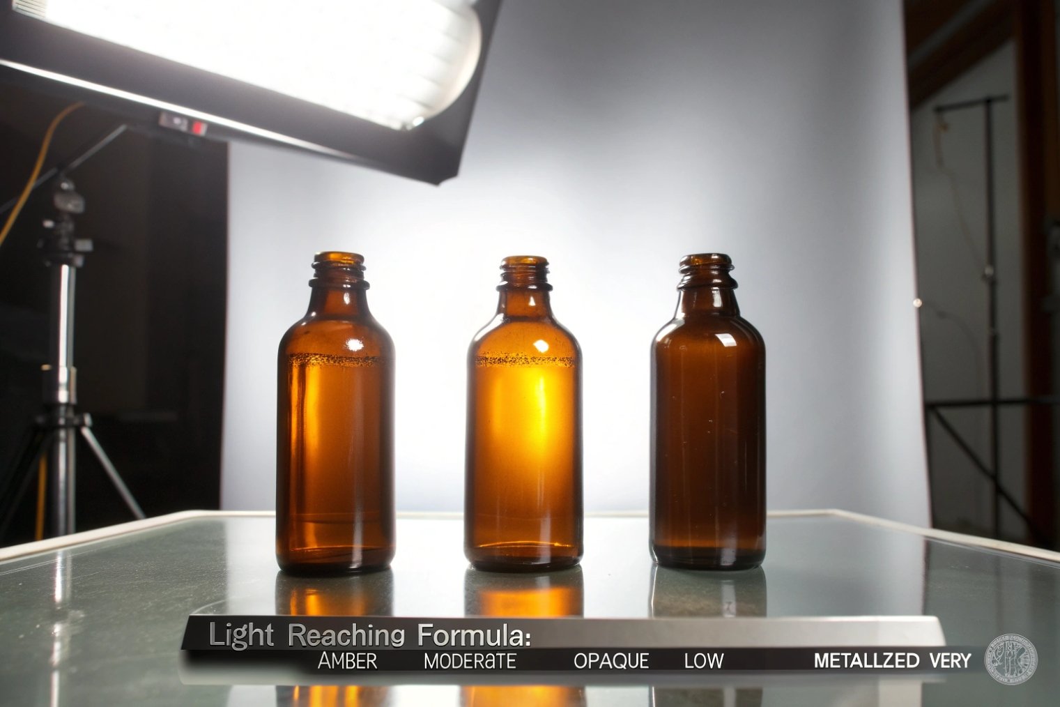
Amber glass is the safest default for strong UV and blue-light protection across pharma, essential oils, and many serums, while opaque/opal can protect even more when visibility is not needed.
Pharmaceuticals: start from photostability and compliance
Pharmaceutical packaging lives under stricter expectations. Many drug products follow photostability logic like the ICH Q1B photostability testing guideline 1, where testing decides if light-resistant packaging is needed. In that world, amber is used so often because amber glass can block most UV and short visible light under ~450 nm 2. If the product is very sensitive, opaque packaging can be the safer choice, because it reduces exposure across UV and visible bands. In the US market, teams often align this with the FDA Q1B photostability testing guidance 3.
A practical rule: when potency matters and shelf life is long, amber (or opaque) is the baseline. Cobalt and green can work for some products, but they need proof. “Blue looks protective” is not proof.
Essential oils: protect aroma and slow oxidation
Essential oils often suffer from oxidation, aroma shifts, and color changes. Many oils are stored in amber because it reduces UV and blue light exposure. Deep violet “biophotonic” glass is also used in parts of the natural market because it blocks large parts of visible light, but the choice should still be supported by spectral transmission data.
A practical rule: for oils sold in dropper bottles with long use time, amber is the safest mainstream path. Darker and more opaque options can help when the oil is known to be fragile.
Serums: the most mixed category
Serums can contain vitamin C, retinoids, peptides, botanical extracts, and acids. Some of these are light-sensitive. Some are fine. Brand teams also want color identity, so cobalt blue is common in skincare. That can be OK when testing supports it. But if the active is known to degrade under blue light, cobalt can be a risky “pretty choice.”
A practical rule: if the serum has strong actives and claims depend on them, amber or opaque protects the business.
| Product Type | Typical Light Risk | Best Default Color | Notes for Buyers |
|---|---|---|---|
| Prescription/OTC pharma | High | Amber or opaque | Validate with photostability outcomes |
| Essential oils | Medium-high | Amber | Consider secondary box for long shelf life |
| Active serums (vit C, retinoids) | High | Amber or opaque | Test finished pack, not only bottle |
| Mild serums (basic hydrators) | Low-medium | Cobalt/green/clear | Control exposure with cartons and storage guidance |
The best protection is not only the darkest bottle. It is the best match between formulation risk and proven transmission performance.
When should you choose amber glass vs cobalt blue vs green glass for light-sensitive formulations?
Choosing a color can feel like a branding decision, but for light-sensitive products it is a stability decision first.
Choose amber when light risk is high or shelf life is long, choose cobalt blue when brand needs it and testing proves it, and choose green when sensitivity is moderate and shade is dark enough.
Choose amber when failure is expensive
Amber is the industry default because it gives strong UV and blue-light filtering across many formulas. It is also widely available in common bottle families like Boston rounds, pharma packs, and droppers. That availability matters for supply stability and price control.
Amber is the best choice when:
- The active is known to be light-sensitive
- The product has long shelf life or slow consumption
- The market expects pharma-style protection
- The label claims depend on potency
Choose cobalt blue when the brand needs identity, and proof exists
Cobalt blue is popular in cosmetics because it signals premium. It can provide meaningful protection versus clear, but it is often described as less protective than amber overall—so many teams use an amber vs cobalt UV protection comparison 4 as a starting point before testing. For some formulas, cobalt is enough. For others, it is not.
Cobalt is the best choice when:
- Brand color is a priority
- The formulation risk is medium, not extreme
- A carton or outer box will be used
- Transmission testing supports the choice
Choose green when sensitivity is moderate and shade is controlled
Green glass covers a wide range, from light green to deep antique olive. Darker greens tend to protect more than lighter greens, but performance varies a lot. Green is often used for traditional categories and mild-to-moderate sensitivity.
Green is the best choice when:
- The product is moderately sensitive
- The shade is dark and consistent
- The brand wants a natural look
- The project accepts less protection than amber
| Decision Factor | Amber | Cobalt Blue | Green |
|---|---|---|---|
| Highest protection need | Best fit | Risky unless proven | Usually not ideal |
| Brand-led premium look | Medium | Strong | Medium |
| Need for visibility | Low | Medium | Medium |
| Shelf-life pressure | Strong support | Needs proof | Depends on shade |
| Supply stability (common SKUs) | Strong | Medium | Strong in some markets |
My guiding principle is simple: when stability risk is high, pick the color that reduces the need for “extra tricks.” That color is usually amber.
Can clear (flint) glass be used for light-sensitive products if you add UV coating, labeling, or secondary packaging?
Clear glass looks clean and premium, but it gives minimal natural light protection. Many teams still want it for visibility and shelf impact.
Yes, clear glass can work if extra barriers block light and the finished package passes photostability testing, but it is a system choice, not a bottle-only choice.
Think in layers: primary, label, and outer pack
Clear glass alone is a weak barrier. So the protection must come from layers:
- A UV coating or UV-blocking lacquer on the glass
- A full-body sleeve or heavy label coverage
- A carton or secondary box that limits exposure
- Storage guidance that reduces sunlight time
Many brands succeed with this method, but only when the system is controlled. Coatings can vary. Labels do not always cover enough area. Cartons can be removed quickly by consumers. If the formula is truly sensitive, the system must still work after purchase, not only during shipping.
UV coating: useful, but it must be qualified
UV coatings can reduce UV transmission, but performance depends on coating type, thickness, and durability. A coating can scratch. A coating can change under heat or chemical contact. The bottle must be tested after decoration and handling, not only as a raw bottle.
Labeling and sleeves: practical protection with design limits
A full shrink sleeve blocks a lot of visible light simply by covering surface area—especially when you select light-barrier shrink sleeve films 5. A thick paper label can also reduce exposure. But clear “windows” and uncovered shoulders still let light in. If the product sits near a window, these gaps matter.
Secondary packaging: the cheapest strong barrier
A carton is simple and strong. It blocks both UV and visible light across most of the bottle. Many pharma-style packs use cartons for this reason. The weakness is user behavior. Some consumers throw the carton away on day one.
| Add-On Method | What It Blocks | Strength | Weak Point |
|---|---|---|---|
| UV coating on clear glass | Mostly UV | Good when controlled | Needs durability proof |
| Full shrink sleeve | Visible + some UV (depends on print/film) | Strong coverage | Heat and scuff risks |
| Large opaque label | Visible where covered | Low-medium | Uncovered areas leak light |
| Outer carton | UV + visible | Very strong | Consumer may discard |
| Dark overwrap / shipper | Shipping exposure | Useful | Does not protect after opening |
Clear glass is not “wrong.” It just needs a packaging system and real validation. For highly sensitive formulas, amber or opaque usually reduces complexity and risk.
What light-transmittance tests and supplier documents should you request to prove a colored bottle is truly light-protective?
Color names are loose. Factories also have shade variations across lots. A buyer needs numbers, not color words.
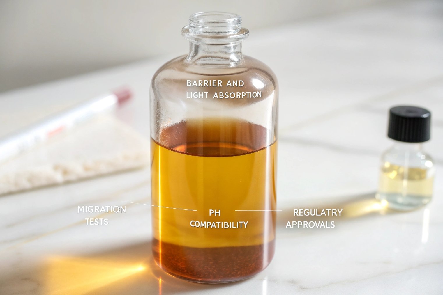
Request a UV-Vis spectral transmittance report for the exact bottle wall thickness, plus lot-based QC documents and a change-control promise, so protection stays stable from sample to bulk.
The core test: spectral transmission across wavelength
The most useful proof is a spectral transmittance curve measured with UV-Vis equipment. It shows how much light passes through at each wavelength. For light-sensitive products, the key range often includes UV and short visible light. The report should state:
- Wavelength range tested
- % transmittance at key points (not only an average)
- Sample thickness or the actual bottle wall thickness
- Test method and instrument details
- Sample count (one sample is not enough)
If you need a practical reference for how a UV-Vis spectral transmittance curve 6 is generated and interpreted, it helps teams write clearer pass/fail requirements.
Even better: test multiple lots. A buyer can ask for a target color window and a routine QC check that keeps the window stable.
Finished-pack validation matters
A bottle is only one piece. Decoration, coating, and labels change transmission. So it is smart to request transmission testing:
- On raw glass
- After decoration/coating
- With the label or sleeve applied (if it is part of the protection plan)
In regulated categories, teams often align the test window with requirements such as USP <671> spectral transmission requirements 7 when packaging is intended to provide light protection.
Supplier documents that reduce sourcing risk
Documents show whether a supplier can repeat performance at scale. For light protection, useful documents include:
- Bottle drawing with key dimensions and tolerance notes
- Glass color code or internal color spec
- QC plan for color consistency and wall thickness checks
- Certificate of Analysis (COA) or inspection report per batch
- Change-control notice process (what happens if raw materials or furnace conditions change)
- Retention sample policy (how long samples are kept for disputes)
| Request Item | What It Proves | What to Check | Buyer Benefit |
|---|---|---|---|
| UV-Vis spectral transmittance curve | Real light blocking by wavelength | Thickness, wavelength range, %T values | Stops “color-only” guessing |
| Multi-lot transmission data | Consistency over time | Lot IDs, variation limits | Protects repeat orders |
| Decoration/coating transmission test | Finished pack performance | After-process testing | Validates marketing finish choices |
| QC inspection report per batch | Routine control | Sampling plan and defect limits | Supports claims and disputes |
| Change-control statement | Stability of supply | Notice timing and approval steps | Avoids surprise drift |
When a supplier can provide these items quickly, the project moves faster and the risk drops. When a supplier avoids these requests, the buyer usually pays later.
Conclusion
Amber is the safest standard, cobalt and green need proof, clear needs layered barriers, and real protection must be shown with UV-Vis transmission data and strong supplier documents.
Footnotes
-
Official photostability testing framework used to justify light-resistant packaging decisions in regulated products. ↩ ↩
-
Practical explanation of why amber often blocks UV/blue wavelengths better than other common tints. ↩ ↩
-
US regulator’s guidance page explaining how Q1B is applied in submissions and photostability expectations. ↩ ↩
-
Side-by-side overview of amber vs cobalt protection trade-offs to decide when “brand color” needs extra barriers. ↩ ↩
-
Example of sleeve materials engineered for very low light transmission when clear containers must protect sensitive formulas. ↩ ↩
-
Clear primer on transmittance/absorbance basics to help teams read UV-Vis curves and write measurable specs. ↩ ↩
-
Defines light transmission testing expectations (including 290–450 nm range) for “light-resistant” container systems. ↩ ↩


