A bottle can look perfect in the mockup, then arrive scuffed, peeling, or hard to recycle. A bad finish hurts the brand. This guide fixes that.
Custom liquor bottles use finishes like frosting, spray paint, hot stamping, ceramic inks, and metallization. The best choice depends on shelf impact, durability needs, run size, and how you want the bottle to recycle and stay food-safe.

A liquor bottle finish is not only decoration. It is also a risk decision. Each finish changes scratch resistance, line handling, lead time, and how easy it is to keep the bottle looking “new” in real distribution. A smart plan starts with a simple question: is the finish mainly for beauty, for grip, for durability, or for brand blocking on shelf?
Which surface finishes are most common for custom liquor bottles?
A brand wants “premium.” The factory wants “repeatable.” The market wants “wow.” If the finish is not matched to the project reality, the bottle looks great once, then fails in the field.
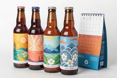
The most common liquor-bottle finishes include clear flint glass, frosting (etched or blasted), spray painting (gloss or matte), screen printing (UV inks or ceramic inks), hot stamping foils, and metallic looks made by vacuum metallization or electroplating.
The “base layer” finishes
Many projects start with one of these:
- Clear flint, no decoration: fastest and simplest, shows spirit color.
- Colored glass (amber/green/black): built-in color effect with no exterior coating.
- Embossing/debossing: logo and pattern in the glass, strong premium cue with no ink.
These choices are often the best for recyclability and for stable long-term look, since there is no paint film to scratch.
The “touch and feel” finishes
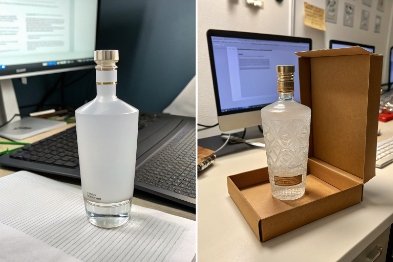
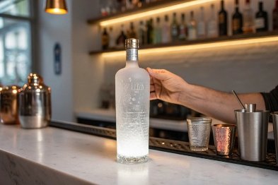
- Frosted (acid-etched or sandblasted): soft matte look, hides small scuffs, feels premium—especially when using acid-etching and spray frosting 1.
- Soft-touch overcoat: velvet handfeel, strong “luxury” signal, but it needs careful scuff control.
- Textured paint (micro-matte): modern look, reduces fingerprints, but can show abrasion if not protected.
The “graphic and metallic” finishes
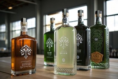
- Spray coating (solid or translucent): full color control, strong shelf blocking; many brands specify supplier-grade colored and special effects glass coatings 2.
- Screen printing (UV or ceramic): direct graphics on glass, less “label” feeling.
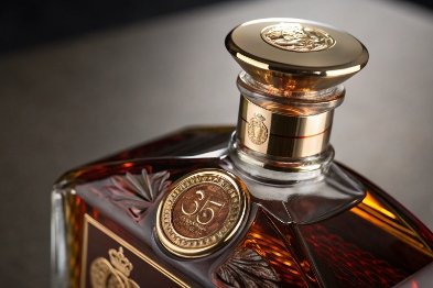
- Hot stamping (foil): metallic logo and accents, good for premium cues.
- Vacuum metallization / electroplating look: full metal or partial metal effect, giftable and bold—built on the vacuum coating and metallizing process 3.
| Finish family | What it does best | Main risk | Best fit |
|---|---|---|---|
| No-coat + emboss | timeless premium, easy recycling | mold cost | core SKUs, long lifecycle |
| Frosting | soft luxury, hides scuffs | fingerprint and grease marks | gin, vodka, skincare-style brands |
| Spray paint | bold color, fast shelf pop | scuff and chipping | strong brand color programs |
| Printing + stamping | premium detail | abrasion at high-touch zones | premium ranges, limited editions |
| Metallized looks | “gift” impact | higher cost, more process steps | ultra-premium, seasonal packs |
A good finish plan picks one hero effect and one supporting effect. Too many layers raise risk fast.
When should you choose frosting, painting, or electroplating?
A finish can sell the bottle, but it can also create claims. The right choice depends on how the bottle will be handled, not only how it will look in a photo.
Choose frosting when you want a soft premium feel and you can accept a matte look. Choose painting when you need strong brand color and flexible design. Choose electroplating or metallized looks when you need a high-luxury metal effect and the price point supports extra processing and tighter QC.
Frosting: best for “quiet luxury”
Frosting works when the brand wants:
- a clean, soft look that feels modern
- a “pharmacy clean” or “spa” vibe
- a way to hide light scuffs from handling
But frosting can show fingerprints and oil marks. In bars, that matters. For a bottle that will be held often, a partial frosting window or frosted panel can reduce that issue while keeping the premium cue.
Painting: best for brand color and fast iteration
Painting is the most flexible choice for:
- full-bottle color blocking
- gradients and translucent tints
- matte vs gloss contrast
- partial windows that reveal the liquid
Painting also makes short brand refresh cycles easier. A new Pantone can be applied without changing the mold. The weak point is scuffing. So the project needs clear handling rules and, in many cases, a protective clear topcoat.
Electroplating / metallized looks: best for “gift shelf” impact
A metal look is powerful for:
- holiday gift packs
- super-premium spirits
- limited-edition collector bottles
The trade-off is process complexity. A metallic finish often needs multiple layers, strict cleaning, and careful packing. It can also create high reject rates if dust control is weak. When the bottle will travel long routes, metallic finishes need abrasion resistance testing before launch.
| Decision point | Frosting | Painting | Electroplating / metallized look |
|---|---|---|---|
| Shelf impact | refined | bold | dramatic |
| Fingerprints | medium/high | low/medium (matte helps) | low/medium (depends on topcoat) |
| Scuff risk | low/medium | medium/high | medium/high without protection |
| Lead time | medium | medium | longer |
| Best use | premium core | core + seasonal | limited + gift |
If the brand does not have strong packing control, painting and plating should be limited to protected zones, not full-body coverage.
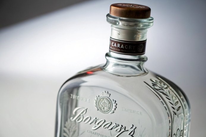
Do hot stamping and ceramic inks meet durability needs?
A premium finish is wasted if it rubs off in cartons, or if it fades after ice buckets and bar service. Durability has to be designed, not hoped for.
Yes, both can meet strong durability needs when specified correctly. Hot stamping can be abrasion-resistant and long-lasting, especially with the right adhesive and a protective topcoat. Ceramic inks, when fired/bonded to the glass, are among the most durable decoration options for reuse and heavy washing.
Hot stamping: great for logos and accents
Hot stamping is strongest when it is treated as an accent, not a full-body design. It works best for:
- neck logos
- medallion marks on the front panel
- small metallic typography
- cap and secondary packaging matching
The real durability driver is the full system: foil + adhesive + surface prep + any clear coat. For glass, many lines add a primer layer—see why a primer is needed for hot stamping on glass 4. If the bottle will be handled in bars, a clear protective layer over the stamped area can protect shine and reduce edge lifting.
Ceramic inks: best for permanent graphics
Ceramic inks (often used in Applied Ceramic Labeling (ACL) printing 5) are chosen when the brand wants:
- direct-to-glass graphics with no label feel
- strong resistance to scuffing and water
- a finish that survives reuse cycles
This is why ceramic-style decoration is common for returnable pools and heavy-use programs. It costs more than a simple paper label, but it can pay back in lower rework and fewer appearance complaints.
What to test before a big launch
- Carton rub/scuff test: bottle-to-divider, bottle-to-bottle contact.
- Ice bucket soak + wipe: check edge lift and haze.
- Wet-hand handling: check fingerprint visibility and slip.
- Chemical wipe: simulate bar cleaning sprays on exterior.
| Decoration method | Best durability strength | Weak spot | Best placement |
|---|---|---|---|
| Hot stamping | metallic pop that can last | edges can lift if abused | logo accents, neck zones |
| Ceramic inks | near-permanent print | color limits and setup cost | core graphics, refillable programs |
| UV inks | flexible colors and effects | scratch risk without topcoat | short-run graphics, protected panels |
The best approach is simple: use ceramic inks for the “must last” parts, and use hot stamping only where metallic shine is worth the extra handling care.
How do sleeves compare for short runs and color effects?
A brand may want a new look fast, with low MOQ and no tooling delay. Sleeves are often the fastest way to get there.
Shrink sleeves are strong for short runs because they need no bottle coating line and can deliver 360° full-color graphics, gradients, and special effects. The trade-off is that sleeves add plastic, can hide the glass premium cue, and must be designed for easy removal if recycling is a priority.
Why sleeves win for speed and flexibility
Sleeves help when the project needs:
- seasonal editions
- market test batches
- many SKUs with different artwork
- complex graphics that are hard to print directly on glass
They can also create color effects that are expensive in coatings, like full photographic art, bold patterns, and deep gradients. For brand owners, the biggest value is speed. Artwork changes do not require re-qualifying a coating recipe.
Where sleeves lose against direct decoration
Sleeves can feel less premium if:
- the film looks glossy and “plastic”
- seams and distortion show on shaped bottles
- the sleeve wrinkles from heat or handling
Sleeves also change the feel in hand. Many premium liquor brands want customers to touch the glass. A full sleeve blocks that.
A smart hybrid approach
A clean approach for many projects is:
- keep the bottle as clear or frosted glass
- use a sleeve only for limited editions
- use a perforated tear strip so removal is easy
When sleeves are part of the plan, align artwork, films, and perforations with the APR Design Guide 6 so removal and recycling outcomes are more predictable.
| Goal | Sleeves | Direct coating/print |
|---|---|---|
| Low MOQ | excellent | medium |
| Fast design changes | excellent | medium/slow |
| True “glass feel” | weak | strong |
| High-end tactile look | medium | strong |
| Recycling simplicity | medium (needs removal plan) | stronger if minimal coating |
Sleeves are a great tool when time matters more than a “naked glass” luxury feel. For ultra-premium, sleeves work best as a temporary campaign layer, not the main brand identity.
Which finishes preserve recyclability and food safety?
A bottle can be premium and still be responsible. The key is to choose finishes that do not create mixed-material headaches and that keep compliance simple.
Finishes that best preserve recyclability and food safety are the ones that keep the bottle mostly glass: embossing, limited printing, and minimal coatings. Exterior decoration is usually safe when materials are compliant and do not contact the liquid, but you still need control at the lip and closure area to avoid contamination and odor issues.
Recyclability: keep it simple and separable
In real recycling, the safest direction is:
- avoid full-body heavy coatings when possible
- keep labels and sleeves easy to remove
- avoid multi-material parts that stay stuck to the bottle
Guidance like the Design for Recovery Guidelines: Glass Packaging 7 generally favors designs that minimize persistent non-glass attachments and avoid unnecessary mixed materials.
If sleeves are used, design them to remove fast. A clear tear strip and clear consumer instruction can make a big difference.
Food safety: control what touches the product and mouth
Most liquor bottle finishes are on the outside. That reduces risk. Still, food safety thinking should include:
- no decoration that flakes into the closure zone
- no coatings that create odor near the lip
- inks and coatings with compliance documentation from suppliers
- careful handling after decoration to avoid dust and oil contamination
The closure matters too. A perfect bottle finish means nothing if the cap liner picks up odor or if the neck has scuffs that stop sealing.
A practical “safe finish” rule set
- Use embossing for permanent brand cues.
- Use ceramic or well-specified inks for direct print that must last.
- Use hot stamping as an accent, not as a full design layer.
- Use sleeves mainly for short runs, and make them easy to remove.
| Finish choice | Recycling friendliness | Food safety simplicity | Notes |
|---|---|---|---|
| Emboss/deboss | very high | very high | no extra materials |
| Limited print (ceramic/UV) | high | high | keep away from lip zone |
| Frosting | high | high | no film to peel, but shows grease |
| Full-body paint | medium | medium | needs scuff control and supplier docs |
| Metallized looks | medium | medium | more layers, more handling risk |
| Full shrink sleeve | medium/low | high | best with easy-removal design |
In the end, the most sustainable premium bottle is often the simplest one: strong glass shape, smart embossing, and focused decoration only where it adds real value.
Footnotes
-
Clarifies acid-etching vs spray frosting and what each does to light diffusion and premium matte feel. ↩︎ ↩
-
Helps compare industrial glass coating options and special effects when you need repeatable spray paint performance. ↩︎ ↩
-
A clear overview of vacuum metallizing fundamentals—how thin metal films are deposited under vacuum. ↩︎ ↩
-
Shows why primer and surface prep drive hot-stamp adhesion and reduce foil lifting on glass. ↩︎ ↩
-
Explains how fired ceramic inks bond to glass for highly durable, label-free graphics. ↩︎ ↩
-
Practical recyclability guidance for shrink sleeves, inks, and perforations to improve separation in recycling. ↩︎ ↩
-
Design-for-recovery perspective on what typically helps or hurts glass recycling when coatings, labels, and add-ons are used. ↩︎ ↩


