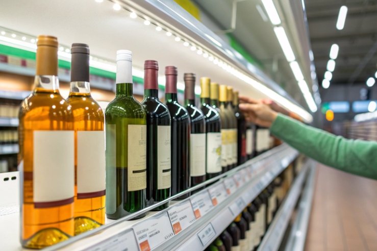
On the shelf, glass color looks like a design choice. In reality, it also decides how your wine ages, travels, and survives retail lighting.
Wine bottles come mainly in amber, several greens, and flint (clear). Amber gives maximum light protection, dark greens give moderate protection, and flint trades protection for strong shelf appeal and visibility, especially for rosé and some whites.

Color is one of the easiest levers to adjust early in a project. If you match color to wine style, route-to-market, and brand palette at the same time, the bottle becomes a quiet quality tool, not just a pretty shell.
When should you choose amber, green, or flint for light protection?
Light-strike (goût de lumière) 1 can flatten aroma before a customer even opens the bottle. The wrong color turns retail lighting into slow damage, especially for delicate whites and rosé.
Use amber when you need maximum UV protection, darker greens for moderate protection and tradition, and flint when color visibility and fast turnover matter more than long light stability.
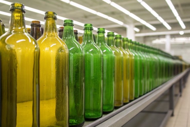
The main wine bottle colors in real use
Most commercial wine glass falls into a small family of tones:
- Amber / brown: the strongest UV shield 2. Best for wines that will face bright retail light for long periods or are very light-sensitive.
- Dark green / antique green: traditional for reds and some sparkling. Good balance between protection and classic wine cues.
- Medium / champagne green: often used for sparkling, Riesling, and some whites. Offers moderate protection with a lighter, fresher look.
- Light / dead-leaf green: common for fresh white wines where the brand wants a lighter feel but still some protection.
- Flint / extra flint / eco flint: almost clear. Chosen when you want the wine’s color to sell the bottle. Protection from light is minimal.
- Specialty colors (blue, black, opaque “UV black”): used for branding and strong shelf impact. Black and opaque glass behave like full shields against light.
The more light-sensitive the wine and the harsher the route-to-market, the more sense amber or dark green makes. For fast-moving SKUs in cartons or dark storage, lighter greens or flint are easier to justify.
Matching color to wine style and route-to-market
Color choice cannot ignore how the wine will travel and sit:
- Long-aging reds in mixed storage: dark green or antique green is a safe default.
- Aromatic whites and rosés in bright retail: amber or very dark green if you can live with less color visibility, or flint plus strong secondary protection (sleeves, boxes, or UV-filter cartons).
- On-premise focus with controlled lighting: more freedom to use flint because exposure is lower and bottles move faster.
Route-to-market matters too:
- Export in clear stretch wrap on pallets: harsher light exposure, so darker glass or UV sleeves help.
- Domestic, mostly case-stacked in shippers: more protection from cartons, so lighter greens and flint become safer if rotation is fast.
| Wine style / use case | Typical glass color | Light sensitivity | Recommended protection level | Notes |
|---|---|---|---|---|
| Long-aging red (ambient storage) | Dark / antique green | Medium–high | Strong: dark green or amber | Classic look, good UV control |
| Fresh aromatic white (retail lit) | Medium green or amber | High | Strong: amber or sleeve/box on flint | If flint, add UV defense |
| Rosé (color is key) | Flint or light green | High | Medium–strong via secondary packaging | Clear sells, but needs cartons, sleeves, or UV labels |
| Sparkling wine / Champagne | Champagne green / dark green | Medium–high | Strong: dark glass + shipper | Pressure and long storage often in darker channels |
| Sweet / dessert wine | Amber, flint, or blue | Medium–high | Medium–strong depending on alcohol and route | Blue used mainly for branding, not performance |
| Limited “icon” cuvées | Black / opaque bottles | High | Very strong: opaque glass | Maximum light protection and luxury feel |
When in doubt, protect the wine first, then adjust design around that choice. It is easier than trying to fix light-strike complaints later with sleeves and warning labels.
How do shade tolerances (ΔE) affect brand consistency?
A brand might approve “antique green” once, but the real world is furnace drift, cullet mix, and different plants. That is where shade tolerances matter.
ΔE (color difference) tolerances define how much glass shade can vary batch to batch. Tight but realistic ΔE ranges keep bottles looking consistent across vintages and factories without causing unworkable scrap rates.
What ΔE means for a wine bottle project
ΔE is a way to measure color difference between a target and a sample. In printing, this is standard language. In glass, it is less common in sales talk, but factories still control shade using lab measurements and cullet/batch ratios.
For a brand, the question is simple: how much shift can customers notice across:
- different production dates
- different batches of cullet
- different plants or lines
If you run a global wine brand, a Bordeaux in Europe and a clone of the same bottle in another region should feel like the same color family. If tolerances are loose, you can end up with:
- “dirty” greens in some lots
- bottles that look more amber or more flint than planned
- shelf images that feel inconsistent in photos and in real life
Setting practical glass color tolerances with suppliers
You do not need to manage the furnace. You just need to give the factory a clear target and a realistic ΔE or shade range 3.
Key steps:
- Lock a master color: one approved physical sample, plus lab measurements if available.
- Agree the tolerance band: for example, “antique green within agreed ΔE from this master.”
- Decide where you care most:
- front panel appearance in daylight
- look under typical retail lighting
- Understand trade-offs: tighter tolerances often mean:
- more cullet sorting
- more batch control
- slightly higher cost or more scrap
Be careful not to demand print-like tolerances for hot-formed glass. The aim is consistency the consumer notices, not perfection on a lab screen.
| Scenario | Tolerance approach | Risk if too loose | Risk if too tight |
|---|---|---|---|
| Single plant, stable cullet source | Moderate ΔE around master shade | Vintage-to-vintage shade drift | Slight cost increase, manageable |
| Multi-country production, same SKU | Tighter ΔE, shared master + samples | Visible shelf differences between regions | Higher scrap and pushback from some suppliers |
| Value-tier wine, price-led channel | Wider, visual-only tolerance | Acceptable minor variation | Little benefit versus effort |
| Icon or flagship range | Tight ΔE + regular visual reviews | Diluted premium feel on shelf | Higher cost but justified by positioning |
In practice, a mix helps. Use clear lab language for supplier control, and add simple visual checks (for example, “side-by-side under D65 standard illuminant 4”) for your internal brand team.
Do colored sleeves or coatings supplement clear glass?
Flint sells wine color, but flint also lets in everything the light can offer. For sensitive wines, that creates a conflict between marketing and chemistry.
Yes. Colored sleeves, printed shrink films, and spray coatings can add light protection and brand impact to clear bottles, but they also add cost, complexity, and recycling challenges that you need to plan around.
Why brands layer color on flint
Many rosé, white, and sparkling projects want:
- strong visibility of wine color
- big canvas for graphics
- some extra UV protection
Colored full-body shrink sleeves 5 and coatings help achieve this without changing the glass furnace color:
- Full-body shrink sleeves: wrap most of the bottle in printed film. They can block or filter light, add strong branding real estate, and hide some scuffs.
- Partial sleeves or labels with UV inks: cover key areas while letting some glass show through.
- Spray coatings (tinted or opaque): sprayed color that mimics solid-colored glass. Can be glossy, matte, or frosted.
- “Soft touch” or textured coatings: visual and tactile upgrade, with some light filtration if dark enough.
These options are very flexible for marketing. They also allow regional customization on the same flint bottle: one market gets a full sleeve, another gets a simple label.
Technical and operational trade-offs
Extra layers always carry trade-offs:
-
Light protection:
- Opaque sleeves and coatings can behave like amber or black glass.
- Translucent or light designs may only slow, not stop, light-strike.
-
Scuff and abrasion:
- Sleeves protect the glass surface, but can wrinkle or scuff themselves.
- Coatings can chip, scratch, or show “white lines” at edges if packing is harsh.
-
Line performance:
- Sleeved bottles need controlled temperature and shrink tunnels.
- Coated bottles may need gentler conveyors to avoid visible damage.
-
Regulatory and migration:
- All inks, films, and coatings must be suitable for food-contact packaging environments, even if they do not touch the wine directly.
- Solvent and odor control matters, especially in tight cartons.
-
Recycling:
- Sleeves can confuse optical sorters if not designed for easy removal or if they hide the glass color.
- Some markets request perforated “easy-tear” sleeves to improve recycling.
| Method | Light protection | Design flexibility | Cost impact per bottle | Recyclability complexity |
|---|---|---|---|---|
| Full-body opaque sleeve | Very high | Very high | Medium–high | High unless sleeve is easily removed |
| Partial sleeve / large label | Medium | High | Medium | Medium |
| Tinted spray coating (matte) | Medium–high (dark tones) | Medium | Medium–high | Medium, depends on region and process |
| Opaque spray coating | Very high | Medium | High | Medium–high |
| No sleeve, flint only | Very low | Low–medium | Lowest | Easiest for recycling |
If you choose sleeves or coatings to rescue flint from light problems, it helps to test:
- UV transmission through the final package
- rub and scuff resistance after vibration
- how the package sorts in your target region’s recycling system
This keeps the solution from becoming a new problem later in the chain.
How do color choices impact recyclability streams?
It is easy to say “glass is infinitely recyclable.” It is harder to keep your specific bottle flowing into the highest-value cullet stream.
Color choices steer bottles into different recycling streams. Flint and standard greens and ambers fit well into existing systems; odd colors, heavy coatings, and full sleeves can lower cullet value or push glass into lower uses.
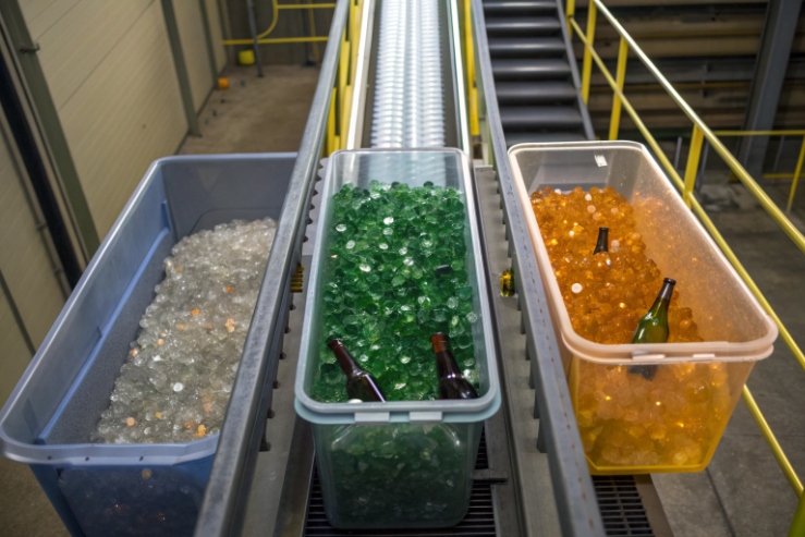
How glass color streams really work
In many markets, post-consumer glass is:
- Collected (kerbside bins, bottle banks, or deposit systems).
- Sorted by color: flint, green, amber/brown, plus a mixed stream.
- Cleaned, crushed into cullet, and fed back into furnaces.
Cullet rules:
- Flint (clear) glass 6 cullet is usually the most sensitive, because even small amounts of colored glass can tint a whole batch. It often has the highest quality requirements.
- Green and amber cullet tolerate more variation and are widely used for wine and beer bottles.
- Odd colors (blue, black, UV-coated, decorated heavily) often end up in:
- mixed cullet
- non-container uses (insulation, aggregate)
That is still recycling, but it may not be bottle-to-bottle recycling.
Designing color for the recycling reality in your target markets
To keep your bottle in the best loop:
- Use standard colors (flint, green, amber) that match local streams.
- Avoid heavy metal-based pigments that can complicate furnace chemistry.
- If you use sleeves:
- consider sleeves with compatible density for optical sorting
- use tear-off perforations and clear messaging so consumers remove them
Regional nuance matters:
- Some countries have strong green-glass demand (large beer and wine industries), so green cullet is welcome.
- Other regions struggle with green cullet oversupply and prefer flint and amber.
- Deposit-return systems (DRS) often improve sorting quality and raise recycling rates for all colors.
Keeping bottles in closed-loop recycling for flint, green, and amber glass 7 is usually easier with standard colors and minimal coatings.
| Color / treatment | Main recycling stream | Relative cullet value | Notes |
|---|---|---|---|
| Standard flint | Flint cullet | High if clean | Sensitive to contamination by colored glass |
| Standard antique / dark green | Green cullet | Medium–high | Widely used for wine and beer |
| Standard amber / brown | Amber cullet | Medium–high | Strong beer and some wine demand |
| Cobalt blue / specialty | Mixed or color-specific where available | Medium–low | Often used in niche furnaces or downcycled uses |
| Opaque black glass | Often mixed cullet | Lower | Harder to sort optically by color |
| Full-body printed sleeve | Depends on sorting tech | Lower if sleeve stays on | Perforations and labels can help improve outcomes |
| Heavy decorative coating | Standard streams but more loss | Medium–low | Chips and density changes can increase rejects |
If your brand has strong sustainability positioning, it helps to talk early with both glass suppliers and local recycling partners. Small changes in color, coating, or sleeve design can keep you in the high-value loop without sacrificing shelf impact.
Conclusion
Glass color is not only a design choice. It balances light protection, brand consistency, secondary decoration, and how easily your bottle returns to the cullet stream after the last pour.
Footnotes
-
Explains wine light-strike causes, which wines are vulnerable, and why colored glass helps. ↩ ↩
-
Shows how amber glass filters UV and blue wavelengths for stronger light protection. ↩ ↩
-
Practical explanation of ΔE and how tolerance settings affect production consistency. ↩ ↩
-
Defines D65 and why standard illuminants matter for repeatable visual color checks. ↩ ↩
-
Industry guidance on shrink sleeve design features (like removability) that improve recycling outcomes. ↩ ↩
-
Explains “flint” terminology and why color sorting matters for high-quality glass recycling. ↩ ↩
-
Summarizes how flint, green, and amber bottles can stay in closed-loop recycling when properly sorted. ↩ ↩


