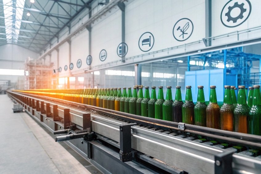
Color shifts in glass bottles can feel random. Shade bands, off-spec greens, and uneven tints often show up only after full production, when scrap is most painful.
Color variation in glass bottles comes from a mix of batch chemistry, cullet and redox balance, temperature and mixing in the furnace and forehearth, thickness differences, and downstream coatings and storage, all of which change how light passes through glass.

Color is not only about the recipe on paper. Real furnaces run with drift, cullet changes, worn refractories, and storage realities. When we link each variation to a physical mechanism, we can decide whether to fix the source or adjust the color tolerance and visual standard.
Do batch chemistry, cullet ratios, and redox shift color tones?
Color issues often start before the glass melts. Small changes in oxide balance, cullet mix, or redox already move the base color, even when operators feel the line is “stable”.
Yes. Batch oxide composition, cullet mix, and furnace redox have a strong impact on glass color strength and hue, because they change colorant concentration and oxidation state, especially systems based on iron, chromium, cobalt, selenium, and sulfur.
How batch chemistry moves color
Batch is never perfectly constant. Moisture in sand and soda, sulfate level, and even grain size change melting and oxidation.
Key batch drivers:
| Factor | Mechanism | Typical visual effect |
|---|---|---|
| Sand / soda moisture | Changes effective sulfate and alkali | Small hue shift, variable seed count |
| Sulfate content (SO₃ source) | Controls fining and oxidation potential | Green → amber drift, seeds and cords |
| Total iron (Fe₂O₃) | Sets base green intensity | Cleaner flint vs greenish flint |
| Alkali / lime ratio | Changes melt structure and colorant solubility | Slight tone and density differences |
When batch Fe, Cr, Co, or Se/C dosing moves, color moves. Colorant pump drift or blockage is a frequent root cause. A few percent change in Fe₂O₃ or CoO addition can move delta-E into “reject” territory, especially on light tints like antique green or dead-leaf.
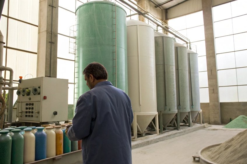
Cullet ratio and cullet quality
Cullet is a double-edged tool. It saves energy and stabilizes the melt, but it also carries color memory.
| Cullet parameter | Risk |
|---|---|
| Ratio change (hot vs cold ends) | Overall tone shift during the day |
| Mixed-color cullet (green/amber) | Local green or amber bias in flint or extra |
| Contaminants (metals, ceramics) | Dark specks, streaks, local shade differences |
When cullet sorting is not strict, green or amber pieces enter a flint batch. They melt and mix, but not always fully before forming. This gives small greenish cords or local regions slightly off from the target neutral. On emerald green or amber, cullet with deeper color can push the glass into a darker lane-to-lane tone.
A key control point is that cullet must be sorted by color 1 and kept clean enough that “color memory” and contaminants do not become your daily drift mechanism.
Redox balance and amberization
Redox in the furnace controls the ratio of Fe²⁺ to Fe³⁺, and the behavior of sulfur and carbon-based colorants. In practice, the Fe²⁺/Fe³⁺ redox balance 2 is one of the most powerful levers for “why it looks greener today” vs “why it looks browner today”.
Simple view:
| Redox condition | Chemistry shift | Visual effect |
|---|---|---|
| More oxidizing | More Fe³⁺, less Fe²⁺ | Lighter, yellower green or flint |
| More reducing | More Fe²⁺, more Fe–S complexes | Darker green, amber/brown tendency |
| Sulfur imbalance | Stronger amber, risk of “dirty” brown | Amber drift, brownish highlights |
Fuel/air ratio, SO₃ carryover, CO levels, and carbon in the batch all set this balance. When operators “tune for pull” or foam control, they sometimes move into a slightly more reducing mode without noticing that color is drifting. Long-term shifts in burner settings can build a new steady color that no longer matches the original standard tile.
Can furnace zoning and forming temperatures create shade bands?
Even with a perfect recipe, the glass does not stay uniform. Temperature gradients in the furnace, forehearth, and feeder change color lane by lane and gob by gob.
Yes. Temperature differences across the furnace, forehearth, and feeder change colorant equilibrium and effective thickness. They also drive incomplete mixing, which causes visible shade bands, cords, and lane-to-lane color shift.
Temperature, mixing, and color equilibrium
Colorant systems are sensitive to temperature. Redox state and solubility can shift as the melt cools.
Key effects:
| Zone | Issue | Result |
|---|---|---|
| Furnace surface vs bottom | Different temperature and redox | Vertical color gradients, cords |
| Forehearth left vs right | Different set points or crown losses | Lane-to-lane shade variation |
| Feeder and orifice | Fast cooling and shear | Gob-to-gob minor shade differences |
If the melt is not fully homogenized before the throat and forehearth, cold regions can carry richer colorant pockets. These appear later as faint streaks or “veins” where Fe, Cr, or Co are slightly higher. Operators often see them as light and dark bands on the inspection belt.
This is why tight forehearth temperature monitoring 3 is not only about viscosity and weight control—it is also a color-stability tool.
Cords, striae, and local color bands
Incomplete mixing and fining produce cords: narrow regions with different composition and refractive index. When these cords also have different colorant content, they show as color streaks.
Simple cord types:
| Cord type | Origin | Typical look |
|---|---|---|
| Colorant-rich cord | Poor mixing of colorant stream | Darker green/amber lines |
| Refractive cord | Temperature / viscosity stratification | Wavy distortion, slight tint |
| Sulfur / SO₃ cord | Local redox or fining imbalance | Brownish or smoky streaks |
These cords line up with flow lines in the forehearth and are often lane-specific. When one or two lanes sit under a colder section of crown or insulation, that lane can be persistently darker or lighter.
For background and terminology, the BritGlass note on striae in glass 4 is a helpful reference.
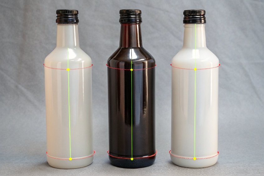
Forming, thickness, and apparent shade bands
Forming and gob temperature link directly to thickness. Color strength depends on path length. So shade bands can appear even when composition is stable.
Common cases:
- Cooler gob → shorter parison spread → thicker shoulder or heel → deeper perceived color ring.
- Hotter gob → more stretch → thinner sidewall → lighter vertical bands.
- Embossed areas → thicker under embossing → darker “printed” color around logos.
In practice, operators see three things at once: real colorant variation, path-length variation, and local surface conditions. When we measure delta-E on a flat panel, it sometimes looks fine. On the bottle, the human eye still picks up a ring in the heel or shoulder because that zone is both thicker and slightly different in oxidation.
How do coating thickness and ink opacity drive perceived delta-E?
Even when the naked glass is in spec, sprayed coatings and printed inks can push the perceived color outside the agreed tolerance. Customers judge the whole bottle, not just the raw glass.
Coating thickness, pigment loading, and ink opacity change light reflection and transmission. They can increase or mask base-glass color differences, which shifts measured and perceived delta-E between bottles and between print runs.
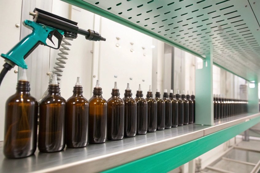
Spray coatings and path length
Organic or inorganic coatings add a new optical layer. The key variables are:
| Coating factor | Effect on appearance |
|---|---|
| Film thickness | Darker, more saturated color with thickness |
| Pigment concentration | Stronger hue, higher opacity |
| Gloss / matting agents | Change in light scatter and gloss |
A slightly heavier spray pass on one side of the bottle makes that panel look deeper and more saturated, even if the base glass is identical. When the line has poor gun balance or turntable speed variation, panels show a step in color around the diameter. On dark greens, blues, and blacks, these differences show up clearly under D65 light.
Inks, opacity, and registration
Inks and enamels also change perceived color and even measured delta-E at the QC station.
Important ink variables:
| Ink property | Visual result |
|---|---|
| Opacity | Hides or reveals base-glass color variation |
| Pigment type | Changes undertone (warm vs cool) |
| Layer count / hits | Stronger color, risk of edge ridges and haloing |
| Cure quality | Gloss and slight yellowing if overbaked |
Opaque white or black prints hide shade differences behind the label area. Semi-transparent metallic inks do the opposite. They amplify small color variations in the glass because the background is still visible and the ink adds a subtle tint.
Delta-E and human perception
Instrument delta-E and what buyers see are not always aligned. Coatings and inks change this relationship. If you need a defensible method reference, the CIEDE2000 color-difference formula 5 is commonly cited in industrial color control.
Three common scenarios:
| Scenario | Instrument view | Human perception |
|---|---|---|
| Base glass off, uniform coating | High delta-E bare glass, lower total | Bottles look acceptable overall |
| Base glass in spec, non-uniform coating | Delta-E passes panel test | Shade bands obvious on the line |
| Ink opacity shift between runs | Small delta-E on ink drawdown | Big perceived change on bottle |
So, when we talk about color tolerances with customers, it helps to define which condition we measure. Bare glass, coated glass, and printed glass can each have their own realistic delta-E window. Otherwise, a small change in coating recipe or ink opacity can trigger complaints, even while the glass furnace stays perfectly stable.
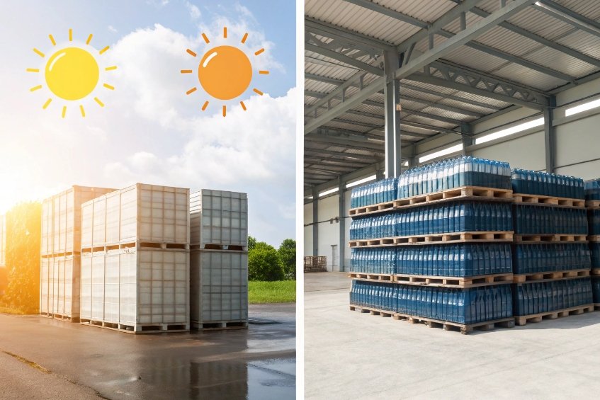
Which storage or UV exposure factors fade or yellow finishes?
Color does not freeze at cold end. Time, light, and storage conditions can move color again, especially for coated or decorated bottles and glasses stored in open yards or bright warehouses.
Heat, humidity, alkalinity, and UV exposure can fade organic coatings, yellow some finishes, and change surface gloss. They also drive alkali leaching from the glass, which creates haze and makes colors look dull or shifted.
UV impact on glass and coatings
Pure soda-lime glass is relatively stable, but certain colorants and decolorizers react with UV. Organic coatings and inks are even more sensitive.
Typical UV effects:
| Layer | UV response |
|---|---|
| Organic spray coat | Fading, chalking, loss of gloss |
| Organic inks | Hue shift, loss of saturation |
| Manganese-bearing flint | Slow amethyst tint (solarization) |
In outdoor or window storage, light bottles with bright organic coatings can lose intensity. A vivid pastel can become washed out, which increases apparent delta-E even though the glass below did not change. For historical flint with manganese, long UV exposure can push it toward a light purple—often called solarized amethyst container glass 6.
Temperature, humidity, and surface leaching
Glass reacts with water and CO₂ at the surface. Under warm, humid conditions, especially in sealed cartons, alkali can leach out. Packaging teams often describe this as blooming or weathering on glass containers 7.
Results:
| Condition | Effect |
|---|---|
| High humidity, long storage | Alkali bloom, iridescent or dull haze |
| Stacked hot bottles in boxes | Condensation marks, patchy gloss |
| Aggressive washing / cleaners | Micro-etching, permanent haze |
This haze scatters light. So colors look lighter, milkier, or just “dirty”. Even if the spectrophotometer still sees the same chromatic coordinates under controlled geometry, the eye reads a dull, low-gloss color and often flags it as “off”.
Interaction with contents
Filled product can also change the look of the package. Oils, acids, and alcohols sometimes interact with inner surfaces or coatings on the outside.
Common interactions:
| Product type | Possible effect |
|---|---|
| High-proof alcohol | Attack on some organic external coatings |
| Acidic sauces | Inner surface etching over very long time |
| Essential oils | Swelling of some label and ink systems |
When cleaners or harsh chemicals spill on coated bottles during transport or shelf life, they can strip or etch the coating locally. This creates pale or yellowish patches that increase apparent variation between bottles in the same case.
Good storage practice is simple but powerful: keep bottles dry, shielded from direct sun where possible, avoid long-term outdoor exposure, and test coating systems for UV and chemical resistance against real customer conditions. That way, most of the color variation stays inside the controlled area of the plant, not out in the market.
Conclusion
Glass color is a system. Batch, cullet, redox, temperatures, thickness, coatings, and storage all combine, so stable color needs control at every one of these steps.
Footnotes
-
Why cullet must be color-sorted and decontaminated to prevent “color memory” drift. ↩ ↩
-
Explains how Fe²⁺/Fe³⁺ and furnace redox shift green/amber tone in container glass. ↩ ↩
-
Shows why small forehearth temperature differences change viscosity and lane-to-lane consistency. ↩ ↩
-
Defines striae/cords and links them to incomplete mixing and visible tint bands. ↩ ↩
-
Reference implementation note for ΔE00, widely used to standardize perceived color difference. ↩ ↩
-
Details manganese solarization that turns “clear” glass amethyst after long sunlight exposure. ↩ ↩
-
Explains humidity-driven alkali leaching (“blooming”) that creates haze and dulls perceived color. ↩ ↩


