A light-sensitive formula can look fine at filling and still degrade on shelf. When that happens, the brand gets blamed, not the packaging choice.
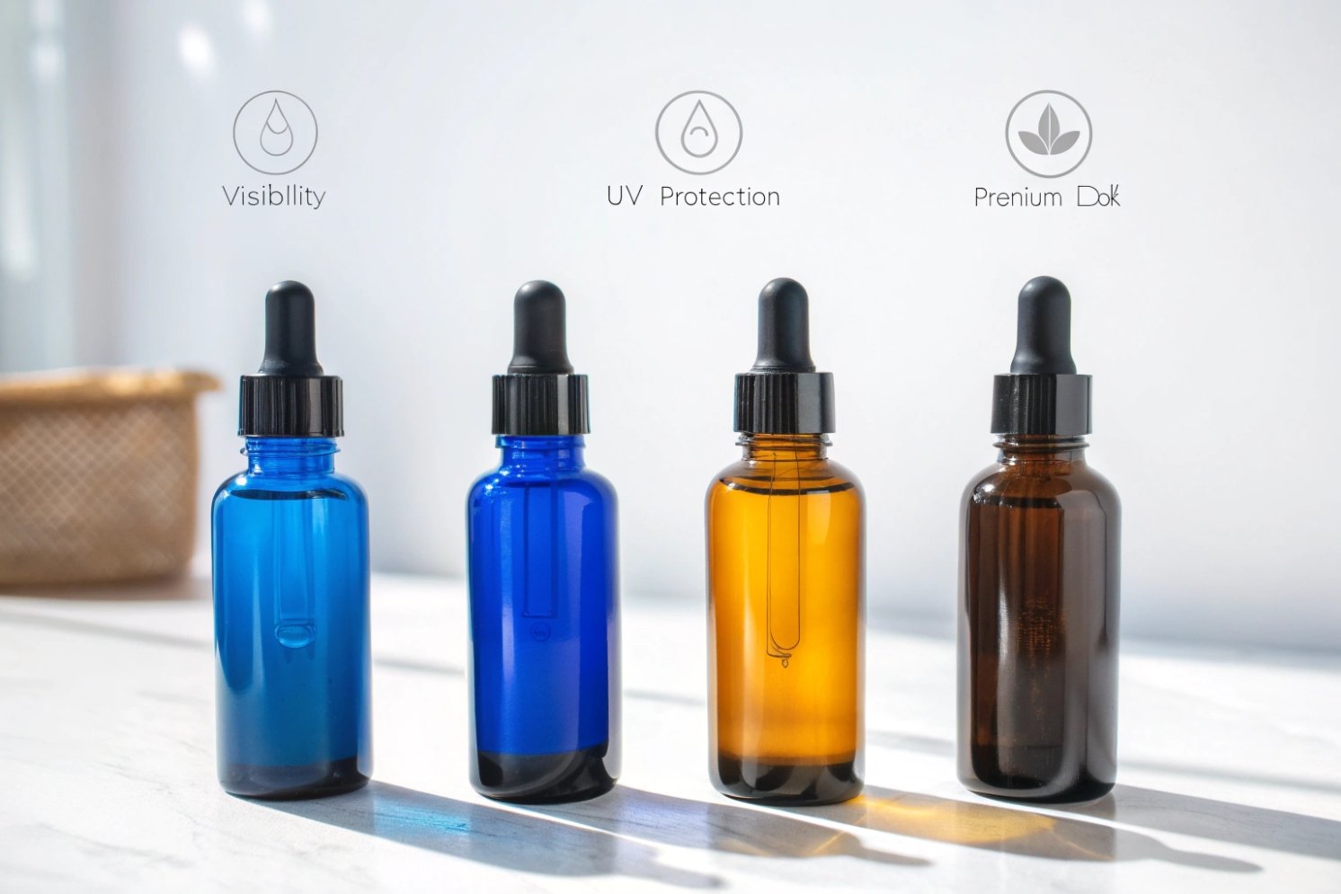
Cobalt blue glass offers a strong premium look and meaningful light filtering compared with clear glass, while still showing the product better than amber. It is a smart middle option when branding matters and maximum UV blocking is not required.

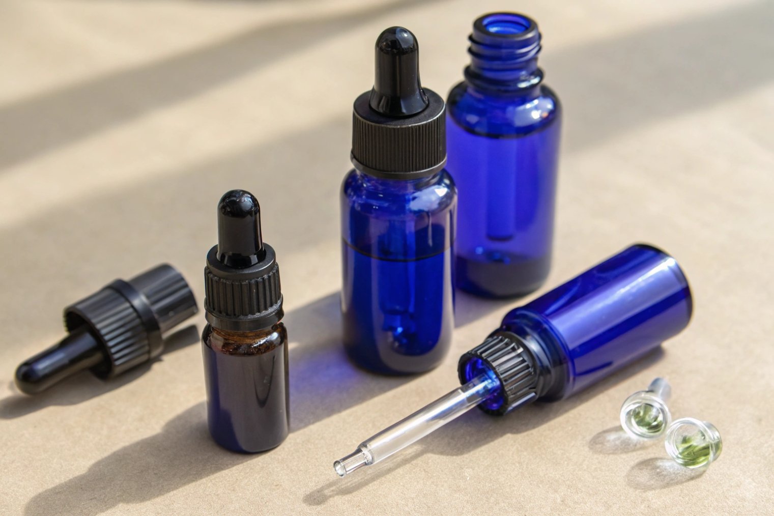
Why cobalt blue exists in packaging decisions
Cobalt blue glass is not “just a color.” It is a packaging signal and a light-management tool. The color comes from cobalt-based colorants used in glassmaking 1, which creates a deep, stable blue tone. That tone helps reduce light exposure compared with clear glass. It also changes how consumers read the product on shelf.
In daily sourcing work, cobalt blue usually enters the conversation for one of two reasons. The first reason is performance. The product is somewhat light-sensitive and needs more protection than flint. The second reason is branding. The brand wants a pharmacy or apothecary feeling without using the common amber look.
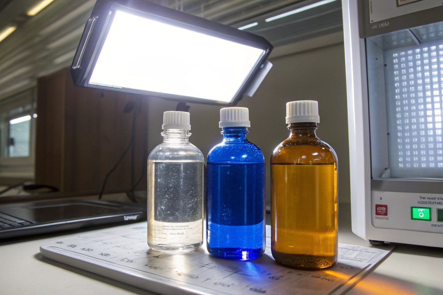
Cobalt blue sits in the middle of the protection spectrum. It typically performs better than clear glass for light control, and it can be similar or stronger than some lighter greens depending on shade and thickness. Still, amber often remains the safest default for maximum UV and blue-light filtering for very sensitive actives. This is why cobalt blue should be treated as a “prove it” color. It is not enough to say “blue protects.” Protection should be confirmed with UV–Vis spectral transmittance data 2 for the exact bottle.
Cobalt blue also has a unique branding advantage: it can make the product feel premium and calm. It often reads as “clinical luxury,” not “cheap wellness.” It also can hide small batch color differences in oils or botanicals, which can reduce consumer worry.
| Color | Protection level (typical) | Product visibility | Common brand signal | Best use case |
|---|---|---|---|---|
| Clear (flint) | Low | High | simple, transparent | low sensitivity or boxed products |
| Green | Low to medium | Medium | natural, traditional | moderate sensitivity, heritage look |
| Cobalt blue | Medium | Medium | premium apothecary | beauty oils, serums, specialty supplements |
| Amber | High | Low | pharmacy, maximum protection | high sensitivity and long shelf life |
Cobalt blue works best when the brand wants a premium shelf moment and the formula team can support the choice with testing or secondary packaging.
A good color choice is only the first step. The next step is to compare cobalt against the other common colors in a way that matches real formula risk.
How Does Cobalt Blue Glass Compare to Amber, Green, and Clear Glass for Protecting Light-Sensitive Formulas?
Light damage is slow, silent, and expensive. A few months under retail lighting can change color, odor, and potency without obvious warning.
Cobalt blue usually protects better than clear glass and can outperform many greens, but amber often provides stronger overall protection for highly light-sensitive formulas. The right choice depends on your sensitivity level and whether a carton or sleeve will stay on during use.
Light risk is about wavelength, not “darkness”
Light protection is not only about how dark a bottle looks. Different colors filter different parts of the spectrum. Many cosmetic and wellness actives degrade faster under UV and short visible wavelengths. So the best comparison is a transmission curve, not a photo.
Clear glass is the baseline. It gives visibility and low cost, but it offers minimal light filtering. If a formula is light-sensitive, clear glass needs extra help such as a UV coating, a full-body label, a shrink sleeve, or a carton that blocks light.
Green glass is a wide family. Some greens are light and offer only mild protection. Some antique or deep olive greens can do better. Still, green is often chosen for tradition and shelf identity more than for maximum protection.
Amber glass is the common standard when performance comes first. It is widely used because it usually blocks more of the risky UV and blue light bands. The trade-off is lower visibility and a more “pharmacy” look that not every brand wants. (If you need a neutral reference point for what “amber” means in packaging, see amber glass 3.)
Cobalt blue is a performance-and-brand compromise. It reduces light exposure compared with clear and can support a premium look. It also helps brands stand out from amber-heavy shelves. Still, cobalt should be treated as “medium protection” until testing proves otherwise for your exact bottle.
How to upgrade cobalt blue protection without losing the look
If cobalt is the right brand choice but the formula is sensitive, protection can be improved with simple steps:
- Add an outer carton for retail and shipping.
- Use a full wrap label or sleeve to reduce visible light.
- Use an internal liner and tight closure to reduce oxygen-driven changes (especially when vapor loss and oxidation are linked to your target oxygen transmission rate (OTR) 4).
- Consider a UV coating only if durability and scuff resistance are validated.
| Formula sensitivity | Best default color | If cobalt is required | Extra protection option |
|---|---|---|---|
| Low | clear or green | cobalt is fine | basic label, no carton needed |
| Medium | cobalt or amber | cobalt is often workable | carton or sleeve for safety |
| High | amber or opaque | cobalt needs proof | carton + strong closure plan |
This comparison keeps the conversation practical. It stops the team from picking a color only for aesthetics or only for fear.
Now the next question becomes simple: which products actually gain the most from cobalt blue?
Which Products Benefit Most From Cobalt Blue Bottles (Serums, Essential Oils, Aromatherapy, Pharmaceuticals, and Supplements)?
Choosing cobalt blue for every product can waste money. Avoiding cobalt blue for every product can waste shelf impact. The key is to match it to the right categories.
Cobalt blue bottles fit best for premium serums, facial oils, aromatherapy blends, and supplements that need moderate light protection and strong shelf differentiation. For highly light-sensitive pharmaceuticals, amber or opaque packs often remain the safer baseline unless testing proves cobalt is sufficient.
Skincare serums and facial oils
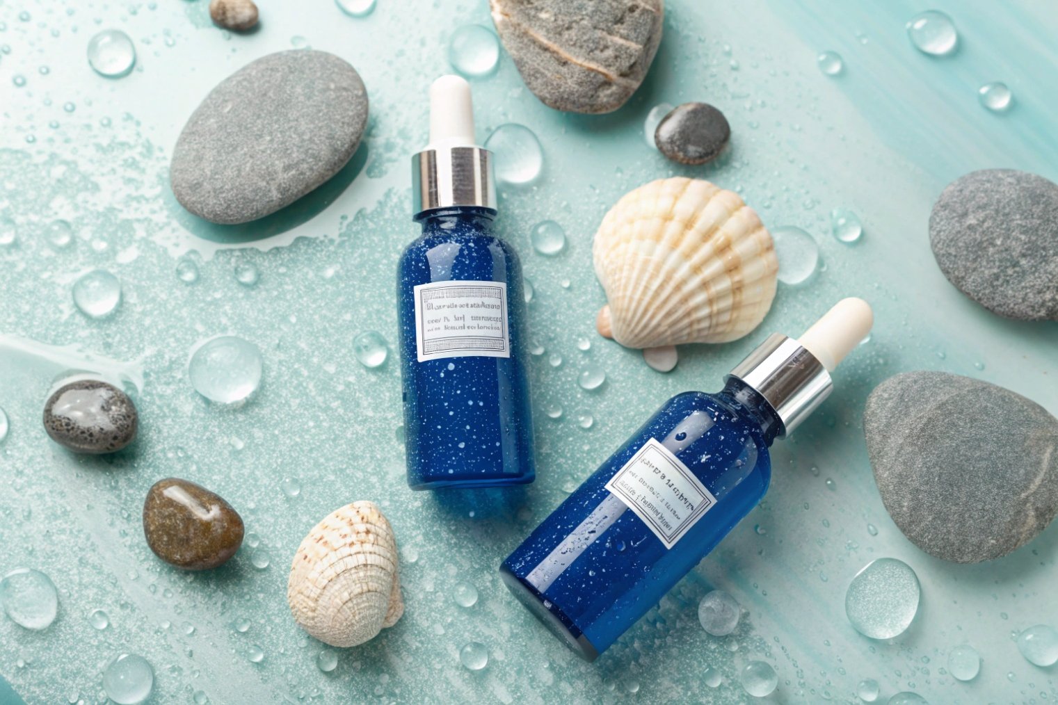
Cobalt blue works well for serums that are not extremely light-sensitive but still benefit from reduced exposure versus clear glass. It also looks premium in small sizes like 15–50 ml. When paired with a dropper or treatment pump, cobalt blue can create a strong luxury signal.
Facial oils and botanical blends are also common fits. Oils often face oxidation and aroma drift. Glass helps because it is inert, and cobalt reduces light exposure compared with flint. Still, closure choice matters. A weak wiper or incompatible gasket can cause leaking and odor change even in the best bottle.
Aromatherapy and essential oils
Many essential oil brands use amber because it is a safe performance default. Cobalt blue is often chosen when the brand wants a premium look and can add a carton or store guidance. It can work well for blends sold as gifts or as bathroom-counter products where the carton is kept.
Supplements and nutraceuticals
Cobalt blue can differentiate supplements, especially liquid drops and premium wellness SKUs. It can also help reduce consumer color bias in certain liquids, which is useful when the product naturally varies by harvest or batch. Still, for products that must maintain strict potency over long shelf life, the pack should be selected based on testing outcomes, not color tradition.
Pharmaceuticals
For pharmaceuticals, the safest approach is performance-first. Many pharma packs default to amber or opaque systems for light-sensitive products. Cobalt blue can still be used in some cases, but the packaging team should confirm light resistance by testing for the exact container and thickness—commonly aligned to an ICH Q1B photostability guideline 5. A carton can be part of the real protection plan, but it should not be assumed that consumers always keep it.
| Product type | Typical need | Cobalt blue fit | Best closure match | Extra note |
|---|---|---|---|---|
| Premium serum | dose + premium look | strong | dropper or treatment pump | add carton for active-heavy serums |
| Facial oil | aroma stability | strong | dropper with good wiper | check gasket compatibility with oils |
| Aromatherapy blend | gift + shelf impact | strong | dropper or screw cap | carton improves protection |
| Liquid supplement | differentiation | medium-strong | dropper or child-resistant cap | test transmission and stability |
| Light-sensitive pharma | strict performance | cautious | pharma-grade cap/liner | confirm with testing and pack system |
Cobalt blue is at its best when it supports a premium story and still meets the stability target with real validation.
Next is how to make cobalt blue look truly high-end with decoration choices that stay durable.
What Premium Branding and Decoration Options Work Best on Cobalt Blue Glass Bottles for High-End Packaging?
A cobalt blue bottle already looks special. The wrong decoration can ruin it fast. Poor contrast, weak adhesion, or scuffing makes premium look cheap.
High-end results on cobalt blue come from strong contrast, simple artwork, and durable decoration methods like screen printing plus metallic hot stamping accents. The best choices keep compliance text readable and survive wet hands and bathroom wiping.
Use contrast like a luxury tool
Cobalt blue is dark and saturated, so contrast decides readability. White, silver, and gold usually read well. Black often disappears. Pastel colors can look dull unless ink opacity is strong. Many premium brands use one clean color for the base print and one metallic accent for the logo.
Screen printing for the “printed-on” look
Silk screen printing is one of the best ways to make cobalt blue look like true luxury. It removes label edges and creates a clean surface. It also supports durable text for ingredient or usage notes when the ink system and curing are correct. For multi-color designs, costs rise because each color needs its own setup.
Hot stamping for metallic highlights
Hot foil stamping can add gold or silver accents that pop against cobalt. It is best for logos and short text, not for long compliance copy. On glass, hot stamping often needs a primer layer. Primer quality and cure control decide whether the foil stays sharp and whether it flakes.
Labels as a smart hybrid
Labels still have a place on cobalt blue, especially for multi-language SKUs, barcodes, and long compliance panels. A clear label can preserve the cobalt look while adding flexibility for fast updates. For very premium looks, a screen-printed front panel plus a small back label can balance beauty and compliance.
| Decoration option | Best visual effect | Durability (typical) | Cost and setup feel | Best use on cobalt |
|---|---|---|---|---|
| Screen printing | no-label luxury | high when cured well | higher setup, lower unit at scale | hero SKU, stable design |
| Hot stamping | metallic logo pop | medium-high with good primer | die cost + setup time | logo, short front text |
| Clear label | “almost printed” look | medium (edge risk) | low setup, fast changes | multi-SKU compliance |
| Frosted coating | soft premium touch | depends on coating | extra process + QC | luxury skincare positioning |
| Spray color + print | bold identity | depends on rub resistance | more steps, more risk | limited editions |
A premium decoration plan should be approved with rub testing and humidity exposure testing. This is especially important for cobalt blue because contrast makes scuffs easy to see.
Now comes the bulk reality. Cobalt blue looks consistent in small samples, but bulk lots can drift without the right controls.
What Should You Verify Before Bulk Purchasing Cobalt Blue Bottles (Color Consistency, Light-Transmittance Tests, Coatings, and MOQ/Lead Time)?
A bulk order can fail even when the sample looked perfect. Color can shift. Decoration can scuff. Protection can be weaker than expected. Then the launch is delayed.
Before bulk purchase, verify cobalt color consistency by lot, confirm light protection with spectral transmittance testing for your exact bottle thickness, validate any coating or primer system, and lock MOQ and lead time with a clear quality plan.
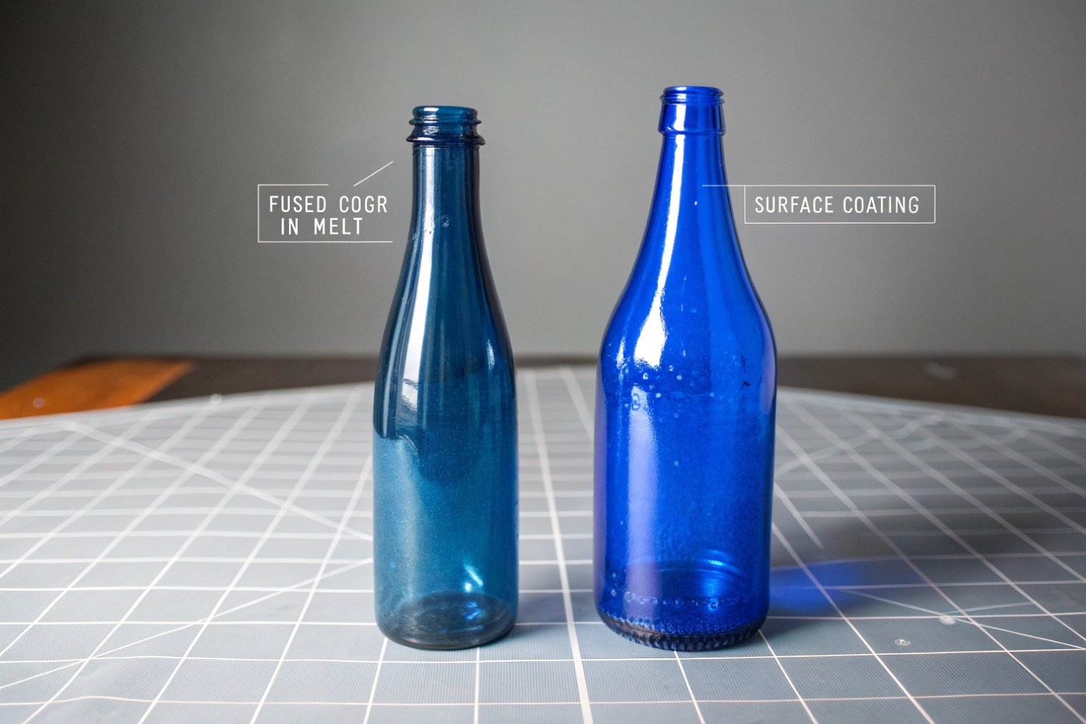
Color consistency: control the shade, not the name
“Cobalt blue” is a family name in the market. Different factories can produce slightly different blues. Even the same factory can have drift across lots if controls are weak. For premium brands, small shade changes look like quality problems.
The best approach is to lock a color standard and set an acceptable tolerance. A simple method is to approve a signed golden sample and require supplier retention samples for each batch. If the brand needs tight control, color measurement (for example, in the CIE L*a*b* color space 6) helps teams talk about drift without arguing by eye.
Light-transmittance: ask for numbers, not promises
If the product is light-sensitive, request a spectral transmittance report. The report should be for the actual bottle, not a flat glass coupon, because thickness and geometry matter. This test is the clean way to confirm if cobalt protection is enough or if amber or secondary packaging is needed.
Coatings and primers: prove durability
If UV coating, frosting, spray, hot stamping primer, or special inks are involved, the system must be validated. Many failures come from weak surface prep or weak curing. A simple rub test and a defined adhesion method (such as an ASTM D3359 tape adhesion test 7) before mass production can save a lot of money.
MOQ and lead time: plan for decoration and closures
Cobalt blue bottles can be standard or custom. Standard shapes can move fast. Custom molds and decoration add time. Hot stamping requires die making. Screen printing requires screens per color. Pumps and droppers can also drive lead time, especially if the project needs special gaskets or metal-free pathways.
| What to verify | Why it matters | How to verify | What to lock in writing |
|---|---|---|---|
| Shade consistency | premium look depends on it | golden sample + lot comparison | acceptable color tolerance |
| Wall thickness spec | affects light protection | drawing + sampling checks | thickness range and weight |
| Spectral transmittance | proves real protection | UV-Vis test report | wavelength range + limits |
| Coating/primer adhesion | prevents peeling and scuff | tape + rub + humidity aging | process steps and cure method |
| Closure compatibility | stops leaks and odor drift | soak test + torque test | gasket/liner material spec |
| Packing plan | reduces scuffs and breakage | carton and divider sample | packing spec + pallet plan |
| MOQ and lead time | protects launch timeline | production schedule | milestones and penalties if possible |
A short pilot run is also useful when the project is high value. It helps confirm real yield, real decoration quality, and real shipping performance before committing to a large order.
Conclusion
Cobalt blue is a premium, shelf-differentiating glass that offers meaningful light filtering over clear glass. It works best when protection is proven by testing and supported by stable bulk quality control.
Footnotes
-
Learn how cobalt colorants create deep blue glass and why the tone stays stable across production. ↩ ↩
-
Understand UV–Vis testing and how spectral transmittance data proves real light filtering by wavelength. ↩ ↩
-
Quick reference for what “amber glass” means and why it’s widely used for light protection. ↩ ↩
-
Explains OTR so you can connect packaging choices to oxygen-driven stability risk, not just “looks.” ↩ ↩
-
Official photostability guideline that helps decide when light-resistant packaging is required and how to validate it. ↩ ↩
-
Learn how CIE L*a*b* enables measurable color tolerances (ΔE) instead of subjective visual debate. ↩ ↩
-
Defines a standard tape adhesion method to qualify coatings/prints before bulk production and reduce peeling failures. ↩ ↩


