Perfume bottles are changing fast. Old heavy glass and noisy metal collars feel outdated while brands push for lighter, smarter, more sustainable luxury in every detail.
The latest glass perfume bottle innovations combine refillable lightweight architectures, high-PCR glass, metal-free pumps, advanced surface finishes, and NFC/AR storytelling, so bottles look luxurious, feel good in hand, and support circular, low-carbon goals.

Across 2025 launches, glass architecture, closures, coatings, and digital features are designed together as one system. This system must protect the juice, reduce weight and waste, and still give that “wow” moment when a consumer lifts the bottle and hears the soft click of the cap. The fastest shift is toward refillable packaging systems 1 that keep a “forever” bottle in hand while reducing single-use material over time.
Loose, noisy caps can make a premium fragrance feel cheap, and exposed crimp collars often break the clean line of an otherwise beautiful bottle.
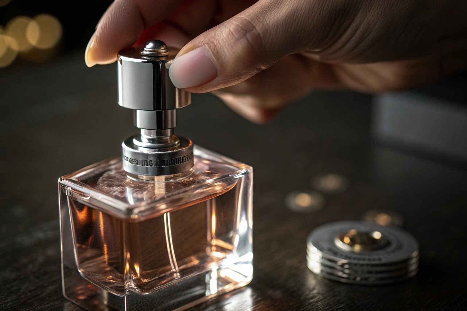
Magnetic caps and hidden crimp collars are becoming a new norm in prestige fragrance because they give a smooth, silent closure, protect the pump, and keep silhouettes clean while supporting refillable and recyclable systems.
Why magnets feel like instant luxury
A strong, well-tuned magnet gives a clear “click” that signals quality. When the cap centers itself on the neck, the user does not need to look. The gesture feels natural and precise. This matters even more when brands shift to refillable glass architectures. The main bottle may stay with the consumer for years, so every opening and closing event needs to feel consistent.
In current projects, many brands pair magnetic caps with metal-free or POM-free pumps. The magnet sits in the cap insert, while the pump body stays as mono-material as possible, so recyclability improves. As recycled glass (cullet) content rises to support lower-carbon goals, recycled glass cullet 2 helps cut furnace energy while keeping glass in a circular loop.
Hidden collars and clean shoulders
Hidden crimp collars sit below a decorative shroud or under a slightly raised shoulder. The consumer does not see the raw metal ring. This gives a continuous line from shoulder to neck and keeps minimalist geometries intact. It also works well with lightweighting programs, where shoulders are slightly reduced and walls thinned by around 15–20% while impact resistance is maintained.
Here is a simple comparison:
| Element | Visible Collar + Friction Cap | Hidden Collar + Magnetic Cap |
|---|---|---|
| First impression | Functional, sometimes basic | Clean, premium, “tech” luxury |
| Opening experience | Loose, may squeak or wobble | Centered, smooth, audible click |
| Design freedom | Limited shoulder shaping | Easy to hide hardware and keep pure lines |
| Refill compatibility | Often one-shot, non-refillable | Suits long-life bottles and refill systems |
| Recycling impact | Mixed materials, more disassembly | Better with metal-free pumps and clear glass |
Engineering and production considerations
Magnetic caps and hidden collars look simple, but the stack-up is complex. Tolerances of glass neck, crimping, collar height, and cap insert must align. If the magnet is too strong, the pump may stress during removal. If it is too weak, the click disappears. In a factory, teams fine-tune neck finish design, crimping force, and cap tooling through several sampling rounds—often guided by FEA packaging standards 3 where applicable.
As brands shift to refillable bottles, the closure must withstand many cycles, so stress tests become stricter. Drop tests, vibration tests, and repeated open/close tests help check that magnets do not crack decorative sprays or lacquered collars. When done well, this system supports the wider strategy: lightweight glass, higher recycled content, and more durable, reusable centerpiece bottles.
How are gradient spray coats and safe inner lacquers applied?
Flat, single-color bottles sometimes fail to stand out on a crowded shelf, and poorly chosen coatings can chip, fade, or even interact with the fragrance.
Gradient spray coats and safe inner lacquers use controlled spray lines, water-based or low-VOC paints, and tight curing profiles, so brands get vivid color stories without compromising juice safety or recyclability goals.
Outside gradients: from clear base to rich shoulder
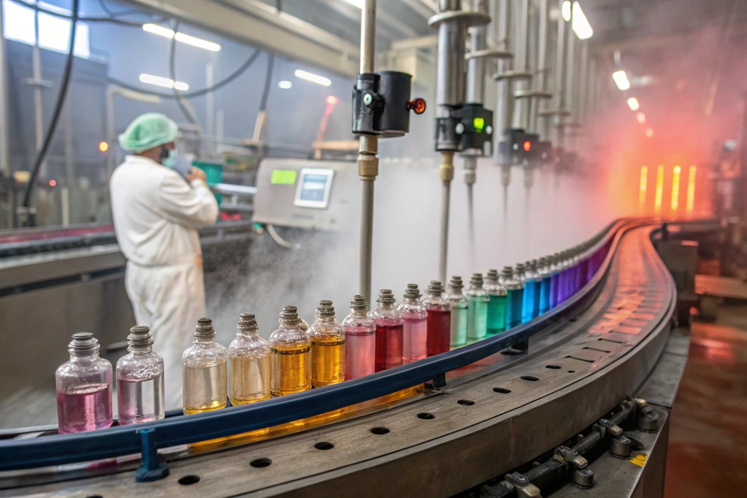
Most visible gradients are applied on the outside of the glass with automated spray booths. Bottles move on a carousel. Spray guns angle and flow are adjusted so more paint lands at the shoulder and less at the base. By controlling line speed, nozzle distance, and mask design, the factory can create soft fades, hard cutoffs, or multi-band ombré effects.
These spray coats now often use water-based systems and low-VOC coatings 4 to reduce emissions and support sustainability narratives. When combined with lightweight glass, gradients help keep a premium look even with thinner walls. Customers still feel depth and color. In some designs, the gradient aligns with facets or embossing, so raised logos catch light differently from the matte zones.
Inner lacquers: safety first, then aesthetics
Inner lacquers sit inside the bottle to create a colored “juice” effect while the actual fragrance may be colorless. For this, safety is non-negotiable. The lacquer must sit behind the glass, not dissolve into the liquid. It must pass migration tests, stress-crack screening, and long-term storage simulations with alcohol-based formulas.
A simplified view:
| Coating Type | Position | Main Purpose | Key Checks |
|---|---|---|---|
| External spray | Outside | Color and finish | Adhesion, scratch, UV stability |
| Inner lacquer | Inside | Color illusion, depth | Migration, compatibility |
| UV inkjet print | Outside | Fine graphics, text | Resolution, ink adhesion |
Safe inner lacquers are usually applied by spinning the bottle while dispensing a measured amount of lacquer, then draining excess and curing. The process must avoid streaks and bubbles. It also must not weaken the glass by adding thermal shock during curing, especially if the bottle is already lightweighted.
Pairing coatings with digital printing and etching
Gradient coats now live alongside direct-to-glass UV inkjet printing 5. This allows labels, codes, and patterns to wrap 360° around the bottle with low MOQs. For limited editions, one base bottle and gradient can support many artworks, so stock risk drops. It also keeps the pack mono-material when brands remove pressure-sensitive labels.
Frosted or acid-etched finishes add another layer. They give a soft, tactile feel and help hide fingerprints. They can also filter some UV, which is useful when juices are sensitive to light. In some designs, the gradient sits behind a frosted veil, which softens the color and raises perceived luxury. Automated frosting and sandblasting lines are now more consistent, which lets engineers safely use thinner glass walls while keeping a uniform surface.
Can 3D embossing/debossing and facets improve hand feel?
A bottle can look stunning in photos but still feel slippery, sharp, or awkward in real use, which hurts both perception and daily enjoyment.
3D embossing, debossing, and carefully cut facets greatly improve hand feel by adding grip, soft catch points, and light play, while also embedding branding and sustainability messages directly into the glass.
Haptics as part of the design brief
Hand feel is now a core part of the design conversation, not an afterthought. Many briefs specify “no-slip zones”, “soft edges”, or “eyes-closed recognizability”. Functional embossing is a strong tool here. Raised or recessed logos, rings, or micro-patterns can act as grip bands without adding extra parts.
Facets serve both optical and tactile roles. Symmetric facets give a modern, minimal look; asymmetric layouts feel more artistic and sculptural. When combined with lightweight glass engineering, facets must be designed so stress does not concentrate at thin corners. Advanced molding and better gob control now allow complex geometries, such as off-center necks and twisted bodies, without unacceptable scrap rates.
Embossing vs debossing vs micro-texture
Each type of relief has a different impact:
| Technique | Feel in Hand | Visual Effect | Notes for Production |
|---|---|---|---|
| Embossing | Raised, more grip | Highlights catch light | Needs draft angles for mold release |
| Debossing | Recessed, subtle guidance | Shadows define logo or pattern | Good for discrete branding |
| Micro-texture | Soft, almost skin-like | Matte, reduces fingerprints | Often used in bands or “haptic zones” |
| Strong facets | Edgy, architectural | Strong sparkle and refraction | Glass flow and stress need careful control |
Micro-textured haptic zones are especially powerful. They can sit where fingers naturally rest, often on the side or back panel. Consumers feel the difference without always noticing it visually. This is a clean way to support larger, heavier formats like 100 ml or 150 ml while keeping a secure grip.
Integrating haptics with sustainability
When brands push for 20% or more glass lightweighting, grips and facets help keep a sense of solidity. They also enable slightly thinner walls, because the structure is broken into smaller “panels” that resist bending. Recycled glass, with its small color variations and character, can pair well with deep embossing that celebrates circularity, such as recycling symbols or storytelling icons molded directly into the base.
Borosilicate and high-white formulations are entering more premium projects where impact resistance matters. Stronger glass lets designers explore bolder undercuts, deep debossed badges, and generous facets without making the bottle too heavy. At the same time, live or on-demand laser engraving at retail can add personal names or short messages into flat or lightly curved zones, turning a tactile bottle into a keepsake and lifting gifting value.
What smart features (NFC/AR) enhance storytelling and trials?
A beautiful bottle can still feel distant if the brand story stays trapped in a small box panel, and consumers struggle to test or understand the fragrance online.
Smart features such as NFC tags, QR codes, and AR experiences extend the glass bottle into a digital layer that supports authentication, richer storytelling, guided trials, and post-purchase engagement.
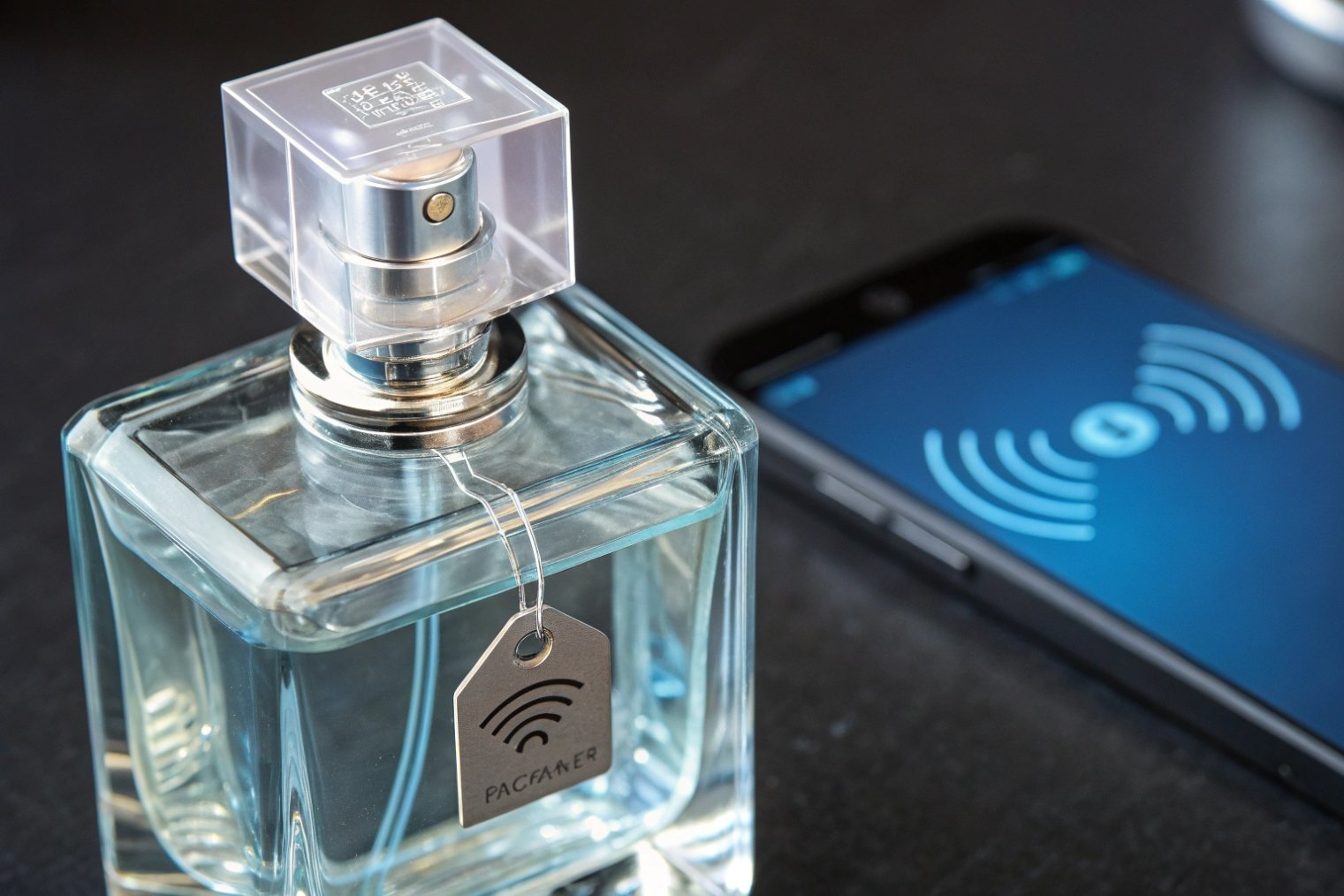
From static object to connected touchpoint
Smart perfume bottles often embed NFC tags embedded in caps 6, the label, or a glass medallion. A simple tap with a smartphone can open a brand micro-site, a short film, or a digital certificate. For markets worried about counterfeits, this also adds a verification step. The tag ID can link to a secure database, and the user sees if the bottle is genuine.
QR codes offer similar functions at lower cost. Direct-to-glass UV inkjet printing makes it possible to print small, clean codes on the base or back panel. Because no sticker is needed, the pack stays mono-material. Codes that follow GS1 Digital Link 7 can connect one printed code to consistent product, recycling, and authenticity pages across markets.
AR to extend the trial
AR (augmented reality) features help when consumers cannot spray the fragrance, such as in e-commerce, travel retail, or sealed displays. A scan of the bottle can trigger:
| AR Feature | Consumer Benefit | Brand Benefit |
|---|---|---|
| Scent pyramid animation | Understand notes and dry-down | Educate without heavy text |
| Virtual try-on halo | Visualize mood or “vibe” of scent | Stronger emotional link |
| Layering suggestions | Combine with other house scents | Cross-sell and retain users |
| Gamified stories | Unlock badges or samples | Data capture and loyalty building |
In-store, AR mirrors or screens can sync with the bottle. The consumer picks up a flacon; sensors or NFC triggers an on-screen story. This keeps testers simple and reduces the need for extra printed materials.
Design and engineering for smart features
Smart components must not spoil the pure glass aesthetics. Tags and antennas hide under opaque caps, under shoulder rings, or within a small recess in the base. Engineers need to plan space for them early, along with magnet placement and metal-free pump design. For refillable architectures, the smart feature should stay with the main bottle, not the refill pod, so long-term engagement continues.
Durability is key. Tags must survive filling, hot air drying, transport, and daily handling. Adhesives must tolerate alcohol and temperature swings. Data teams also need a plan for content updates, so the digital story stays fresh throughout the bottle’s life. When this system works, the glass bottle becomes a bridge between physical ritual and digital narrative, which is powerful in a crowded fragrance market.
Conclusion
Glass perfume bottles in 2025 blend lighter, more sustainable structures, refined touch and color, and smart digital layers, so each flacon becomes a long-life, refillable, and story-rich object rather than a disposable container.
Footnotes
-
Overview of refill and reuse packaging models to guide durable “forever bottle” strategies. ↩ ↩
-
How recycled glass cullet reduces furnace energy and CO₂, supporting recycled-content and lightweighting claims. ↩ ↩
-
Reference standards used across aerosol/fragrance packaging, helpful when designing collars, neck finishes, and pump interfaces. ↩ ↩
-
Defines VOCs and why low-VOC coatings matter for compliance and sustainability reporting. ↩ ↩
-
Primer on UV printing for understanding durability and resolution of direct-to-glass graphics. ↩ ↩
-
Official NFC Forum hub for standards behind tap-to-authenticate and connected-packaging experiences. ↩ ↩
-
Guide to GS1 Digital Link for QR “digital IDs” that connect packaging to trusted, structured product data. ↩ ↩


