If a formula is light-sensitive, the wrong bottle can quietly ruin it on the shelf. If a brand looks like everyone else, it gets ignored.
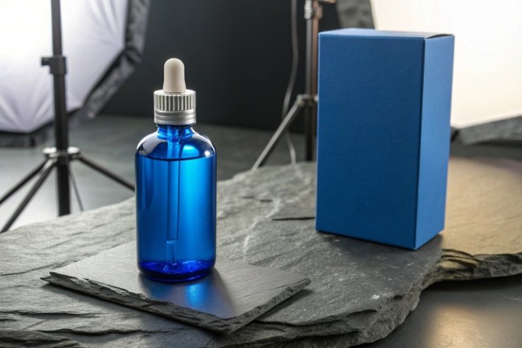
Cobalt-blue glass bottles give a strong shelf signature, offer moderate light protection compared with clear and green glass, and keep glass’s inert, premium feel. They also come with tighter color-control and recycling trade-offs that need planning.

Cobalt works best when it is treated as a packaging strategy, not just a color. The smart path is to link the bottle color to your risk level (light sensitivity), your channel (retail vs professional), and your brand memory goal (instant recognition).
Does cobalt enhance shelf recognition vs amber and green?
In a crowded aisle, shoppers do not read first. They scan. When the pack looks familiar, it blends in. When it looks different but still premium, it earns a second look.
Yes. Cobalt-blue is a strong recognition tool because it is less common than amber or green, so it can become a brand signature. Amber often signals “protection-first,” while green often signals “tradition,” but cobalt signals “premium and modern.”
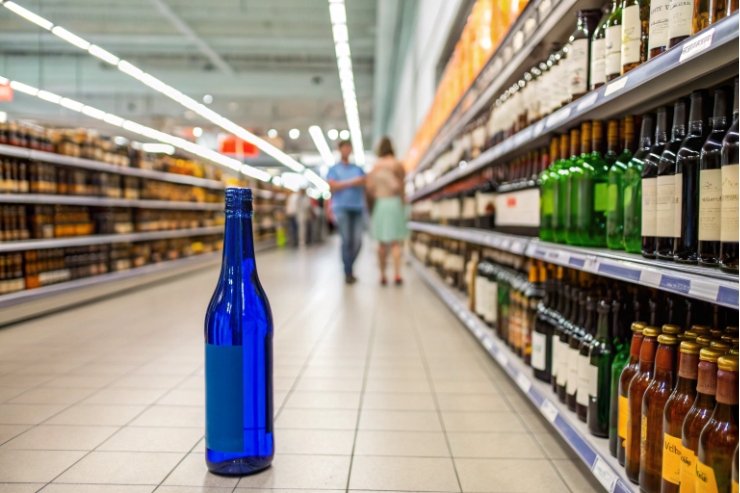
Why cobalt stands out in real retail behavior
Most shelves have patterns. Amber shows up in apothecary and pharmacy cues. Green shows up in wine and some wellness. Flint (clear) dominates mass-market categories. Cobalt sits outside those defaults, so it creates a visual interrupt.
That interrupt can be good or bad. It is good when the brand wants to be remembered. It is bad when the category expects a certain look and punishes anything else. In my experience, cobalt performs best in categories where “ritual” and “design” matter: skincare serums, aromatherapy sprays, premium spirits, and boutique supplements.
Cobalt also gives strong contrast for decoration. White ink, metallic foils, and minimal labels read clean and sharp on blue. Amber can make some colors look muddy. Green can fight with certain label palettes. If the brand uses a lot of gold and white, cobalt often makes those choices look intentional.
Where amber and green still win
Amber is the safest “functional” color when the formula is truly light-sensitive. It also feels familiar in wellness and pharma-style design. Green can win for heritage cues, especially in beverages. If the product story is “old world,” green may be the faster signal.
So the decision is not only “which looks best.” It is “which is easiest to own as a signature.” If the plan is to build a recognizable line family, cobalt gives a strong anchor.
| Color | First impression | Typical shelf role | Best for brand goal |
|---|---|---|---|
| Cobalt blue | Premium, modern, crafted | Brand signature bottle | Stand out and be remembered |
| Amber | Protective, apothecary, safe | Functional protection cue | Communicate stability and care |
| Green | Traditional, heritage, natural | Familiar beverage cue | Signal tradition and origin |
| Flint (clear) | Clean, simple, mainstream | Value and transparency | Show product and price clarity |
A practical “signature test” before you commit
A quick internal test helps: line up 10 competitor bottles, then place your cobalt sample in the middle. Step back two meters. If the cobalt bottle is the first thing people point to, it has signature power. If it feels random, the brand system needs more support (label, cap, secondary pack).
How does UV protection compare for sensitive formulas?
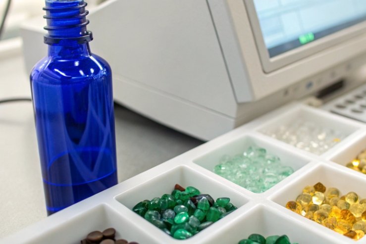
Light damage is not always visible. A serum can look the same and still lose performance. A beverage can taste fine in week one and drift by week eight. This is where color choice stops being design and becomes risk control.
Cobalt-blue offers meaningful UV and some visible-light filtering compared with clear glass, and it often protects better than green. Amber usually provides the strongest light barrier among common container colors—see UV protection compared with amber glass 1. For highly sensitive formulas, cobalt should be treated as “moderate protection,” not “maximum protection.”
What “protection” really means
Light protection is about which wavelengths get through and how much energy reaches the product. Different actives have different sensitivities. Some degrade mainly under UV. Some react under blue visible light. Some are stable until long exposure.
Cobalt-blue glass is not a lab instrument. It is a practical filter. It cuts down light energy, but it does not create darkness inside the bottle. That is why storage and secondary packaging still matter.
For sensitive formulas, the clean way to decide is to request a simple UV-Vis transmission check 2. Many brands do this once per bottle color and wall thickness. Then they match that to stability results. That approach avoids guessing.
When cobalt is “enough”
Cobalt often works well for:
- essential oils and aromatherapy blends sold in cartons or stored away from bright display lights
- cosmetics that already use outer boxes, pumps, or opaque labels
- premium spirits where shelf turn is steady and product is not extremely light-reactive
When cobalt is not enough by itself
Cobalt is risky when:
- the product is known to be highly photo-sensitive (certain vitamins, some botanicals, and oxidation-prone actives)
- the retail channel uses strong lighting and long display time
- the bottle is clear-labeled and sits in direct light for months
In those cases, amber or an added light barrier becomes the safer plan.
| Protection level | Typical bottle color choice | When it makes sense | What to add if needed |
|---|---|---|---|
| Maximum | Amber (or opaque systems) | Highly light-sensitive products | Carton, sleeve, or secondary pack |
| Moderate | Cobalt blue | Balanced look + protection | High-coverage label or carton |
| Low to moderate | Green | Brand tradition, some filtering | Strong secondary packaging |
| Low | Flint (clear) | Visibility-first products | Sleeve/carton if formula needs it |
Wall thickness and fill level also matter
Two cobalt bottles can protect differently. Thicker glass usually transmits less light. A full bottle leaves less headspace, so less light reaches deeper zones. These details matter in stability planning.
This is why “cobalt blue” should be specified as a controlled material choice, not just “make it blue.” Shade, thickness, and consistency define real performance.
Are there color-tolerance and recycling considerations?
Color is easy to admire and hard to control. With cobalt, tiny changes can shift the whole look. That can create painful surprises across production lots.
Yes. Cobalt-blue needs tight color tolerance control because cobalt colorants are strong and small dosing shifts can change shade. Recycling also needs planning, because colored cullet streams are often sorted by color and cobalt glass can be harder to keep in a closed loop with flint.
Color tolerance: what buyers should actually specify
For a brand, “blue” is not one thing. There is a deep royal blue, a lighter blue, and a blue-green drift that can look “off.” The right way is to define tolerance using color measurement (often with L*a*b* values 3 and a ΔE tolerance band 4).
A supplier can hold tight shade control by managing:
- cobalt oxide as a powerful glass colorant 5 in the melt
- cullet mix ratio and color cleanliness
- furnace redox conditions (which can affect color tone)
- mold and forming stability (because thickness affects perceived color)
A buyer should also understand that decoration can shift perceived color. A full sleeve makes cobalt look darker. A minimal label makes it look brighter. So “final shelf color” should be tested with the real label system.
Recycling: it is recyclable, but not always closed-loop
Glass itself is recyclable. The practical issue is sorting. Many recycling streams separate flint, amber, and green because color impacts the next melt. Cobalt-blue is a smaller stream. In some regions it may be mixed into colored glass streams or used in applications where color uniformity is less strict.
There is also a useful reality: more research and industry work is happening to make mixed-color container glass recycling more feasible, but the output often becomes a darker mixed color rather than a clean, clear flint loop. This means cobalt can still support sustainability claims, but a brand should be careful with “closed-loop” language unless the supply chain is proven.
What to do if sustainability is a core claim
If sustainability is a top message, a brand can:
- use high post-consumer recycled (PCR) content 6 when available in cobalt streams
- design labels and closures to be easy to separate
- use secondary packaging that is recyclable and not glued heavily
- communicate “recyclable glass” rather than promising perfect closed-loop recovery in every region
| Topic | Risk | How to control it | What to ask your supplier |
|---|---|---|---|
| Shade drift between lots | Brand inconsistency | ΔE tolerance + sample approval | Color reports by batch |
| Thickness-driven color shift | Looks darker/lighter | Control weight and wall | Weight tolerance and QC plan |
| Cullet contamination | Unwanted tone | Clean cullet stream | Cullet source and screening |
| Recycling stream mismatch | Sustainability confusion | Clear claims and local guidance | Regional recycling guidance support |
In short, cobalt is premium, but it is less forgiving. Brands that treat color as a specification, not a feeling, avoid most problems.
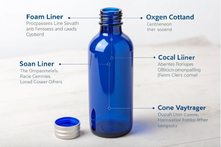
When should cobalt be paired with inner sleeves or liners?
Many teams think “the bottle color handles protection.” Then stability data comes back, and the timeline gets tight. A layered barrier strategy prevents that panic.
Pair cobalt with inner liners or sleeves when the formula is highly light-sensitive, oxygen-sensitive, or prone to flavor loss. In most cases, the first upgrade is not an inner sleeve. It is the right cap liner, induction seal, or a high-coverage outer sleeve/carton.
Start with the closure seal before adding inner sleeves
For many products, oxygen ingress and aroma loss are bigger threats than light. A better liner can improve shelf life without changing the bottle.
Common closure upgrades include:
- cone liners for strong sealing on glass finishes
- foam or multi-layer liners for better compression recovery
- induction seals for tamper evidence and initial barrier (when compatible with the product and cap)
These changes can be small in cost, but big in performance, especially for essential oils and volatile formulas.
When inner sleeves make sense
Inner sleeves or inner liners are usually used when:
- the product is extremely light-sensitive and the brand insists on cobalt (not amber)
- the product will sit under strong lighting for long periods
- the brand needs a secondary barrier to reduce both light and scuffing
That said, “inner sleeve” can mean different things:
- an internal bag or liner (less common for premium cosmetics and spirits)
- an external shrink sleeve that wraps the bottle (very common and effective)
- an outer carton that blocks most light (often the easiest choice)
For most premium brands, an outer carton or a high-coverage sleeve is the cleaner choice than an internal liner. Internal liners can raise compatibility questions, add filling complexity, and change consumer perception.
A simple pairing guide that keeps decisions fast
If the formula is mildly sensitive: cobalt + strong label coverage is often enough.
If the formula is sensitive: cobalt + carton or sleeve + strong liner is safer.
If the formula is highly sensitive: amber is usually the clean answer, unless cobalt is non-negotiable for brand identity.
| Formula risk | Cobalt-only risk level | Best pairing | Why it works |
|---|---|---|---|
| Low (stable oils, simple liquids) | Low | Cobalt + standard liner | Shelf pop without extra cost |
| Medium (some botanicals, mild oxidation) | Medium | Cobalt + better cap liner | Stops aroma loss and leakage |
| High (photo-sensitive actives) | High | Cobalt + sleeve or carton | Adds major light barrier |
| Very high (strict stability needs) | Very high | Consider amber or opaque | Reduces risk without complexity |
The most practical rule
If the product needs real protection, do not bet everything on glass color. Use color for brand and moderate filtering, then use closures and secondary packs for the hard work. That keeps the design premium and the formula stable.
Conclusion
Cobalt-blue glass bottles help brands stand out and offer moderate light filtering, but they need tighter color control and smart recycling messaging. For sensitive formulas, pair cobalt with strong closures and secondary light barriers.
Footnotes
-
Quick comparison of cobalt vs amber UV filtering for packaging decisions. ↩ ↩
-
Explains UV/Vis transmission measurement basics for evaluating how much light reaches your formula. ↩ ↩
-
Helps teams interpret L*a*b* coordinates and communicate “the same blue” across suppliers. ↩ ↩
-
Practical guide to setting ΔE tolerances so shade stays consistent without excessive scrap. ↩ ↩
-
Explains why cobalt oxide is extremely potent and how small dosing shifts change glass shade. ↩ ↩
-
Defines PCR for glass and how recycled content is calculated for credible sustainability claims. ↩ ↩


