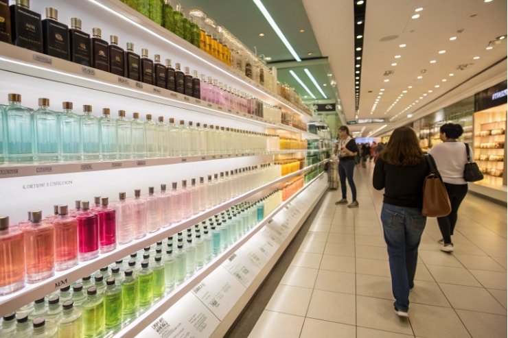
Most people smell with their eyes first. A shopper sees the bottle color long before they read the notes or try the tester.
Perfume bottle color quietly tells a story about freshness, sensuality, and luxury. It shapes how strong people expect the scent to be, and how much they are willing to pay.

When the glass color, juice tint, and carton all speak the same “color language,” the customer already feels the right mood before the first spray. That is why color is not decoration. It is part of the fragrance design.
Which bottle colors signal freshness, sensuality, or luxury to target buyers?
Many brands pick a nice color “by taste” and then wonder why the wrong shoppers stop at the shelf.
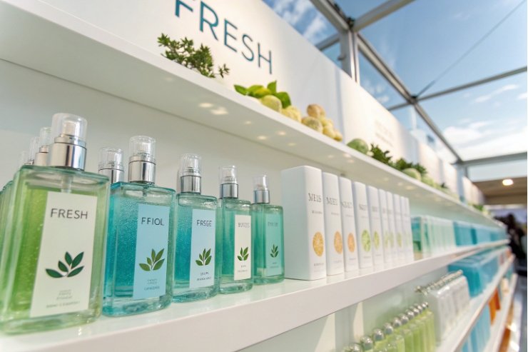
Freshness reads as green, blue, and soft transparent tones, sensuality leans into pinks, reds, and warm ambers, while luxury cues appear in black, deep jewel tones, and metallic gold.
Color as a shortcut to scent and emotion
Color gives the brain a shortcut: it hints at the scent type before the cap comes off.
Some very common links:
- Green bottles suggest fresh, herbal, or “natural” notes. Think leaves, tea, grass, mint.
- Blue leans toward aquatic, airy, or sporty scents. Sea breeze, ozone, clean fabric.
- Yellow and bright orange signal citrus, energy, and sunlight. Lemon, bergamot, mandarin.
- Pink often hints at rose, peony, or sweet floral notes and a romantic mood.
- Brown and warm amber connect to woods, resins, and gourmands. Cozy and smooth.
These links are not random. Studies on cross-modal associations between colors and odors 1 show that many people consistently match certain smells with certain colors, so the bottle can “pre-frame” the nose in the first second.
Now layer emotion on top:
- Freshness → blue, mint green, soft turquoise, clear glass with pale juice.
- Sensuality → red, wine, plum, hot pink, warm amber gradients.
- Luxury → black, deep navy, emerald, royal purple, plus accents of gold or rose gold.
Shoppers may not explain these choices in words, but they feel them.
Using saturation and pastel tones to fine-tune the message
Brightness and softness matter as much as the basic hue.
- Pastels (dusty rose, powder blue, sage green) feel soft, refined, and more “expensive” than loud, neon versions. They fit romantic or skin-scent perfumes.
- High saturation (vivid red, bright blue) feels energetic and bold. Good for young, playful, or club-style scents.
- Very low saturation and dark tones (ink blue, bottle green, charcoal) feel rich and serious. These are perfect for evening and luxury lines.
In broader packaging research, even a simple black “mark” cue can lift perceived premiumness 2—which is why dark, restrained palettes so often outperform loud colors in high-end fragrance.
A simple map:
| Target cue | Good choices | Usually avoid |
|---|---|---|
| Fresh daily | Clear, light green, light blue, soft yellow | Very dark black, heavy metallics |
| Sensual date | Pink, red, plum, amber gradients | Cold greys, very clinical whites |
| High luxury | Black, deep blue, emerald, gold accents | Very bright neon tones |
| Natural / eco | Soft greens, browns, frosted clear, beige | Hard plastic-like metallic finishes |
In my projects, the best results come when the bottle color, cap, pump, and outer box all follow the same emotional line. Then the customer reads the story in one glance, without any words.
How does color shape perceived fragrance family and strength (EDT vs. EDP)?
Two bottles can hold almost the same formula, but if one looks dark and heavy and the other looks pale and airy, people will expect them to smell very different.
Bottle color pushes the nose toward a certain fragrance family and also sets expectations for strength: pale, clear tones suggest light EDTs, while deeper, richer tones suggest stronger EDP or parfum.
Color and expected fragrance family
Most shoppers do not know all the olfactive families by name. They still use color as a guide.
Common reading patterns:
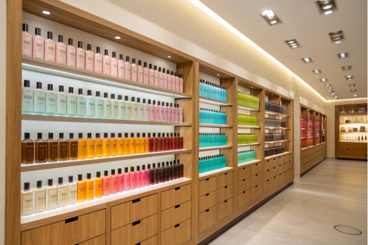
- Floral: pinks, soft purples, rose gold, and light pastels.
- Citrus / cologne: light yellow, lime, pale orange, clear with a yellow juice.
- Fresh / aquatic: aqua blues, teal, ice-like clear bottles.
- Woody / oriental: amber, brown, dark green, smoke tints.
- Gourmand: warm caramel, chocolate browns, creamy beige.
If your juice is a soft white floral but you put it in black glass with heavy gold details, many people will expect something much darker and sweeter. They may test it and feel “this is not what I thought,” which hurts conversion.
So color should confirm your main note family, not fight it. Research on using color–odor correspondences in fragrance packaging 3 points to a simple advantage: “matching” visuals can increase preference because the brain reads the offer as more coherent.
Color and the “how strong is this?” feeling
Color also plays with perceived power.
- EDT and cologne often live in lighter, clearer, more transparent bottles. They look fresh, casual, “daytime.”
- EDP and parfum often use deeper tones, heavier glass, and more opaque decoration. They look rich and “nighttime.”
Even when the actual formula difference is small, the bottle can make the EDP feel stronger and more long-lasting in the mind of the consumer.
You can use this effect on purpose. For example:
| Format | Typical visual strategy | Message at first glance |
|---|---|---|
| Cologne / EDT | Clear or light-tinted glass, slim lines | Fresh, easy, spray often |
| EDP | Richer color, thicker base, metal or dark cap | Intense, fewer sprays, lasts longer |
| Parfum / extrait | Very dark or solid color, small size, heavy cap | Precious, concentrated, special occasions |
A smart trick is to keep the same basic bottle shape for EDT and EDP, but darken the glass or juice tint and cap for the EDP. Shelf blocks then show a clear “strength ladder” that customers understand without reading.
Color-induced expectations can help or hurt
Researchers have shown that color alone can create “odor illusions.” If people see a red drink, they may report more fruity notes even when the smell is the same. Perfume is no different.
So when you choose a bottle tint or juice tint, you also decide:
- Which notes people will notice first.
- Whether they will call it “strong,” “soft,” “sweet,” or “fresh.”
If you want a light EDT to feel more present, you can go one step darker in color. If you want a rich gourmand to feel more daytime, you can soften the glass color and use a lighter label and cap. Color becomes a quiet way to tune perception without touching the formula.
Do darker bottles increase perceived longevity and willingness to pay?
Many niche and luxury perfumes sit in very dark, almost opaque bottles. This is not an accident.
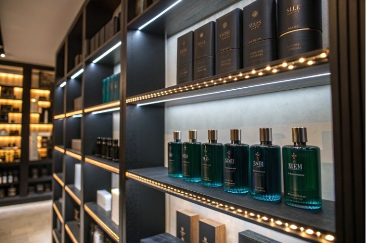
Darker, lower-saturation bottles usually raise perceived concentration, longevity, and status, and they often support a higher price point—while also giving real technical benefits for light-sensitive formulas.
Why deep and dark feels expensive
Several simple cues work together:
- Dark colors like black, deep blue, and dark green feel serious and reserved. They suggest “not for everyone.”
- Low saturation makes the pack look calm and controlled, not loud or cheap.
- Opaque or near-opaque glass makes the juice feel mysterious and rare.
Shoppers often link these cues with:
- Higher quality ingredients.
- Stronger and longer-lasting scent.
- “Evening” or “special occasion” use.
Across categories, experimental work shows packaging colors can shift perceived value and willingness to pay 4, which is why “darker = more premium” is such a reliable lever when the story fits.
Perceived longevity and real performance
Dark bottles do more than look rich. They also block more light, which can slow down some types of scent breakdown.
So you get two layers:
- Perceived: “This looks like it will last longer on my skin.”
- Technical: better protection of light-sensitive notes in store and at home.
This double effect is powerful. But you need to balance it:
- Too dark, and customers cannot see how much juice is left.
- Very dark glass can make photography and online shopping harder.
- Overuse of black can also make a brand block look heavy or similar to others.
A short comparison:
| Bottle style | Perceived longevity | Perceived price level | Best for |
|---|---|---|---|
| Clear, pale tint | Lower | Entry to mid | Fresh EDTs, daily mists |
| Soft pastel | Medium | Mid to premium | Floral EDPs, bridal, “clean” perfumes |
| Deep colored | Higher | Premium | Woody, oriental, signature EDPs |
| Black / opaque | Very high | Luxury / niche | Extrait, oud, evening or statement scents |
If you want to push a line upward in price and prestige, darkening the bottle and cap palette is often one of the fastest, lowest-risk moves—especially if your formula already has good staying power.
When not to use very dark glass
Dark equals serious, but not every story is serious.
You might avoid very dark glass when:
- The scent story is about lightness, youth, or fun.
- You focus on transparency, “skin scent,” or barely-there notes.
- You want to show off a special juice color as part of the concept.
In those cases, you can still use darker details (like a deep cap or label) to add a premium touch while keeping the main bottle lighter.
How should culture, gender cues, and UV protection guide your color choice?
Color is not read the same way in every country or by every audience. At the same time, UV and light protection needs do not care about that.
Use culture and gender codes to aim your color story at the right buyer, then filter those ideas through real UV and stability needs so the bottle also protects the juice.
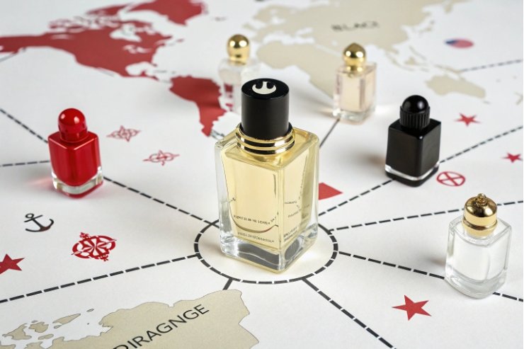
Culture shifts the meaning of each color
A color that feels safe in one region can be strange or even negative in another. In other words, color meanings vary widely across cultures 5, so global lines usually need market checks, not just internal preference.
Some broad examples:
- Red: lucky and festive in many Asian markets, sometimes aggressive or “danger” coded in others.
- White: purity and minimalism in many Western markets, linked to mourning in some cultures.
- Black: luxury and elegance in many places, but also death or bad luck in others if used alone.
So for global lines, you often see:
- Neutral main bottle colors (clear, soft amber, gentle tints).
- Culture-specific tweaks in cartons, labels, or limited editions.
Before locking a color, it helps to review key markets with local partners or at least mood boards from each culture.
Gender cues and the rise of unisex codes
Traditional gender coding is strong in fragrance:
- Feminine: pinks, purples, soft gold, curves, and pastels.
- Masculine: blacks, navy, smoke grey, metallic accents, sharper edges.
If your perfume follows these classic lines, the bottle should not fight that expectation. A classic “for her” floral in a hard black cube will confuse many shoppers.
But unisex and gender-fluid scents now claim more shelf space. Their color codes are often:
- Beige, taupe, and nude tones.
- Warm greys and smoky transparent glass.
- Shared neutrals like amber, olive, and ink blue.
This trend fits what cross-cultural research on pink/blue preference patterns 6 suggests: gender color signals exist, but their strength and direction can shift by culture and context—so “unisex” palettes often choose safer neutrals.
UV protection as a non-negotiable
Finally, the formula itself can veto some color ideas.
Natural-heavy juices, high citrus, and some delicate molecules are very light-sensitive. For these, we need:
- Darker glass (amber, brown, dark green) or strong tints.
- Or at least a printed or lacquered layer that covers a large area of the wall.
If the marketing team insists on clear glass for a light-sensitive scent, then:
- Outer packaging must block light during storage.
- You may add strong warnings about storage on pack.
- Stability tests must show real safety over the full life.
For tinted glass selection, it helps to remember that amber glass can absorb wavelengths below about 450 nm 7, which is why it’s such a common “default safe” choice when light risk is real.
A quick checklist:
| Factor | What to check | Possible response |
|---|---|---|
| Culture | Local meaning of chosen color | Adjust shade or combine with safe neutrals |
| Gender coding | Target buyer and story | Lean into or soften traditional cues |
| UV sensitivity | Light stability data for the formula | Darker glass, lacquer, or solid carton |
| Sustainability | Recycling and refilling goals | Prefer tints over heavy opaque coatings |
When you let culture, gender, and chemistry sit at the same table, the final color choice feels natural, sells better, and protects the fragrance at the same time.
Conclusion
Bottle color is a silent storyteller. When you choose it with intention, it guides the right buyer to the right scent and supports both price and performance.
Footnotes
-
Evidence that people reliably match certain odors to certain colors, shaping expectation before smelling. ↩︎ ↩
-
Research linking simple dark/black cues in packaging to higher “premium” perception in consumers. ↩︎ ↩
-
Shows how matching packaging color to scent expectations can raise preference and purchase intent. ↩︎ ↩
-
Demonstrates packaging color can affect perceived value and willingness to pay in controlled experiments. ↩︎ ↩
-
Practical overview of how the same color can carry different meanings across regions and cultures. ↩︎ ↩
-
Explains cultural variation in pink/blue preferences and why gender color codes aren’t identical everywhere. ↩︎ ↩
-
Useful reference on why amber glass blocks more high-energy light than blue, supporting stability decisions. ↩︎ ↩

