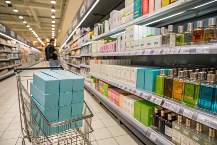
Shoppers decide fast. Very often they react to the color of the pack long before they read a single word on the label.
Packaging color influences purchase decisions by shaping emotion, trust, and perceived value in seconds, steering which product gets picked up, tested, added to cart, and recommended to others.

If the formula, story, and price are right but the color is off, the pack works against the product. When color strategy connects to category codes and buyer psychology, the same formula feels more premium, more trustworthy, and easier to choose.
A useful baseline is to treat color as a perception cue first, and a design detail second—this matches what long-running color psychology research 1 has found about how color can shift judgments and behavior.
Two bottles can hold almost the same formula. The one with the better color story will look safer, more expensive, and more “worth trying” at first glance.
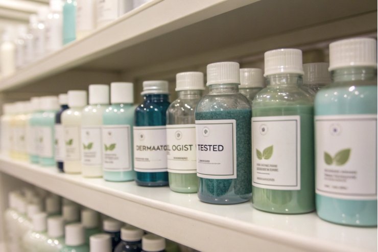
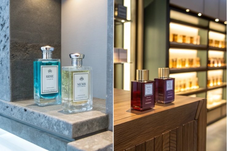
Cool blues, soft greens, and clean neutrals tend to increase trust, while deep blacks, golds, and low-saturation jewel tones signal status, craftsmanship, and premium positioning in cosmetics and fragrance.
Core emotional cues by color
Most buyers use fast color shortcuts, and marketing work like Impact of Color on Marketing 2 is a helpful reference point for why these shortcuts matter at shelf and on thumbnails:
- Blue reads calm, clinical, reliable. Good for “safe”, “dermatologist tested”, or tech-care lines.
- Green suggests natural, plant-based, gentle. It also carries a health and eco cue when used with restraint.
- White, cream, soft grey express purity and minimalism. They fit “clean beauty” and fragrance that leans on transparency.
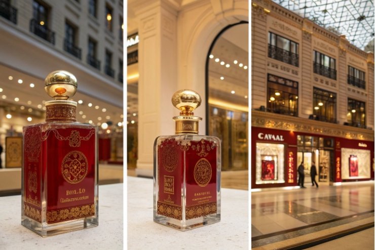
- Black, charcoal, deep navy communicate sophistication, strength, and night-time use. They help a pack feel more expensive.
- Gold, rose gold, champagne metallics layer on opulence and “treat yourself” energy. They support higher price points when combined with good materials.
Brightness and saturation also change the signal. Bright, high-saturation colors look energetic but can feel less “serious”. Softer, muted tones feel more mature and upscale. For skincare and fine fragrance, this often means:
lower saturation + slightly darker tones = higher perceived status and quality.
Premium does not always mean dark. The trick is to balance clarity (what is this, who is it for?) with status.
A simple map for cosmetics and fragrance:
| Goal | Recommended palette direction | Notes |
|---|---|---|
| Clinical trust (serums, actives) | Cool blues + white, light grey | Add clear glass to show formula purity |
| Natural trust (EOs, botanicals) | Desaturated greens, ambers, soft beige, off-whites | Let raw glass and simple typography do most of the talking |
| Everyday premium | Soft neutrals + one accent metallic (gold, copper, gunmetal) | Keep logo and text restrained, avoid too many accents |
| High luxury / status | Black or deep jewel tones + controlled metallic highlights | Heavy glass, small logo, minimal pattern, slow visual rhythm |
When we develop glass bottles and decoration for a “premium but honest” positioning, we often start with three anchors:
- One trust color (blue, green, or neutral).
- One status color (black, deep plum, or a metal).
- The natural tone of the glass or juice.
Then we let those three carry the story instead of adding many more hues. This keeps the pack calm and confident, which is what premium buyers expect.
If the team is split between two “good” palettes, quick preference checks using visual design testing methods 3 can settle the debate with real buyer reaction instead of opinion.
Do warm vs. cool palettes change perceived scent family and product efficacy?
Most shoppers sniff with their eyes first. Warm and cool palettes serve as silent pre-tasters for both smell and “how well this will work on me”.
Warm palettes push the mind toward gourmand, floral, and sensual scents and indulgent care, while cool palettes lean toward fresh, aquatic, and “effective” formulas that feel cleaner, lighter, and more functional.
Warm vs. cool for fragrance expectations
Color and scent have strong crosslinks. When buyers see color, they start to predict what they will smell—this lines up with work on olfactory crossmodal correspondences 4:
-
Warm tones (red, orange, coral, gold, caramel, chocolate):
People expect sweetness, spice, warmth, evening wear, and richer textures. They prepare for stronger, more lingering perfumes or nourishing creams. -
Cool tones (blue, teal, mint, icy silver):
People expect marine notes, citrus splashes, mint, eucalyptus, and airy textures. They prepare for lighter, fresher, “cleaner” scents and quick-absorbing formulas. -
Neutral / pastel tones (powder pink, lavender, blush, beige):
People expect soft florals, powdery notes, baby skin, and comfort. They often read these as gentle, safe, and “non-threatening”.
This is powerful because it means a warm bottle can make the same fragrance feel sweeter and heavier than it does in a cool bottle, even when the juice is identical.
Warm vs. cool for perceived efficacy
For skincare and body care, color also tweaks how “effective” products feel:
- Cool palettes with blue, white, and touches of silver often read as clinical and precise. Buyers link these to actives, acids, brightening, and blemish control.
- Warm palettes with peach, pink, and gold read as comforting and indulgent. Buyers link these to moisturising, pampering, and ritual.
You can mix the two to keep emotion and efficacy together:
| Product type | Warm / cool balance | Example color strategy |
|---|---|---|
| Acne or repair serum | Mostly cool + tiny warm accent | Blue glass, white label, small copper line for tech-luxury |
| Night repair oil | Warm base + cool highlight | Amber glass, soft gold details, cool grey typography |
| Fresh EDT fragrance | Cool dominant | Clear or aqua bottle, minimal white or chrome accents |
| Intense evening EDP | Warm dominant | Deep plum or wine bottle, gold logo, dark cap |
When color and juice point in the same direction, users feel the product “works” even before they see long-term results. When they fight each other, usage drops or repeat purchase stalls, even if the formula itself is sound.
How much can color-led A/B tests lift CTR and shelf conversion in retail?
Color decisions often happen in a design meeting. Real buyers never see the alternative options, so teams stay unsure. A/B testing fixes that.
Color-led A/B tests can deliver double-digit lifts in click-through and noticeable jumps in shelf conversion, especially when they improve visibility, category fit, and trust cues without breaking brand recognition.
Where color A/B testing actually pays off
We see the biggest gains in three places:
-
Digital thumbnails
On marketplaces and brand sites, the pack shrinks to a tiny image. Higher contrast and clearer color blocks often give better CTR. A simple change from pale-on-pale to stronger contrast between bottle and background can lift clicks. -
Crowded shelves
If all competitors use similar shades, a small shift can make your SKU pop or, sometimes, blend in better. For example, if the whole shelf is dark, a controlled lighter accent can stand out; if everyone is bright, a calm deep bottle can feel more serious. -
Line architecture
Within one brand, better color spacing between SKUs helps shoppers navigate. Clear visual steps between fresh, floral, and intense flankers cut confusion and support upsell.
Practical ways to test and what to watch
You do not need complex experiments at the start. Simple A/B testing (and when to move to multivariate) 5 methods already show strong signals:
-
E-commerce A/B
Run two hero visual variants (for example, light vs darker bottle) across equal traffic. Watch CTR, “Add to Cart” and scroll depth. Keep all other elements constant. -
In-store mock shelf tests
Use real-size printouts or sample bottles on a shelf with competitors. Ask test shoppers which pack they pick up first and why. Time their decision. -
Ad creative tests
Test two color treatments in ads with the same copy and audience. Compare click and save rates.
A rough benchmark from many categories:
| Type of color improvement | Typical effect range* |
|---|---|
| Small contrast / brightness tweak | 2–5% CTR or pickup lift |
| Clearer category cue (green for “natural”, blue for “fresh”) | 5–10% lift, sometimes more for new brands |
| Strong visibility change on crowded shelf | 10–20% relative lift in first pick-ups |
*Not a promise, but a realistic range we see when color changes fix clear problems.
The key is to test within brand codes. A strong red that doubles CTR but breaks your brand story may not be worth it. The best color optimizations feel natural, as if the pack always looked this way.
How should culture, region, and lighting conditions guide your final color choice?
A shade that feels luxurious in Paris can feel fun or even unlucky in another market. Store lighting can also kill a subtle effect that looked perfect on a monitor.
Final color choices should respect local cultural meanings, store lighting, and channel mix, so the pack stays readable, attractive, and premium in real-world conditions, not only in the design file.
Culture and region: same hue, different story
Color is not universal, and cross-market work like this cross-cultural colour–emotion association study 6 is a good reminder that meanings can shift.
So one global master design may need local tuning:
- Slightly softer or deeper reds.
- More focus on blue and green where those hues signal trust.
- Gold accents scaled up or down based on local taste.
When planning a multi-region fragrance or skincare line, it helps to check early mockups with local teams or distributors. Often a small shift in tone is enough, so printing and glass can still share the same basic recipes.
Lighting conditions and channel reality
Colors behave differently under:
- Warm retail LEDs.
- Cooler supermarket or pharmacy lighting.
- Sunlight through windows.
- The flat backlight of a phone screen.
Subtle gradients and low-contrast pastel-on-pastel often die under harsh store light. Dark bottles can turn almost black, hiding careful tints—so it helps to sanity-check under real fixtures and compare the store’s Color Rendering Index (CRI) 7 when you evaluate samples.
A few simple checks:
| Channel / context | Design focus for color | Test method |
|---|---|---|
| Department store fragrance | Deep colors, metallic accents, spotlight reflections | View samples in store under real lighting |
| Pharmacy / mass retail | Clear color coding, high legibility | Place mocks on real shelf with competitors |
| Online marketplaces | Strong outline, clean silhouette, bold main hue | Check at thumbnail size on a real phone |
| Boutique / spa | Softer palettes that match interior colors | Put samples in the planned interior mood board |
We also match pack color to environment. A pale green bottle in a pale green store gets lost. In that case, we might keep the same color family but darken the glass or add a more contrasting label so the bottle does not disappear.
Bringing it together in a simple decision path
When we help a brand lock color decisions, we usually follow this path:
- Start from fragrance family / product benefit → choose warm vs cool, light vs dark.
- Layer in trust and premium cues → adjust saturation and add metals or neutrals.
- Check culture and market → fine-tune tones and dominant hues.
- Test in real lighting and channels → confirm visibility and mood.
- Run small A/B experiments online or in-store → validate with data, not opinion.
The final palette is not only beautiful. It also feels natural for the scent, safe for the buyer, correct for the price, and comfortable under the real lights where people actually shop.
Conclusion
Color is not decoration; it is a fast language that shapes trust, scent expectations, and price perception long before anyone sprays or opens the bottle.
Footnotes
-
Peer-reviewed overview of how perceiving color can change judgment, emotion, and behavior. ↩ ↩
-
Evidence-focused paper on how color impacts marketing outcomes and consumer choices. ↩ ↩
-
Practical guide to testing visual design options (including color) with real users. ↩ ↩
-
Explains research on how smell links with visuals like color, shaping expectations. ↩ ↩
-
Clear explanation of A/B vs multivariate testing and when each method fits. ↩ ↩
-
Cross-cultural data showing how color-emotion links can vary across languages and markets. ↩ ↩
-
Quick reference for how accurately lighting reveals colors—useful when approving samples. ↩ ↩


