The wrong wine bottle makes great juice look cheap, heavy, or confusing. The right one tells your story before anyone reads the label or tastes a drop.
You choose the right wine bottle by matching shape, color, weight, punt, and closure to your wine style, price tier, target market, and filling line, so the glass quietly supports both brand and logistics.

Glass should not fight your wine. It should support it. When shape, color, and closure all send the same message, buyers understand your position in three seconds on the shelf. If you need a fast baseline on silhouettes, sizes, and what each bottle “signals,” the ultimate guide to wine bottle shapes and sizes 1 is a useful reference before you go custom. {#fnref1}
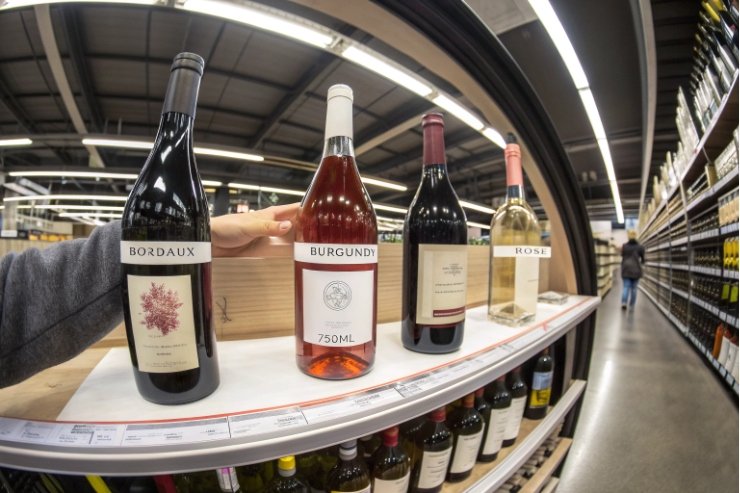
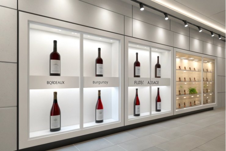
Which Bordeaux/Bourgogne shapes fit style cues?
Every bottle shape carries a story, even for people who do not know the names. A classic Bordeaux shoulder feels different from a soft Burgundy slope at a glance.
Use Bordeaux shapes for structured, classic, “serious” wines; Burgundy shapes for softer, elegant, or terroir-driven styles; and keep flute or specialty forms for aromatic whites and niche projects.
Reading shape as a style shortcut
Most shoppers scan shelves fast. Shape is one of the first filters. I rely on that:
- Bordeaux (high shoulders, straight body) signals structure, clarity, and classic hierarchy.
- Burgundy (sloping shoulders, wider body) signals charm, texture, and place.
- Flute / Alsace / Mosel shapes signal aromatic whites and light, fresh styles.
Here is a simple way to map them:
| Shape type | Typical grapes/styles | Style cue in the mind of the buyer |
|---|---|---|
| Bordeaux | Cabernet, Merlot, blends, Sauvignon | Classic, structured, “serious”, age-worthy |
| Burgundy | Pinot Noir, Chardonnay, cool-climate | Elegant, softer, gastronomic, terroir-focused |
| Flute | Riesling, Gewürztraminer, aromatics | Floral, delicate, off-dry or high-acid whites |
| Specialty | Rosé, blends, design-driven projects | Modern, playful, Instagram-ready, or luxury icon |
If your red is tannic and structured, a Burgundy bottle confuses people. If your Pinot sits in a tall Bordeaux, it looks stiffer than it tastes. Shape and wine style should not argue.
Matching shape to brand position and channel
Shape also interacts with tier and channel:
- Entry and core lines: stock Bordeaux/Burgundy shapes keep costs and MOQs under control.
- Premium and icon SKUs: semi-custom or custom silhouettes justify higher margins.
- On-trade focus: choose shapes that pour well and rack neatly in fridges and back bars.
Practical checks I always make:
- Does the chosen bottle fit existing cartons and racks?
- Will the label size work on that curvature without wrinkling?
- Can the bottle run on your current filling, corking, and capsule line without change?
If you want a family look, decide early which “home base” you prefer: Bordeaux or Burgundy. Then carry that through from entry to top tier, changing weight, height, and details as you climb the ladder. The range feels related even before people see the labels.
Do green/amber/flint colors suit product and market?
The same wine looks very different in deep green versus flint. One color whispers “cellar me”. The other shouts “drink me cold tonight”.
Use darker greens or amber for UV protection and aging cues, and flint for freshness and visual impact, always checking that the color matches both wine style and target market expectations.
Color as both shield and signal
Glass color does two jobs at once:
- Protects the wine from light damage.
- Frames the wine as traditional, modern, premium, or casual.
Light risk is not theoretical: research shows shelf lighting can quickly change aroma and sensory identity in flint/clear packaging, a key driver behind “light-strike.” See the PNAS study on light dramatically damaging white-wine aroma 2 if you bottle delicate whites or rosé in clear glass. {#fnref2}
From a technical view:
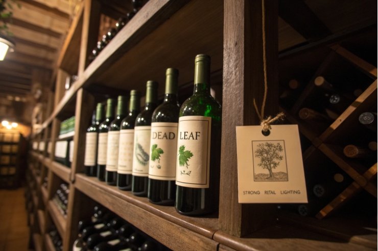
- Dark green / dead leaf: good UV protection, classic for reds and age-worthy whites.
- Amber: very strong light protection, common in beer and some oxidative styles.
- Flint (clear): minimal protection, but maximum product visibility.
A simple comparison:
| Glass color | Best for | Main benefit | Main risk |
|---|---|---|---|
| Dark green | Reds, serious whites, cellaring | Light protection, classic look | Wine not visible in detail |
| Light green | Everyday whites, rosé in some mkts | Balanced look, still some shade | Less UV protection than dark green |
| Flint | Rosé, aromatics, ready-to-drink | Shows color, modern / premium cue | Needs tight control of light exposure |
| Amber | Oxidative styles, special cases | Maximum light blocking | Can look “beer-like” if mis-applied |
For rosé, flint is almost mandatory in many markets because color is the hero. For fine red Bordeaux, flint would feel wrong and risky. Color should follow the wine’s story, not just design trends.
Market differences and shelf reality
Consumer expectations are not the same everywhere:
- In many Old World regions, dark green for reds and serious whites feels “normal”.
- In some New World markets, flint is linked with modern, clean, “Instagrammable” brands.
- Nordic and some Asian markets can favor flint for everything from Sauvignon Blanc to premium rosé.
I always think about:
- Retail lighting: strong LEDs or sunlight near windows push me toward darker glass or full cartons.
- Fridge doors: flint looks great in chilled cabinets, but only if stock turns quickly.
- Online photos: clear glass makes product photography easier and more attractive.
If your brand has a sustainability message, glass color is also part of that. Many greens can take higher recycled content; using more recycled glass cullet 3 generally reduces melting energy and supports better footprint math. {#fnref3}
What glass weight and punt depth signal tier?
Most people never read the gram number, but they feel it. Heavy glass and a deep punt still read as “expensive”, even when many buyers also care about carbon footprint.
Higher glass weight and deeper punts still signal premium, but modern brands often aim for the lightest bottle that feels solid in hand and runs safely on the line.
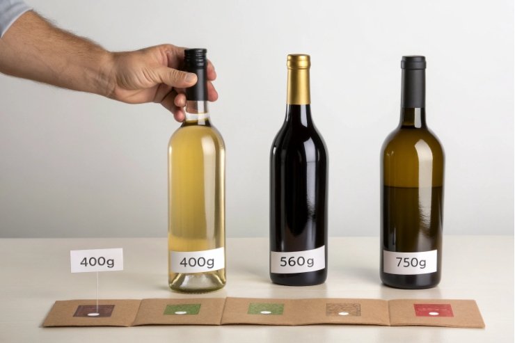
There is no single rule, but patterns are clear:
- Entry level: 380–430 g glass
- Mid-tier: 430–500 g
- Premium and reserve: 500–750 g
- Icon / showpiece: sometimes 800 g+
A rough tier map:
| Tier / role | Typical empty weight | Perceived message |
|---|---|---|
| Value / house wine | 380–420 g | Simple, honest, efficient |
| Core retail range | 420–480 g | Good quality, not flashy |
| Premium / on-trade | 500–650 g | Serious, giftable, “special” |
| Icon / limited | 650 g+ | Luxury, collectable, low-volume |
If you want a modern sustainability anchor, the Sustainable Wine Roundtable’s Bottle Weight Accord 4 is a useful benchmark for where the industry is moving (and what retailers may start expecting). {#fnref4}
Above a certain point, more glass is just more glass. It lifts freight costs, EPR fees, and carbon numbers without adding much extra perceived value. I often see sweet spots around 430–460 g for core ranges and 520–580 g for premium lines.
The right answer depends on:
- Target price point and channel.
- Export distances and pallet efficiency.
- Local sustainability expectations and retailer guidelines.
Punts: grip, optics, and honesty
The punt (the dimple in the base) has three jobs:
- Optical: makes wine look deeper in color and more elegant on table.
- Practical: gives a grip point for pouring and space for sediment on older wines.
- Brand signal: deeper punts are read as higher tier in many markets.
But there is a risk: a deep punt on very thin glass looks fake. People feel the disconnect. Punt design should match the glass weight and brand tone.
Simple guidelines I use:
- Everyday wines: shallow punt or almost flat base, stable and efficient.
- Premium still wines: moderate punt, enough to feel traditional and good for pouring.
- Sparklers: engineered deep punts for pressure, not only style.
All this must also work with your machinery:
- Base design must sit flat on conveyors and pallets.
- Punts should allow clean placement of inkjet codes or debossed dates, where needed.
- Heavy bases should not push total height outside your capsule and carton specs.
In short, weight and punt depth are tools. Use them to support your price story, but do not let them destroy your sustainability and freight math.
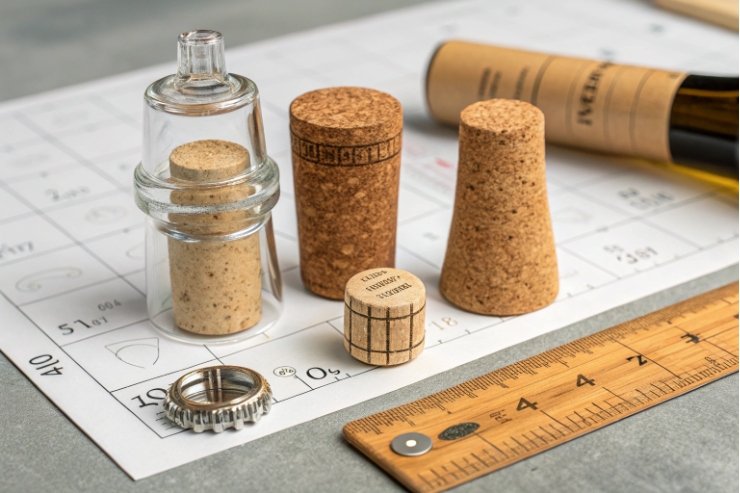
Which closure drives finish dimension choices?
Closure is the last thing the consumer touches before they taste. It is also what tells your glass supplier exactly which finish and neck you need.
Decide first whether your brand leans to natural cork, technical cork, screw cap, or alternative closures, then choose a neck finish (cork mouth, BVS, crown, etc.) that fits both the closure and your equipment.
How closure and brand promise lock together
Closure choice is not only technical. It is emotional:
- Natural cork signals tradition, ritual, and age-ability.
- Technical / micro-agglomerated cork signals control and reduced TCA risk.
- Screw cap (Stelvin) signals freshness, zero fuss, and often New World confidence.
- Glass stoppers, crown, or others signal design-driven or niche positioning.
If you are specifying screw caps, start with the system definition (finish + liner + application conditions). Amcor’s overview of the STELVIN screw-cap system 5 is a clean reference for how BVS finishes and liners are treated as one package. {#fnref5}
Each one needs a different neck and finish:
| Closure type | Typical finish | Main use |
|---|---|---|
| Natural / tech cork | Cork mouth (e.g. 750-CETIE) | Still wines, traditional markets |
| Screw cap (Stelvin) | BVS / roll-on pilferproof | Still wines, freshness and export lines |
| Crown cap | Crown finish | Pet-nat, some sparkers, tank samples |
| Sparkling cork + cage | Special sparkling finish | Traditional method sparkling wines |
| Glass stopper | Dedicated glass-stopper neck | Design-led, premium whites or rosé |
So before finalizing your bottle, answer this clearly: what do you want people to feel when they open your wine, and what closure supports that?
Technical checks before you lock the finish
Once the closure family is set, I check four things:
-
Line compatibility
- Does your existing filler handle that finish height and diameter?
- Do you already own corkers / cappers / rollers for that closure?
-
Market and regulatory fit
- Are there markets where screw cap still faces resistance for certain styles?
- Do some appellations or competitions still expect cork for top tiers?
-
Oxygen management
- Screw caps: choose liner options to match desired OTR (oxygen transmission rate).
- Cork: align cork spec and length with intended aging window.
-
Decoration and capsule
- Neck length and taper must work with your capsule type or wax plan.
- Shoulder and neck transitions must leave clean space for neck labels or medals.
If you want a deeper technical view of oxygen transmission rate (OTR) 6 across closure families, it helps you match closure behavior to style and intended aging time. {#fnref6}
For cork-led ranges, it also helps to know the fault language and risk landscape around cork taint (TCA) 7 when you decide between natural, technical, and alternative closures. {#fnref7}
A closure that feels right in the hand but fights your filling line will eat margin fast. The best closure is one you can apply consistently, with low defect rates, that still fits your story and tier.
In a full range, I often keep one main finish for simplicity, then change closure type only on special cuvées. This keeps glass sourcing, MOQs, and spare parts under control while still signalling ladder steps in the line-up.
Conclusion
When you line everything up—shape, color, weight, punt, and closure—the bottle becomes a clear promise: this is the style, this is the tier, and this is how seriously you treat the wine inside.
Footnotes
-
Reference for standard wine bottle shapes and what each signals to shoppers and sommeliers. ↩ ↩
-
Peer-reviewed evidence that light rapidly alters white-wine aroma, supporting darker glass for sensitive styles. ↩ ↩
-
Explains how recycled cullet lowers melting energy and improves glass sustainability metrics. ↩ ↩
-
Details the Bottle Weight Accord target (<420 g) and why lightweighting reduces wine’s packaging emissions. ↩ ↩
-
Defines the STELVIN screw-cap system and its required BVS finish, liners, and application conditions. ↩ ↩
-
Technical overview of oxygen transmission rate (OTR) and how closure choices manage wine evolution. ↩ ↩
-
Explains cork taint (TCA) and common wine faults, helpful when choosing natural vs technical cork. ↩ ↩


