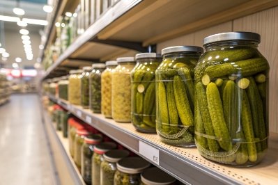
A strong product can still lose trust when a label peels in the fridge or looks crooked on shelf. Small label mistakes often look like big brand mistakes.
Perfect labels come from one clear match: your container shape, your filling line speed, and your real use conditions. Then the right adhesive, compliant content, and simple QC checks keep every bottle looking consistent.

Choosing labels is not only a design task. It is a packaging system task. The label must fit the glass or plastic surface. The adhesive must survive water, oil, and handling. The print must stay readable. The line must apply the label at speed without bubbles or flags. When one part is weak, the label becomes the first visible failure.
Start with the label “job,” not the label “look”
Define the product life in one sentence
A label that lives in a dry pantry behaves very differently than a label that sits in an ice bucket. Before choosing paper or film, the first step is to define the product life in a simple way, like: “This bottle goes from case pack to fridge to wet hands.” That sentence becomes the label brief.
Map the container geometry and the true label panel
Many label problems come from the bottle shape, not the label material. A label needs a stable panel. Taper and sharp radius create wrinkles. Embossed logos create lift points. Mold seams create small ridges that trap air.
A quick geometry check helps:
- Measure the straight wall height where a label can sit flat.
- Check if the diameter changes across that height.
- Identify no-label zones: shoulder slope, heel radius, emboss, deep seams.
- Decide if the label needs to wrap fully or sit as front/back panels.
Use a simple decision table before design work
This table keeps teams aligned. It stops the common mistake: choosing a premium paper, then learning later that condensation destroys it.
| Condition and channel | Best label family | Best face material | Common upgrade |
|---|---|---|---|
| Dry shelf, room temp | Front/back or wrap | Textured paper or BOPP | Matte varnish for scuff |
| Refrigerated, condensation | PSL wrap or front/back | biaxially oriented polypropylene (BOPP) film 1 | Cold-temp adhesive |
| Oil handling (olive oil, sauces) | PSL wrap or front/back | BOPP/PET film | Laminate for edge seal |
| Ice bucket, wet service | PSL film | BOPP/PET film | Strong wet-out adhesive |
| Complex bottle shape | Shrink sleeve | PETG/OPS/PVC (by market) | Matte sleeve + spot gloss |
| Dishwasher reuse | Film PSL | PET or durable BOPP | Heavy laminate + tested adhesive |
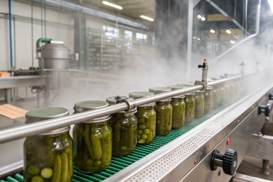
Protect the line speed and the people who run it
A label that looks perfect in a mockup can fail on the line. Line speed is real. Operator time is real. If the label requires slow hand work, the unit cost grows fast. A practical label choice supports:
- stable roll feeding
- clean release liner performance
- predictable placement on a datum point
- low reject rates during shift changes
A label is “perfect” only when it looks premium and runs smoothly.
When the label job and the bottle geometry are clear, the next decision becomes easier: PSL, paper, or shrink sleeve.
PSL, paper, or shrink labels: which fits your shape and line speed?
A label can look premium in a file and still fail in production. This happens when the label type fights the bottle shape or the application speed.
PSL works best for most bottles and jars with a clean label panel, paper works for dry and calm use, and shrink sleeves work best when the shape is complex or when 360° branding is needed at scale.
PSL is the safest default for most brands
Pressure-sensitive labels (PSL) 2 are the most forgiving for glass bottles and food jars. They apply well on flat panels and mild curves. They also support many looks: matte, gloss, clear “no-label look,” metallic foils, and tactile varnish.
PSL also scales well. A good labeler can place PSL at medium to high speed with stable repeatability. This matters when the brand grows and the line runs longer shifts.
Still, PSL is not magic. PSL struggles when:
- the label area is strongly tapered
- the glass has heavy emboss under the label
- the surface is wet or oily at application
Paper labels win on craft feel, but they need the right environment
Paper feels familiar and honest. It also photographs well. Many premium food and beverage brands love textured paper because it signals “handmade” and “heritage.”
But paper has a limit. Condensation can cause edge curl. Oil can stain the face stock. Friction can scuff ink. A protective varnish or laminate can help, but it changes the tactile story. This becomes a brand choice. A rustic look can accept some wear. A luxury look usually cannot.
Shrink sleeves solve shape problems and create a billboard
Shrink sleeves wrap the full body. They work well on:
- strong tapers
- grip contours
- bottles with many curves
- small diameters where wrap labels wrinkle
They also give huge design space. A brand can add story, QR codes, icons, and bold graphics without adding a second label. Sleeves can be perfect for RTD, functional drinks, and fast-moving retail.
But sleeves add process complexity:
- heat shrinking must be controlled
- film choice affects scuff and clarity
- recycling rules vary by market
- full coverage can hide the product, which can hurt trust for products like pickles or honey
If sleeves are on the table, it helps to understand common shrink sleeve substrates 3 early, because film choice affects both appearance and end-of-life options.
Choose label type with one table, then confirm with a line trial
A short trial often saves a full redesign.
| Bottle/jar shape | Line goal | Best label type | What to watch |
|---|---|---|---|
| Straight panel, low taper | Low to high speed | PSL | placement datum and bubble control |
| Strong taper, many curves | Medium speed | Shrink sleeve | shrink uniformity and scuffing |
| Wide-mouth jar, short panel | Medium speed | PSL front/back | edge lift near shoulder radius |
| Textured “craft” look | Low to medium speed | Paper PSL | condensation and rub resistance |
| Clear “no-label” look | Medium speed | Clear film PSL | haze, bubbles, and adhesive show-through |
A brand does not need to pick the fanciest label. A brand needs the label that stays clean and consistent in real use.
Next comes the part that decides most field failures: adhesive.
Which adhesives survive condensation, oil, and dishwashing?
A label material can be perfect, and the label can still fail because the adhesive was not matched to the real world. This is the hidden reason for corner lift and edge curl.
Adhesives must match the surface and the environment. Cold and wet need wet-out performance, oil needs resistance to creep, and dishwashing needs heat and detergent resistance plus a protective laminate.
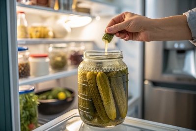
Condensation needs wet-out and cold performance
Condensation creates a water layer. Many adhesives cannot bond through that layer. Labels applied onto cold, sweaty bottles often fail later, even if they look fine at first.
A safer plan includes:
- cold-temperature adhesive rated for wet conditions
- applying labels when the container surface is dry
- using film face stocks that do not “water whiten” like some papers
One overlooked detail is adhesive wet-out time 4—if the product hits cold storage before wet-out completes, edge lift becomes much more likely.
For beverages that go into ice buckets, the label must survive long wet contact and rubbing. Film + proper adhesive is usually the clean answer.
Oil exposure needs edge security, not only center tack
Oil attacks the edges first. A consumer grips the bottle with oily hands, then the oil creeps under the label edge. Paper stains. Weak adhesive lifts. This often shows as flags near the seam.
A practical oil plan includes:
- BOPP or PET film face stock
- permanent adhesive with oil resistance
- laminate or varnish that reduces ink damage and improves edge stability
Dishwashing is a different standard
Dishwashing adds heat, detergent, and long exposure. Many labels do not survive. If reuse is part of the product story, testing is required. The “dishwasher safe” label system usually needs:
- film face stock (PET or durable BOPP)
- adhesive designed for heat and detergent exposure
- laminate that protects print and prevents water intrusion at edges
The closure and the cap liner also matter for reuse, but the label is the visible proof. If the label fails, the reuse story fails.
Build an adhesive selection table and test it fast
A quick in-house test often reveals more than a spec sheet.
| Use condition | Recommended face stock | Adhesive direction | Simple test |
|---|---|---|---|
| Fridge condensation | BOPP film | cold-temp wet-out | chill + sweat for 2 hours |
| Ice bucket service | PET/BOPP film | aggressive wet-out | soak + rub test |
| Oil handling | BOPP/PET film | oil-resistant permanent | oil wipe + edge lift check |
| Freezer storage | film | freezer-grade | freeze/thaw cycles |
| Dishwasher reuse | PET or heavy BOPP | heat + detergent resistant | 5 dishwasher cycles |
| Dry pantry | paper or film | standard permanent | rub in carton simulation |
A good label does not depend on perfect consumer behavior. The adhesive must survive real handling.
Now the label must also stay legal and consistent. That is where regulations and QC protect the brand.
How do regulations and QC stop bubbles, flags, and misalignment?
A label can be beautiful and still cause problems if required content is missing or unreadable. A label can also be compliant and still look cheap if placement drifts during production.
Regulations set what must be printed and how it must be shown, while QC keeps placement consistent and catches defects like bubbles, flags, skew, and barcode failures before products ship.
Regulations affect layout more than most teams expect
Content rules vary by product and market, but the label design impact is similar: space must be reserved, and text must stay readable.
Common content blocks that drive layout:
- product name and identity
- net contents and units
- ingredients and allergens (for food)
- warnings and safety icons (for chemicals, some cosmetics)
- barcode and quiet zone
- manufacturer/importer details
- batch/lot code strategy (label or direct print area)
When the team adds this content late, the label becomes crowded. The design looks rushed. The brand feels small. The better method is to plan a compliance panel from the start and keep it consistent across SKUs—using references like the FDA Food Labeling Guide 5 where applicable.
QC should focus on defects customers notice first
Customers do not measure millimeters. They notice crooked labels, trapped bubbles, and lifted corners. These defects also create supply chain issues because lifted corners snag in cartons.
Key visible defects:
- bubbles and trapped air lines
- flagging at edges
- skew and height drift
- wrinkles on taper
- seam overlap inconsistency
- scuffing and ink rub
- barcode scan failures
Use simple datums and process controls
Label alignment improves when there is one clear reference point. A datum can be:
- a mold seam line
- an embossed mark
- a back-panel center line
- a notch or feature on the container
Once the datum is chosen, the line can lock placement. Operators can then spot drift early.
Add a practical QC checklist that fits real operations
QC must be simple enough to run every shift. This keeps rejects low and consistency high.
| QC checkpoint | What it catches | How to check | When to check |
|---|---|---|---|
| First-piece approval | setup errors | visual + ruler from datum | first 20 units |
| Edge sweep | bubbles and flags | light angle + finger sweep | every 30–60 minutes |
| Skew check | crooked labels | angle gauge or grid board | every roll change |
| Seam overlap | wrap consistency | measure overlap width | per case sample |
| Rub test | scuffing | dry rub + carton rub | each new label lot |
| Condensation test | cold failure | chill + sweat + edge check | high-risk SKUs daily |
| Barcode scan | scan failures | handheld scanner | every pallet |
For barcode success, follow GS1 barcode placement guidelines 6 so the barcode quiet zone stays clear and scanners read consistently.
Catch issues early with one short story test
A short “real life” test often reveals hidden failures:
- place bottles in a fridge overnight
- remove and let them sweat
- wipe with a wet cloth
- rub against carton board
- scan barcode
If the label passes that, it often passes real customers.
If you need a standardized way to rate coating/ink adhesion during development, methods like the ASTM D3359 tape test 7 can help compare options before you scale.
A label is a promise. It promises quality, safety, and consistency. When regulations are built into the layout and QC is built into the process, the label stays strong from factory to shelf.
Conclusion
Perfect labels come from matching label type to shape and speed, matching adhesive to real conditions, planning compliance space early, and running QC that catches drift and edge failures fast.
Footnotes
-
Explains why BOPP film is durable and common for labels in wet, refrigerated, and high-scuff use. ↩ ↩
-
Quick definition of PSL and why it’s a reliable default for scalable bottle and jar labeling. ↩ ↩
-
Overview of shrink sleeve film options and practical considerations that affect performance and sustainability. ↩ ↩
-
Practical guidance on cold-label failures and how wet-out time affects adhesion after chilling and condensation. ↩ ↩
-
FDA reference for key food-label elements like net quantity statements and required labeling structure. ↩ ↩
-
GS1 guidance for barcode size, placement, and quiet zones to reduce scan failures at retail. ↩ ↩
-
Standard method reference for comparing coating adhesion with a tape test during print/coating validation. ↩ ↩


