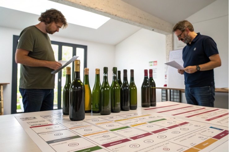
You put years into a wine, then risk the wrong bottle making it look cheap, age badly, or jam your bottling line. That hurts more than cork taint.
To choose a glass wine bottle, match shape, weight, punt, and color to your varietal and price tier, then lock closure, finish tolerances, ΔT/pressure specs, and decoration to what your line, logistics, and brand can reliably execute.

So the choice is not “this bottle looks nice”. It is a chain of decisions: wine style, market expectations, closure, bottling equipment, transport risks, sustainability rules, and brand story. When these line up, the bottle quietly helps you sell and protect the wine at the same time.
Which weight, punt, and color match varietal and tier?
You can have a great Cabernet in a very light bottle that feels like house wine, or a young entry-level white in a heavy monster that drives cost and freight up for no reason. Both send the wrong signal.
Choose weight, punt, and color by thinking “style × tier”: use classic shapes, sensible weight bands, punt depth, and glass tones that match how serious the wine is and how sensitive it is to light and aging.
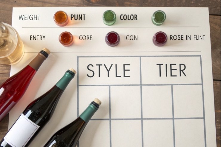
Match bottle family to wine style
First pick the wine bottle family (Bordeaux, Burgundy, flute, Champagne styles) 1. This sets the basic expectations:
| Wine style / varietal | Typical bottle family | Why it works |
|---|---|---|
| Cabernet, Merlot, Bordeaux blend | Bordeaux (high shoulder) | Signals structure and classic style |
| Pinot Noir, Chardonnay | Bourgogne (sloped shoulder) | Softer profile, linked to Burgundy heritage |
| Riesling, aromatic whites | Flute / Alsace / Mosel | Tall, slender, reads as aromatic and fresh |
| Traditional method sparkling | Champagne-style, punted | High pressure resistance, ritual and image |
If you go against these rules, do it on purpose. A modern blend in a Burgundy bottle can work if the label and messaging explain it. But if the shape fights the varietal, buyers feel “off” before they even taste the wine.
Bottle weight and price tier
Next, decide what each tier should feel like in the hand. Here is a simple frame for 750 ml still wine:
| Tier / role | Approx. empty weight* | Signal in hand | Notes |
|---|---|---|---|
| Entry / everyday | 360–420 g | Honest, light, modern | Better for EPR fees and freight |
| Core premium | 420–500 g | Solid, but not wasteful | Good balance for most quality wines |
| Icon / age-worthy | 500–650 g | Serious, cellar-worthy, “special” | Watch transport cost and retailer feedback |
*Ranges vary by market and supplier, but the message is what matters.
If you’re trying to lower freight and emissions, use data from wine bottle lightweighting guidance 2 to set realistic targets by tier.
Use heavier glass when:
- You sell mainly in restaurants or as gifts.
- The wine has real aging ambition.
- The price needs a strong “this is not supermarket” cue.
Use lighter glass when:
- You rely on volume and pallet efficiency.
- Your markets push hard on sustainability and EPR fees.
- Retailers have weight guidelines for shelves and staff.
You can also mix: for example, a lighter bottle for Sauvignon Blanc and a slightly heavier one for your reserve Cabernet, but still within the same design language.
Punt depth and base design
The punt is not only theatre. It helps stability, disgorging (for sparkling), and how the bottle looks on a table. If you want a reality check on signaling vs function, see how Decanter explains the wine bottle punt and perceived quality 3.
Think in three levels:
| Punt level | Use case | Pros | Watch-outs |
|---|---|---|---|
| Shallow / almost flat | Entry whites, rosé, basic reds | Stable, easy to wash, cheaper | Less “premium” look |
| Medium | Core range still wines | Good balance, works with many labels | Needs consistent glass control |
| Deep | Sparkling, icons, showpiece reds | Strong premium cue, good for pouring | More glass, higher cost/weight |
For sparkling, deep punts and heavy bases are non-negotiable for pressure. For still wines, deep punts are aesthetic. Do not overdo them on entry-level ranges; they add cost and weight with no real benefit.
Color by style, sensitivity, and channel
Glass color is one of your strongest silent tools. A useful practical primer is this guide on choosing clear vs colored wine bottles 4:
| Wine type / goal | Suggested color | Why |
|---|---|---|
| Long-aged reds | Dark green / antique green | Good UV protection, classic look |
| Fresh whites for retail | Dead leaf green / light green | Protection plus slight premium signal |
| Rosé and display whites | Flint (clear) or lightly tinted | Shows color, supports lifestyle image |
| Oxidative styles (sherry) | Dark amber / brown | Extra light defense |
If you choose flint for rosé or aromatic whites, protect the product with:
- Tight control of warehouse lighting.
- UV-blocking cartons or trays.
- Shorter shelf-life promises.
You can also reserve clear glass for on-trade or e-commerce channels where light exposure is lower and visual impact is worth the risk.
Do cork vs Stelvin drive neck/finish tolerances?
Many wineries start with “cork or screw cap?” as a brand question, but the glass neck cares even more than the consumer does. A nice bottle with bad finish tolerances will break your line and your closures.
Yes. Natural or technical corks need tight and consistent bore and mouth dimensions, while Stelvin and other ROPP screw caps need even stricter control of thread profile and top land flatness to seal and torque correctly.
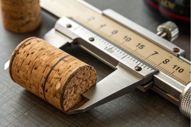
What cork actually uses on the neck
A cork system touches several parts of the finish:
- Inner diameter (bore) where the cork sits.
- Mouth diameter and bevel where the cork enters.
- Top surface that meets the capsule edge.
If the bore is too tight:
- Insertion force spikes.
- Glass can chip or micro-crack.
- Corks deform, which harms long-term sealing.
If the bore is too loose:
- Corks may creep over time.
- Oxygen ingress becomes unpredictable.
- Wine may leak under horizontal storage.
So for cork-driven lines, specify:
- Bore diameter tolerance and roundness.
- Allowed mouth chamfer variation.
- Surface quality inside the neck (no blisters or sharp seams).
Ask your bottle supplier to match these to your corker head and your chosen cork type (natural, micro-agglomerated, or synthetic). Each behaves slightly differently.
Stelvin / ROPP: thread and top land
For Stelvin and other ROPP closures, the finish is more complex. You now care about:
- Thread profile (pitch, angle, depth).
- Top land flatness where the liner compresses.
- Neck support ring that guides caps on the line.
If you’re specifying screw caps, start from the STELVIN® closure system requirements 5 and then align your bottle supplier, cap supplier, and torque targets as one package spec.
If the thread is off:
- Caps may cross-thread or not run down fully.
- Torque becomes inconsistent.
- Some bottles leak under side-load or during transport.
If the top land is not flat or within height spec:
- The liner will not compress evenly.
- Oxygen ingress and reduction control become unreliable.
- Some bottles may show weeping or staining under the capsule.
So screw-cap wines often demand the strictest finish AQLs in your portfolio. You may accept more decorative variation on the body than on the neck.
Mixed strategies and bottling line planning
Some producers want both cork and Stelvin on the same basic bottle for different markets. This can work, but only if:
- The chosen finish meets the stricter of the two closure systems.
- Your line can handle change parts without constant adjustment.
- You and your glass supplier agree on tighter finish tolerances from day one.
A simple comparison:
| Feature | Cork-finished bottle | Stelvin / ROPP bottle |
|---|---|---|
| Critical dimensions | Bore ID, mouth chamfer | Thread profile, land flatness, height |
| Line sensitivity | Medium | High |
| Consumer signal | Tradition, aging, ritual | Freshness, modern, reliable |
So yes, closure choice absolutely drives finish tolerances. If you want low hassle on the bottling line, treat the neck specification as a core part of the project, not a footnote.
What ΔT/pressure specs fit your fill line and logistics?
You can pick a beautiful bottle that fits your label and closure, then lose sleep when it starts breaking in the pasteurizer, during warm filling, or on a rough truck route. Technical specs matter as much as looks.
Choose ΔT and pressure specs based on your real process: fill temperature, storage, washing, CO₂ levels (if any), and worst-case logistics conditions, then confirm the bottle design meets that window with proper safety margins.
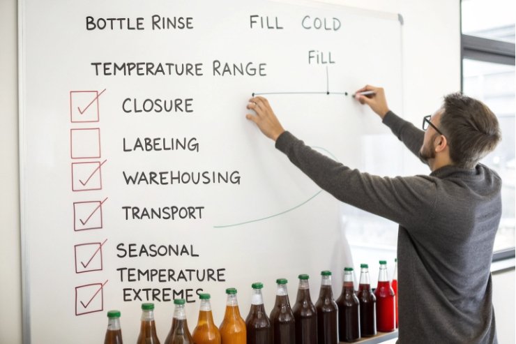
Map your real process, not the ideal one
Start with a simple process map:
- Fill temperature range (for example, 12–18°C for still wine).
- Any warming or cooling between filling and labeling.
- Warehouse and container temperatures in summer and winter.
- Any bottle washing or rinsing steps on site.
Even still wine bottles see temperature swings:
- Cold wine into warm glass, or warm wine into cool glass.
- Trains or trucks that sit in sun, then move into cold storage.
Share this map with your bottle supplier. Ask what ΔT (thermal shock) rating the bottle can handle, both hot-end and cold-end.
ΔT and line safety
Typical still-wine bottles are designed for moderate ΔT. But if you:
- Use very cold sterile filtration and filling.
- Wash bottles on site with hot water.
- Run quick changeovers between hot and cold products on the same line.
Then you need more headroom.
Ask for:
- Test results aligned to the ASTM C149 thermal shock resistance method 6.
- Recommended maximum temperature step between processes.
- Any special handling rules (for example, pre-heating empty bottles before very cold product).
This costs less to handle in design than in broken-glass cleanup on a bottling day.
Pressure, CO₂, and transport
Most still wines sit near atmospheric pressure. But some cases need more:
- Petillant or lightly sparkling styles.
- Wines that may start refermenting in bottle if something goes wrong.
- Rough logistics, where impact and stacking loads are high.
If you have any CO₂ beyond a very low level, tell your supplier:
- Target CO₂ at bottling.
- Maximum expected storage temperature.
They can translate this into an internal pressure window and check that the bottle design, weight, and shape can handle it.
For traditional method sparkling, you need dedicated high-pressure bottles. Never try to push a still-wine bottle into that role. Use the correct glass family.
Logistics: pallet, case, and export stress
Finally, think about where the bottle travels:
- Local only, short routes, small trucks?
- Long exports in uncooled containers?
- High stacking in warehouses?
This affects:
- Required vertical load resistance (stacking).
- Impact resistance (forklifts, conveyors, manual handling).
- The right choice of secondary packaging and dividers.
If a retailer demands 5 or 6 layers per pallet, let your supplier know. Ask them to validate the design for that stacking height with your chosen caseboard.
In short, do not guess. Share your real-world conditions and choose bottles that are proven to survive them with margin.
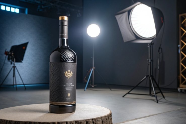
Which emboss and décor align with AQL and brand goals?
It is easy to fall in love with a heavily embossed, fully sprayed, foil-rich bottle on a mood board. It is harder to keep that same design within AQL, yield, and budget in a real plant.
Choose embossing and decoration that tell your brand story in one or two strong moves, while staying simple enough that your glass, printing, and inspection teams can hit your AQL targets without high scrap or line stops.
Decide what the bottle must say, in one glance
Start with the story, not the technique. Ask:
- Is this wine about place, heritage, or design?
- Should the bottle feel classic, minimalist, or ornate?
- Which cue must be visible from two meters away?
Then pick one or two hero elements, for example:
- Embossed estate name on the shoulder.
- A distinctive crest on the base.
- A strong, simple label with one foil element.
Everything else should support, not compete.
Decoration tools and their impact
Common routes:
- Paper labels (offset or digital). Flexible, lower risk, easy to change.
- Screen printing directly on glass. Very durable and premium but needs good surface quality.
- Hot foil stamping on labels or directly on glass. High impact, higher cost.
- Spray / coating (solid or gradient). Strong shelf effect but can hide defects and affect recycling.
- Embossing / debossing in the glass. Permanent and tactile, but tooling-sensitive.
Each one interacts with AQL:
| Decoration level | Production impact | Typical role |
|---|---|---|
| Simple label only | Easiest, highest yield | Entry and core ranges |
| Label + small emboss | Slightly more complex | Premium, but stable to produce |
| Heavy emboss + full spray | Higher scrap risk, more checks | Icons, limited editions |
If you want a complex look but need volume, consider moving detail to the label, not the mold. Paper is cheaper to change than glass.
AQL, QC, and what glass can truly hold
When you set inspection rules, anchor them to the ISO 2859-1 acceptance sampling system indexed by AQL 7 so suppliers and inspectors are speaking the same language.
Embossing and heavy decoration increase:
- The number of surfaces that can show small defects.
- The difficulty of automatic inspection.
- The sensitivity of the bottle to minor handling issues.
Agree up front:
- Visual AQL standards for bubbles, cords, blisters, and emboss clarity.
- Color and coverage tolerances for sprays and coatings.
- Label and print registration slices (how far off is still “OK”).
Then build pilot runs where you check:
- Yield at real speeds.
- How many bottles are downgraded or scrapped.
- How your operators cope with the new design.
This is also where sustainability comes back. Heavy coatings and metallization may look great, but they can complicate recycling or returnable systems. If your brand wants a strong environmental story, aim for:
- Uncoated or lightly coated glass.
- Embossing plus high-quality labels instead of full-body sleeves.
- Inks and adhesives that work cleanly in local recycling streams.
Decor that supports a bottle family
Finally, think long-term. It is cheaper and more coherent to build a bottle family than one-off designs per SKU.
For example:
- Same mold and embossing across varietals.
- Different label colors and foil tones by tier.
- One “icon” special finish reserved for the very top wine.
This keeps your AQL and tooling under control while giving the consumer a clear ladder from entry to flagship.
Conclusion
A good glass wine bottle is not just beautiful; it is the point where wine style, closure, line limits, logistics, cost, and brand story all meet in one reliable, scalable shape.
Footnotes
-
Quick visual guide to common wine bottle families and what they signal on shelf. ↩ ↩
-
Practical report on reducing wine bottle weight without breaking distribution or brand cues. ↩ ↩
-
Explains what punts do (and don’t do) for quality, strength, and perception. ↩ ↩
-
Helps choose glass color based on UV risk, wine style, and retail display reality. ↩ ↩
-
Official overview of Stelvin screw caps and the matching bottle neck-finish system. ↩ ↩
-
Plain-language summary of ASTM C149 thermal shock testing for commercial glass bottles. ↩ ↩
-
Defines AQL-linked acceptance sampling so QC thresholds and inspection plans are consistent. ↩ ↩


