Most shoppers decide if a perfume feels “for him”, “for her”, or “for everyone” long before they spray it. That judgment comes from the glass, not from the juice.
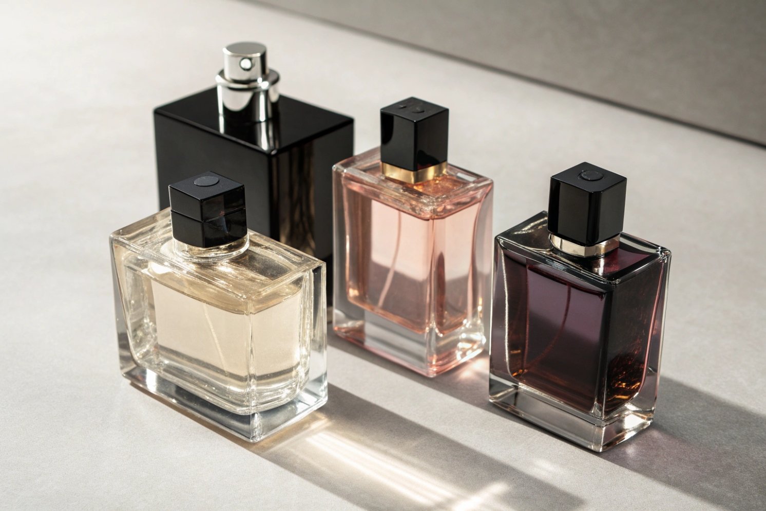
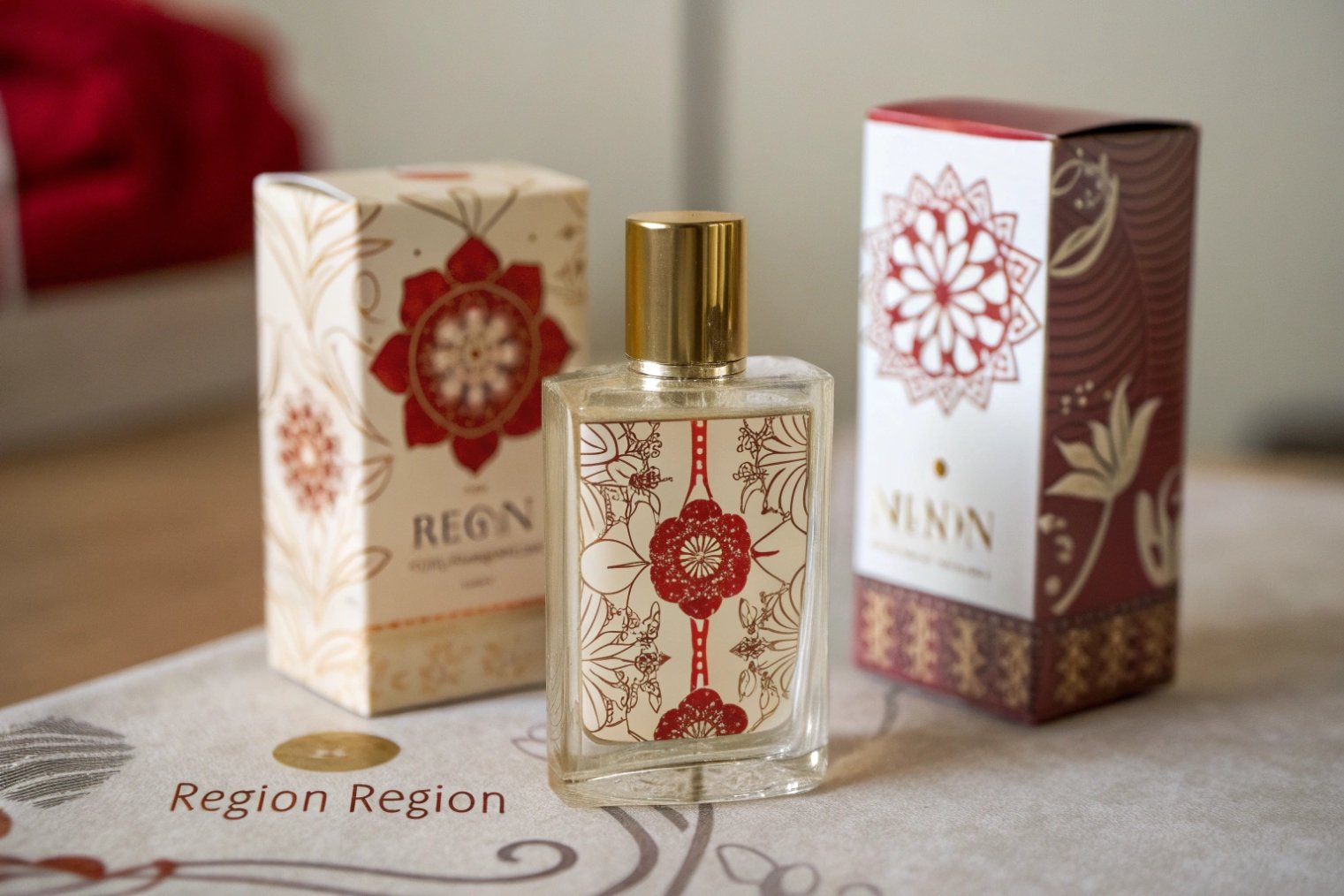
Perfume bottles signal gender cues through shape, color, typography, weight, and texture. Together these details create a fast visual story that frames the scent as masculine, feminine, or unisex before the cap even comes off.

These cues are not “truth” about scent—they’re cultural design codes people have learned from decades of retail. If you understand the codes, you can use them intentionally (or avoid them) instead of copying stereotypes by accident.
Do bottle shape, color palette, and cap design signal masculine, feminine, or unisex positioning?
Yes. Angular shapes, dark palettes, and blocky caps often read more masculine. Curved silhouettes, lighter palettes, and decorative caps often read more feminine. Simple geometry, neutral tones, and restrained contrast typically read unisex.
Shape language: angles vs curves
Shape is the fastest cue on a shelf or a phone screen.
-
Masculine-coded form cues
- Rectangles, squares, sharp shoulders, crisp bevels
- Tall, upright posture (strong verticals)
- Thick base, low “waist” variation
-
Feminine-coded form cues
- Curves, waists, ovals, domed shoulders
- Softer transitions, “flowing” profiles
- Delicate proportions, more negative space
-
Unisex-coded form cues
- Clean cylinders, simple blocks, “apothecary” or “lab” silhouettes
- Balanced proportions (not exaggerated wide or tall)
- Minimal contouring—quiet, functional geometry
A simple rule: the more “architectural” the silhouette, the more it tends to read masculine or niche; the more “ornamental,” the more it tends to read feminine.
Color palettes and glass tone
Color either reinforces shape—or flips it.
| Palette direction | Common signals | Typical gender read |
|---|---|---|
| Dark / cool | black, charcoal, navy, deep green, gunmetal | masculine-leaning |
| Light / soft | blush, lilac, ivory, champagne, pastel | feminine-leaning |
| Neutral / earthy | clear, smoke grey, amber, olive, beige | unisex / niche |
| High contrast | black + gold, white + black | bold, often masculine-leaning |
| Low contrast | tonal pastels, soft gradients | gentle, often feminine-leaning |
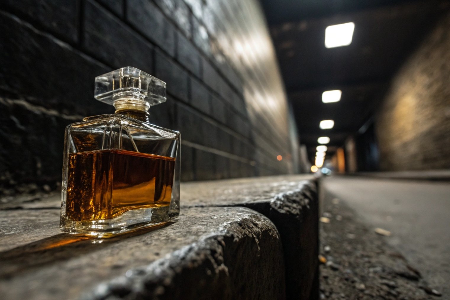
Visible juice color also “sets the mood” quickly: pale = airy/fresh; deep = warm/intense. Even in identical glass, a darker fill can make the same design feel more “serious.”
Cap design and proportion
Caps act like the “signature accessory.” They can change the gender read instantly.
-
Masculine-coded caps
- Short, wide, blocky caps
- Matte finishes, brushed metal, knurling
- Minimal detailing
-
Feminine-coded caps
- Taller caps, domes, sculpted tops
- Gloss, crystal-like cuts, decorative rings
- Jewelry cues (bows, stones, florals)
-
Unisex-coded caps
- Simple cylinders/discs, flat tops
- Same tone as bottle (low contrast)
- One clear material story (all metal or all matte)
If you want unisex but premium, a common move is: neutral bottle + slightly oversized metal cap (quality signal without strong gender decoration).
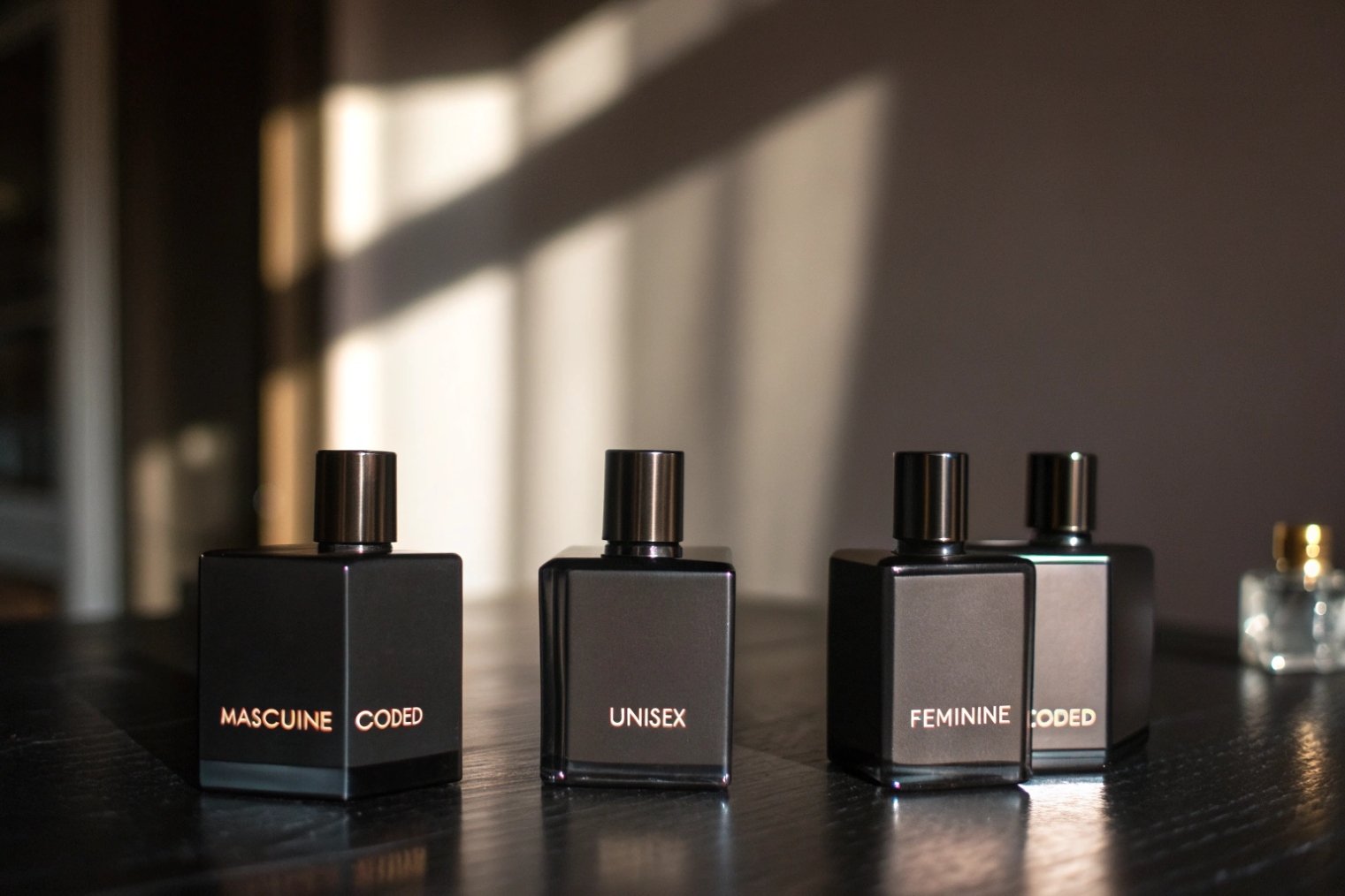
How do typography, label size, and decoration finishes influence gender perception?
Typography weight, label scale, and finishes like foil or emboss can push a neutral bottle strongly toward “bold,” “soft,” or “neutral.”
Typography: the “voice” of the bottle
-
Masculine-coded typography
- Bold sans-serif, wide tracking, ALL CAPS
- Tight, centered layouts; minimal copy
- High contrast (black on clear, white on black)
-
Feminine-coded typography
- Serifs with finesse, scripts, or rounded sans
- Mixed case, thinner strokes, more rhythm
- Softer ink colors, more breathing room
-
Unisex / niche typography
- Clean mid-weight sans or modern serif
- Editorial restraint (brand + name only)
- Quiet hierarchy; nothing shouting
Small typographic tweaks matter more than people expect: switching from script to clean sans can move the whole product into gender-neutral territory without touching the glass.
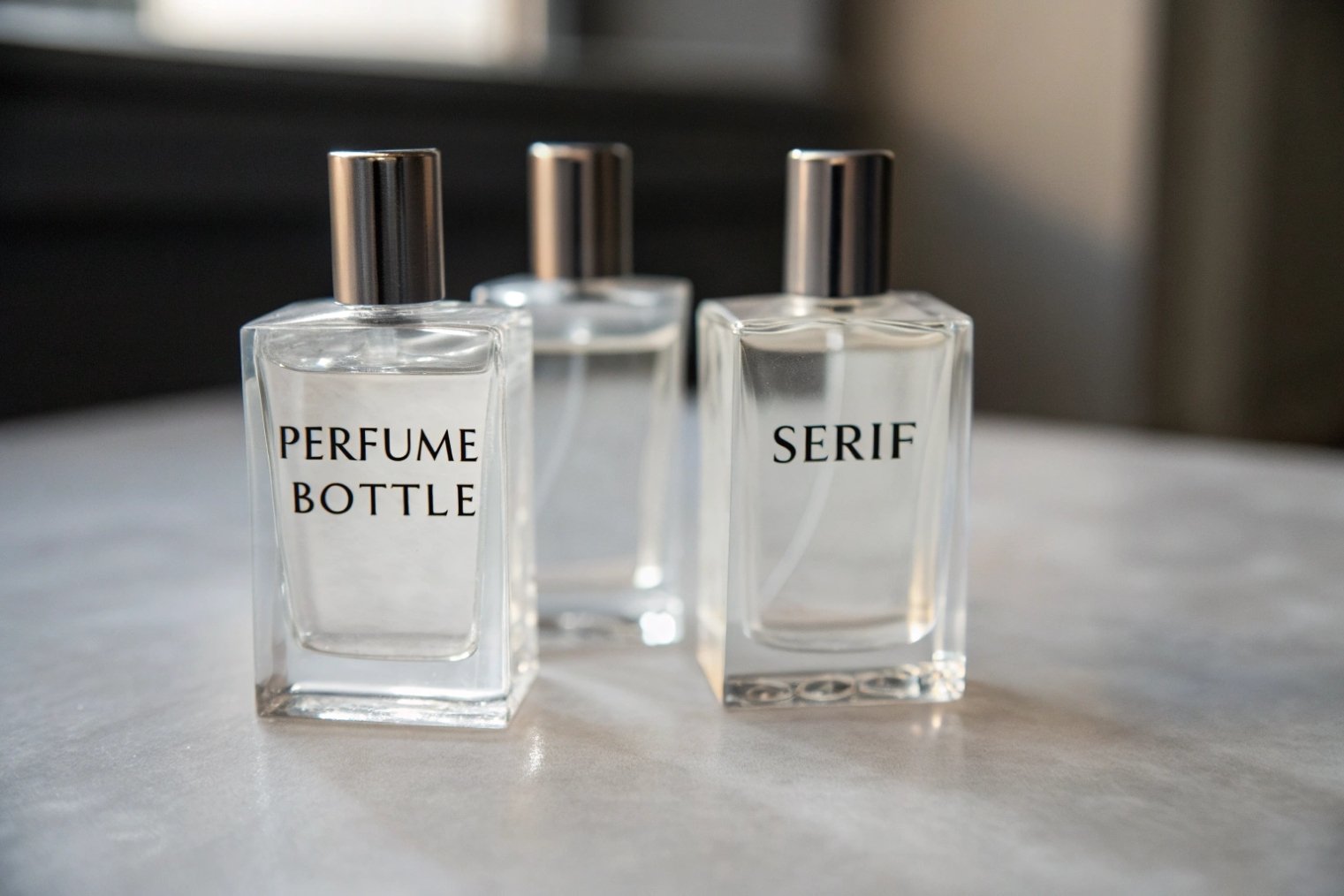
Label size and placement
| Label choice | What it communicates | Typical read |
|---|---|---|
| Small plaque / small mark | controlled, discreet, “technical” | masculine / unisex |
| Large front label | expressive, lifestyle, “approachable” | feminine-leaning |
| Vertical narrow label | architectural, modern | masculine / niche |
| Centered square label | balanced, flexible | neutral |
Do heavier glass bases and magnetic caps read “more masculine”?
Often, yes—because weight and “click” cues feel engineered and serious. But they can also read simply “luxury” if the rest of the design stays neutral.
Why weight changes perception
Weight is a silent message:
- heavier = “lasting value”, “power”, “premium”
- lighter = “delicate”, “airy”, “playful”
Magnetic caps add ritual and precision (the firm close). In many markets, that lands closer to “engineered” than “ornamental,” so it can skew masculine unless balanced by softer cues (color, curves, typography).
Practical tip: If you want premium without strong gender coding, keep the weight—but avoid extreme shapes and high-contrast palettes.
How do regional culture and retail channel norms reshape gender cues?
A bottle that reads neutral in one market can read feminine or masculine in another. Channel matters too: e-commerce needs clear cues at thumbnail size, while in-store context can do more of the sorting work.
Culture changes the meaning of color and symbols
Gold, white, red, florals, animals, and even “minimalism” can carry different associations across regions. Many global brands keep the bottle shape consistent but tune:
- cap finish (matte vs gloss, metal tone)
- label color and contrast
- outer box graphics and wording
Channel changes how “loud” the codes must be
| Channel | How shoppers decide fast | What to prioritize |
|---|---|---|
| Department store | strong gender zoning + quick scanning | silhouette + color contrast |
| Beauty specialty | discovery + testers + niche acceptance | refined typography + material quality |
| Mass/drug | speed + clarity | simple hierarchy + legible name |
| E-commerce | thumbnails + few seconds of attention | bold readable mark + clear shape |
A simple design cheat sheet
If you want a fast internal alignment tool, map your bottle like this:
| Element | Masculine-leaning cues | Feminine-leaning cues | Unisex cues |
|---|---|---|---|
| Shape | angular, straight, thick base | curved, waisted, decorative | simple, balanced, minimal |
| Color | dark, cool, high contrast | light, warm, soft gradients | neutral, tonal, restrained |
| Cap | blocky, matte, engineered | tall, glossy, jewel-like | clean cylinder/disc, low contrast |
| Type | bold sans, all caps | serif/script, lighter strokes | editorial, restrained |
| Finish | satin/matte, brushed metal | pearl/gloss, ornate foil | minimal print, small foil accents |
Conclusion
Perfume bottles communicate gender cues through visual language and tactile signals—shape, palette, typography, weight, and finishes. Use these cues deliberately: either to fit classic “for him/for her” retail patterns, or to build a modern unisex identity that feels premium without boxing anyone in.


