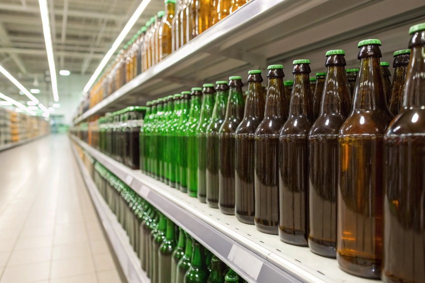
When buyers stand in front of a shelf, they judge price level in a few seconds. Very often, they do this before they even read the label. The glass itself sends the signal.
Glass bottle material properties shape product tiering by controlling clarity, color, weight, precision, and sustainability. High flint, controlled color, heavier bases, tight finishes, UV protection, and strong eco-metrics all push a bottle into higher price tiers.

In FuSenglass daily work, the same basic shape can look entry-level, mid-tier, or luxury. The difference often comes from glass recipe, forming control, and post-processing choices. When these are clear, brand owners can design a “ladder” of good, better, best without changing their filling line or closure system.
Customers do not need a lab to read glass quality. They hold the bottle to the light. They look for color cast, haze, and bubbles. Their brain links these to price.
High flint clarity, tight color control, and low bubble count are strong cues for premium tiers. Visible tint shifts and random bubbles usually signal economy or “craft” stories, not pure luxury.
How optical quality defines the price ladder
When we plan a range for a brand, clarity and color are usually the first “tier switch” we use. Buyers may not know the term “extra flint”, but they feel the difference at once.
Clarity and whiteness
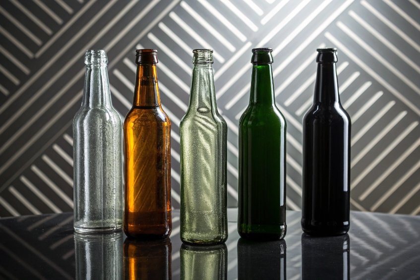
- Economy tier often uses standard soda–lime glass 1 in “flint” grade. It can have a slight green or grey tone. This is fine for sauces, juices, and many mass-market products.
- Mid-tier may step up to improved flint or “high flint”, with better purity and lower iron. The content color looks cleaner and brighter.
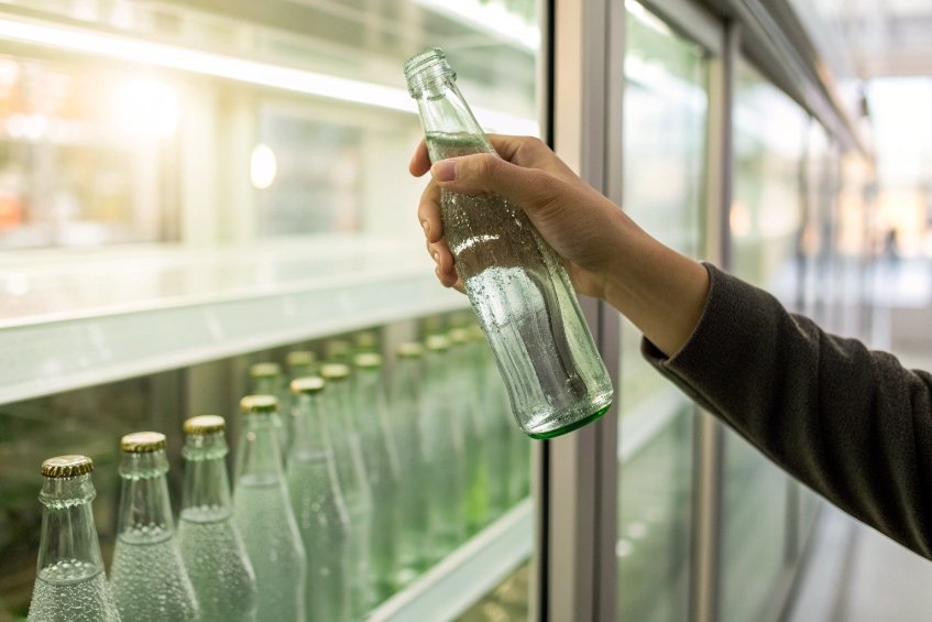
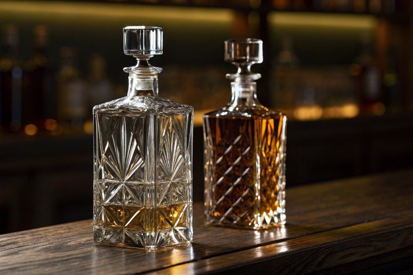
- Premium and prestige tend to use extra / super flint. This needs very pure raw materials and tight furnace control. The glass looks almost “invisible”, so the liquid feels like it floats inside the bottle.
For color-driven products like perfume, wine, and skincare, extra flint lets the true tone of the formula show. This supports higher price claims because the product looks more “true” and pure.
Color consistency and special tints
Color is not only about clear vs amber or green. It is also about consistency from batch to batch. In practice, premium teams usually lock tolerances around measured color using CIE L*a*b* and ΔE color difference 2 so “same shade” is defined numerically, not by opinion.
- Premium brands want the same shade of flint, amber, or green across global deliveries.
- Economy lines accept a wider tolerance, because their buyers are more price-focused.
Special colors support different stories:
- Amber and dark green say “protection” and “tradition”. Good for beer, wine, pharma, and actives.
- Cobalt blue or custom tints say “niche” or “boutique”. They often live in premium or gift segments because the color itself costs more.
- “Wild flint” with cullet tint adds a natural, slightly tinted look. It fits “craft” and eco-luxury stories.
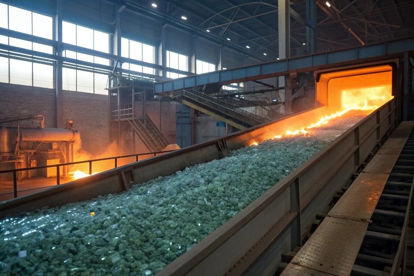
Bubble control and visual defects
Every furnace will make some seeds and bubbles. The question is how many, and what size.
| Quality Aspect | Economy Tier Expectation | Premium Tier Expectation |
|---|---|---|
| Bubble frequency | Occasional small bubbles visible | Very few, almost no visible bubbles |
| Striae / twist | Light optical waves acceptable | Minimal waves, smooth light transmission |
| Inclusions | Very rare, but some accepted | Strong rejection of visible inclusions |
For economy products, a few micro-bubbles can even support a “handmade” look. For luxury spirits or high-end skincare, they break the image at once. So furnace control and inspection rules must match the tier promise.
How do base weight, wall uniformity, and finish precision affect price positioning?
When a person lifts a bottle, the hand feels the truth. A light, uneven bottle fights any “premium” claim. A solid base, stable walls, and clean finish tell a different story.
Heavier bases, more uniform walls, and tight neck finishes strongly support higher price tiers. They improve hand-feel, pouring control, and closure performance, which buyers link with quality and value.
The “weight story” is changing, but feel still matters
Weight used to be the main signal. Many luxury spirits and wines moved to very heavy bases to show power and value. Now regulators and consumers care more about carbon footprint, so the rule is changing. Still, perceived solidity is important across all price levels.
Base weight and center of gravity
- A heavy base gives a strong, stable feel on the table. It feels safe, hard to tip. This is a classic cue for top-shelf spirits, perfumes, and high-end oils.
- A medium base is common for mid-tier daily products. It balances cost, shipping weight, and stability.
- A light base saves glass and freight. It is good for value ranges and eco-focused SKUs, as long as the design still looks stable and well-balanced.
Premium brands today often ask for “smart heavy” designs. We remove weight where it does not add value and keep it in the base and key touch points. This supports both luxury feel and sustainability claims.
Wall thickness and uniformity
Wall thickness is not just about strength. It also changes how the product looks inside the bottle.
- Thick, uneven walls create distortion and color variation. This can cheapen the appearance.
- Uniform walls give clean reflections and a smooth light path. The logo and content look sharp from every angle.
For extra flint bottles, wall uniformity is critical. Any thin area will look “brighter”, any thick area “darker”. This thickness-to-brightness behavior generally follows Beer–Lambert law 3 style attenuation, so small thickness variation can become visible in strong retail lighting. If this pattern is random, the shelf image feels chaotic. So hot-end control and NNPB / blow-and-blow settings must match the tier.
Finish precision and user experience
The neck finish is where design meets function. High tiers demand:
- Tight tolerances on thread, bore, and sealing surfaces.
- Smooth, clean land for closures and tamper bands.
- Good verticality, so labels and capsules align.
This is not only about leaks. A rough or badly formed finish makes caps feel “gritty” or loose when they turn. A smooth, precise finish gives a clean click and stable torque. That small detail often separates mid-tier from premium in the user’s mind.
A simple view of how these factors play into price:
| Property | Economy Positioning | Premium Positioning |
|---|---|---|
| Base weight | Light, stable enough | Focused weight in base, strong hand-feel |
| Wall uniformity | Basic control, some variation | Tight control, minimal optical distortion |
| Finish precision | Functional, wider tolerance | Precise, smooth, strong closure performance |
Designers can fine-tune these levers to build clear steps in a brand ladder, while keeping the same basic silhouette.
Does UV protection (amber/green/UV coating) align with higher product tiers?
Some products need protection from light. Others use dark glass as a style choice. In both cases, color and coating decisions send a clear message about the product tier and promise.
UV-protective glass can signal either “functional care” or high-end performance. Amber, green, and UV coatings often sit in higher tiers when they connect to product stability, actives, and origin stories.
Functional protection vs style-driven darkness
In technical terms, amber glass gives strong UV protection. Dark green and some coated systems also reduce light damage. But consumers do not read wavelength charts. They react to the story behind the color.
Amber and pharma-grade protection
Amber glass is strongly linked to:
- Pharmacy and medical bottles.
- Serious skincare with retinol, vitamin C, or other sensitive actives.
- Specialty beers and some health drinks.
Here, the color says: “This formula needs protection, so we protect it.” That supports higher positioning because the pack looks more engineered and trustworthy.
Green, black, and coated solutions
Dark green glass protects less than amber but still blocks some light. It links to:
- Traditional wine and olive oil.
- Heritage and regional stories.
Black or very dark coated bottles often sit in prestige segments:
- Niche perfumes and serums.
- High-end spirits with mystery and drama.
These bottles may use clear glass plus UV coating, or naturally darker glass with extra spray. To keep claims honest, it helps to reference defined ultraviolet radiation bands (UVA/UVB) 4 and specify what wavelength range the package actually blocks.
UV features inside a tiering strategy
Not every product with UV needs to be premium. A simple technical range can use standard amber for clear “pharmacy” signals. But for higher tiers, we see patterns like:
- Extra flint for entry line, amber or dark coated glass for “pro” line.
- Clear glass for lower strength formulas, amber or black for high-actives hero products.
So UV protection becomes one more lever:
| Aspect | Economy / Standard | Premium / Specialist |
|---|---|---|
| Glass color | Standard flint or light green | Deep amber, dark green, or coated black |
| UV function message | Basic shelf life | Protects actives, “lab-grade” performance |
| Decoration mix | Simple print and label | Embossing, metallic, or textured finishes |
When UV choices are tied to real product needs and clear claims, they support higher price points without looking like empty decoration.
Which certifications and sustainability metrics (cullet %, emissions) elevate brand perception?
Today, many buyers judge quality not only by how the bottle looks, but by how it is made. They ask about recycled content, energy use, and certifications. This shifts the idea of “premium” from only heavy and shiny to “high-end and responsible”.
Higher cullet content, lower emissions per bottle, and clear certifications now play a big role in premium perception. They help brands tell a “sustainable luxury” story without losing the quality cues of glass.
Cullet percentage and visual story
Cullet is recycled glass that goes back into the furnace—often specified and audited as glass cullet (recycled container glass) 5. More cullet means:
- Lower melt temperature and less energy per ton.
- Lower CO₂ emissions.
- Often, a slight color shift in flint if cullet mix is high.
For some eco-luxury projects, we use “wild flint” with visible tint and tiny variations. These are not defects. They become part of the story:
- “No two bottles are exactly the same.”
- “High recycled content, low impact.”
For classic crystal-clear prestige, we still use very clean cullet and more virgin raw material. But many top brands now ask us to find a balance between purity and recycled content.
Emissions, energy, and certifications
Glass plants can track:
- CO₂ per ton of glass.
- Energy use (gas and electricity).
- Use of renewable energy.
For credibility across global channels, many brands align carbon accounting language with the GHG Protocol Product Life Cycle Standard 6 and then translate results into simple, consumer-friendly claims.
When factories hold ISO-style certifications, food-contact approvals, and sometimes external carbon data, brands can turn this into clear claims:
- “Bottle made in a low-emission furnace.”
- “X% recycled glass content.”
- “Fully recyclable mono-material pack.”
For global retail and duty-free channels, third-party audits and quality certifications also support higher tiers, because they reduce risk for big buyers.
The old rule was simple: heavier glass equals more premium. Now, the new rule looks more like this:
| Dimension | Old Luxury Signal | New Premium Signal |
|---|---|---|
| Weight | Very heavy base and walls | Smart lightweight, still solid in the hand |
| Sustainability | Rarely mentioned | Clear cullet %, emissions, recyclability |
| Story | Status, power, tradition | Care, responsibility, modern craft |
At FuSenglass, many new bottle families combine:
- A more efficient weight profile.
- High cullet content where color and clarity allow it.
- Strong quality control, so lighter glass still feels safe and stable.
To make sustainability claims easier to verify for premium buyers, some brands also request third-party documents like Environmental Product Declarations (EPDs) 7 for packaging materials where available.
This helps brand owners move their whole range up in perception. They offer glass that looks and feels premium, but also fits the values of today’s customers and retailers.
Conclusion
Glass material choices define how a product feels on shelf and in the hand. With smart design, brands can climb the tier ladder while staying functional and sustainable.
Footnotes
-
Explains soda–lime glass basics and why “flint” clarity depends on impurities and composition. ↩ ↩
-
Defines L*a*b* and ΔE so color consistency can be specified with measurable tolerances. ↩ ↩
-
Shows how thickness and absorption change transmitted light—useful for understanding visible brightness banding. ↩ ↩
-
Reference for UV wavelength bands and exposure concepts used when making “UV protection” packaging claims. ↩ ↩
-
Clarifies what cullet is and why recycled glass content matters for manufacturing energy and emissions. ↩ ↩
-
Widely used framework for product carbon footprint accounting—helps brands report emissions per bottle consistently. ↩ ↩
-
Learn how EPDs present verified environmental impacts to support “responsible premium” positioning. ↩ ↩


