A glass bottle can look premium, yet fees can jump fast when scope stays vague and print limits appear late.
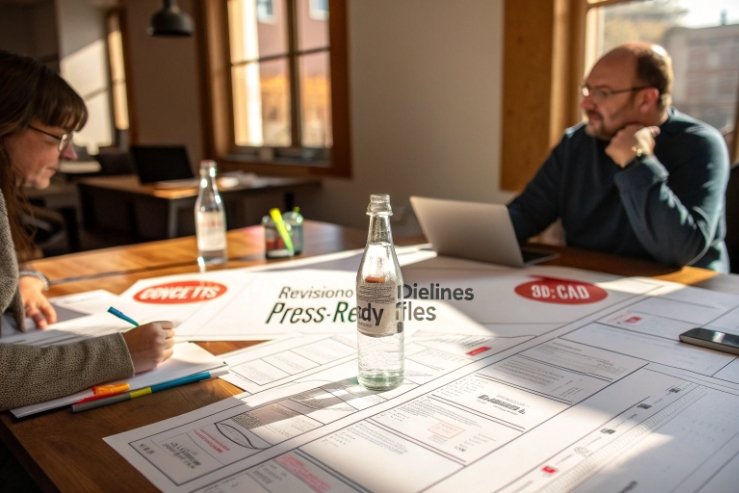
Glass-bottle packaging design is priced by scope: concepts, revisions, dielines, 3D/CAD, and press-ready files. Most teams bill these as separate phases, then add costs for special finishes, sample rounds, and SKU rollouts.

If the budget feels hard to predict, it usually comes from one thing: deliverables are not clearly listed. Once every output is named, pricing becomes simple. The real win is to tie money to decisions: which routes get explored, which files get production-ready, and how many times the team will re-open artwork after samples.
Are Concept, CAD/3D, and Prepress Billed Separately?
Buying “a label design” sounds simple, but glass bottles often need different skill sets and different software. That is why line items split.
Yes, they are often billed separately because concepts, CAD/3D, and prepress are different deliverables with different risk. Many studios bundle them into phases, but the cost drivers stay separate.
What is the real “unit” being priced?
Most quotes are not really for “design.” They are for outputs. Outputs take time. Time can be billed as a fixed fee or as hourly time. In the U.S. and Canada, many packaging studios quote around $100–$149 per hour for agency work. Some projects are sold as fixed packages because clients want price certainty, but those packages still assume a certain number of hours.
Where the split usually happens
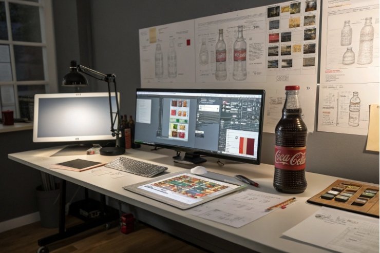
Concept work is about options. It includes mood boards, typography directions, and 2–4 distinct visual routes. CAD/3D is about structure and realism. It covers bottle shape constraints, label wrap geometry, and renders—often starting from a 3D bottle model 1—that show light, glass thickness, and decoration. Prepress is about production. A solid prepress workflow 2 includes packaging dielines 3, trapping notes 4, barcode rules, and clean separations that printers and decorators can actually use.
| Phase | Typical deliverables | Common billing method | What pushes cost up |
|---|---|---|---|
| Discovery + brief | brand inputs, competitor shelf scan, constraints list | fixed fee | unclear regulations, unclear channel (DTC vs retail) |
| Concepts | 2–4 routes, front/back layouts, type system | fixed or hourly | extra routes, extra revision rounds |
| CAD/3D + renders | 3D bottle model, photoreal renders, hero angles | add-on or separate phase | multiple bottle sizes, complex glass geometry |
| Production artwork | final label, dieline fit, vendor spec match | fixed phase | many SKUs, many languages, tight deadlines |
| Prepress support | separations, spot layers, printer handoff notes | hourly or retainer | multiple printers, frequent last-minute changes |
A practical way to scope it
When brands ask for a “single quote,” a clean approach is a staged quote:
- Phase 1: concepts (you can stop here if it is not right)
- Phase 2: refine + production artwork for one hero SKU
- Phase 3: optional CAD/3D, optional prepress, optional SKU extensions
This keeps the early spend focused on direction. It also stops the team from paying prepress-level fees before the brand has made a real choice.
Do Embossing and Special Inks Increase Artwork Fees?
Special finishes look great on glass, but they add technical layers. They also add more vendor back-and-forth. That is where fees rise.
Yes, embossing, foils, and special inks can increase artwork fees because they need extra layers, tighter tolerances, and more proofing with the printer or bottle decorator. The “idea” may not cost more, but production artwork often does.

Why finishes add labor
A standard CMYK label is one set of files. A label with foil, emboss, spot colors 5, and varnish is several sets of instructions. Each finish needs its own layer, naming rules, and limits. On glass decoration, there can be extra constraints like ceramic inks, screen print mesh limits, or minimum line weights. That forces more checks and more iterations.
From the manufacturing side, the biggest cost driver is not the finish itself. It is the risk of mismatch between artwork and the real process. Foil stamping 6 needs clean boundaries and safe margins. An emboss needs a clear height map and no tiny islands. A metallic ink may shift color under different lighting. So the designer spends more time building files that survive real production.
| Finish / technique | Why it adds work | Typical design add-on | Notes for glass bottles |
|---|---|---|---|
| Embossing and debossing 7 | needs clear area maps and tooling notes | extra production layer + proof support | label stock and adhesive affect result |
| Foil stamping | requires foil layer + trap + min stroke checks | add-on per SKU or per label | foil can crack on tight curves |
| Spot white (clear label) | needs white underprint layer | add-on for separations | critical for readability on dark liquids |
| Special inks (metallic, neon) | needs spot color setup + vendor specs | add-on for color-managed files | color shifts are common across runs |
| Varnish / soft-touch | needs varnish mask + safe zones | minor add-on | can change barcode scan quality |
A simple way to protect budget
Ask for two prices:
1) Standard print-ready CMYK (baseline)
2) “Finish-ready” production files with all spot layers and vendor handoff
This makes the upgrade cost visible. It also helps compare vendors. One studio may include separations. Another may treat it as prepress support. Both can be fair, but the scope must be named.
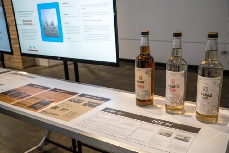
How Do Sample Rounds and Color Approvals Affect Budget?
Sampling feels like a production issue, yet it often becomes a design cost. Each sample round can reopen files, notes, and approvals.
Sample rounds and color approvals raise budget when they trigger new revisions, new proof cycles, or new press checks. The easiest control is to include a fixed number of rounds, then price extra rounds clearly.
What actually happens during approvals
A typical flow includes: digital proof → physical proof → decorated bottle sample → color sign-off. Each step can reveal issues that were invisible on screen. A label may wrinkle on a tapered bottle. A frosted coating may reduce contrast. A gold ink may look green under retail LEDs. When that happens, the design team must adjust files, export new proofs, and sometimes rewrite notes for the printer.
If approvals are not scoped, the team ends up in “free revision” mode. That burns time and creates tension. A healthier model is to treat approvals as a planned part of the job with a clear allowance.
| Approval step | What can go wrong | Design impact | Budget control |
|---|---|---|---|
| Digital proof | type size too small, barcode issues | quick edits | include 1–2 rounds |
| Physical proof (label) | color shift, varnish effect | color tweaks + notes | define Pantone targets |
| Decorated bottle sample | alignment drift, seam conflicts | adjust dieline + safe zones | add a “fit check” milestone |
| Final color sign-off | lighting differences, batch variation | locked specs + tolerance | document pass/fail criteria |
Tips that save money on glass projects
- Lock the bottle substrate early. Clear glass vs amber glass changes contrast.
- Use a simple “must match” list. Pick 2–3 hero colors. Let the rest be close.
- Ask for process limits up front. Screen printing and ceramic inks have real minimums.
- Write a color tolerance statement. Without it, teams chase perfection forever.
- Set who approves what. Too many approvers creates endless micro-edits.
In projects that involve multiple decorators, it helps to budget a small “vendor coordination” pool. That pool covers calls, spec checks, and file relabeling. It is not glamorous work, but it prevents costly late surprises.
What Retainers or Per-SKU Models Make Sense?
Bottle brands rarely stop at one SKU. Flavors expand. Seasonal editions appear. Compliance changes. A pricing model must match that reality.
Retainers work when changes are frequent and small. Per-SKU models work when layouts are templated and the brand expects many variants. The best approach is often a “master design + SKU rollout” structure.
When per-project pricing wins
If the goal is a new brand look or a new bottle family, fixed project pricing is clean. It fits a defined start and finish. It also aligns with high-value work like concept routes, brand story translation, and key visuals.
When per-SKU pricing wins
Per-SKU pricing is strong when structure and rules stay the same. The designer is not reinventing. The work becomes adaptation: new flavor color, new callouts, updated nutrition panel, and new regulatory text. Many studios discount per SKU when the template is stable. This is common in beverage, spirits, and functional drinks, where a family system is built once and then extended.
When a retainer makes sense
A retainer is best when there is ongoing production pressure: new markets, quick promos, frequent small edits, and constant file requests from printers. Retainers also work when a brand wants priority access to the same designer, not a new team each time.
| Model | Best for | What you pay for | Risk | How to set it |
|---|---|---|---|---|
| Fixed project fee | new brand, new bottle line | clear deliverables | scope creep | define routes + revision rounds |
| Master + per-SKU rollout | product families | system build + variants | template instability | lock rules, then discount SKUs |
| Hourly | uncertain scope | time used | cost uncertainty | cap hours per month |
| Monthly retainer | ongoing needs | reserved capacity | unused hours | set rollover rules and SLA |
A practical hybrid that brands like
- One-time “master build” fee: concept + final system + production files for 1 hero SKU
- Per-SKU rollout fee: each new variant priced lower because the system is reused
- Optional retainer: small monthly pool for micro-edits, vendor questions, and emergency file pulls
This setup keeps the expensive thinking work in one place. It also makes growth predictable. It prevents paying “new project” prices for routine flavor extensions.
Conclusion
Clear deliverables, fixed revision counts, and a master-to-SKU rollout plan keep glass bottle packaging design pricing predictable, even when special finishes and sampling are involved.
Footnotes
-
Understand what goes into building and rendering a 3D bottle model for packaging mockups. ↩︎ ↩
-
Learn what prepress includes so you can scope “print-ready” work accurately. ↩︎ ↩
-
See how dielines define cuts, folds, and panels so artwork fits real packaging. ↩︎ ↩
-
Understand trapping notes so files print cleanly without gaps or misregistration. ↩︎ ↩
-
Learn how spot colors work so you can plan inks, separations, and vendor specs. ↩︎ ↩
-
Understand foil stamping basics and file requirements to avoid costly production rework. ↩︎ ↩
-
Learn the difference between embossing and debossing so you can spec texture effects correctly. ↩︎ ↩


