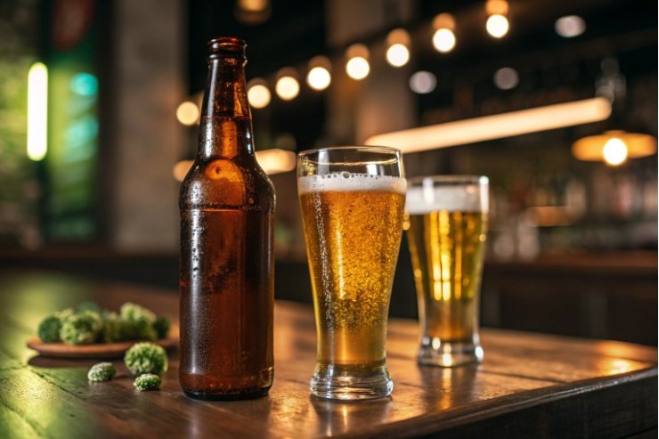
You buy the same beer in different bottles, and one tastes skunky. It feels random, but glass color and light exposure are quietly changing the flavor in the background.
Beer-bottle color changes taste indirectly. Amber glass blocks more UV and blue light, so it protects hop aroma and prevents “skunking” much better than green or clear glass, especially in bright retail and storage conditions.

Beer does not care about fashion. It only “cares” about light, oxygen, and time. Color is simply one way glass controls light, while branding teams push for clear visibility and iconic greens. Good packaging finds a balance between both.
Does amber block “skunking” better than green or clear?
You open a bottle and the first smell is wet dog or skunk, not hops. That is not a brewing fault. It is usually a light and packaging problem.
Yes. Amber glass gives the strongest real-world protection against light-struck “skunky” flavors, while green is weaker and clear glass is almost unprotected unless extra barriers or light-stable hop products are used.
What “skunking” really is
When beer sits in light, especially UV and blue light, hop-derived iso-α-acids break down. This breakdown makes small sulfur compounds that smell like skunk spray. You can notice this even after short exposure in direct sunlight or harsh store lighting.
A simple name for this defect is lightstruck flavour 1 {#fnref1}. It is closely linked to the compound 3-methyl-2-butene-1-thiol (MBT) 2 {#fnref2}, and it can be triggered by light in a band that overlaps the most damaging blue/near-UV region, including beer-relevant wavelengths discussed in work on riboflavin absorbance near 445 nm 3 {#fnref3}.
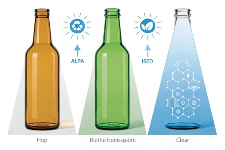
The glass color controls how much of that light reaches the beer:
- Amber / brown glass blocks most UV and a lot of blue light.
- Green glass blocks less, so more harmful light slips through.
- Clear / flint glass blocks almost nothing in the important range.
So the beer inside is the same at filling, but its light history is different at opening.
Side-by-side protection comparison
Here is a simple way to think about it:
| Bottle color | UV / blue-light protection | Skunking risk in normal retail | Typical use today |
|---|---|---|---|
| Amber/brown | Very high | Lowest | Most craft, many lagers and ales |
| Green | Medium | Noticeable | Legacy European brands, “heritage” imports |
| Clear/flint | Very low | Highest | “See the beer” brands, flavored or light lagers |
If you want the technical “why,” studies measuring glass transmission spectra and package protection against light 4 {#fnref4} show why amber generally outperforms green and clear in real exposure conditions.
The color itself does not add flavor. The difference comes from what light does to the hop compounds while the beer waits to be drunk. Heavily hopped beers and bright, crisp lagers are especially sensitive to this.
If all bottles live cold and dark from brewery to glass, you will notice less difference between colors. But in real chains, with fridges, windows, and bright shelves, amber gives you more safety margin.
Can sleeves and cartons offset clear-glass risks?
Clear bottles show off color and clarity. They look great in photos and on social media. But they also leave beer wide open to light damage unless you add extra protection.
Yes. Full sleeves, large labels, and solid cartons can shield clear or green bottles from light, but they must cover enough area and stay in place all the way from brewery to drinker.
How secondary packaging helps
Think about light like rain. If the bottle is a person, amber is a thick coat, green is a thin jacket, and clear glass is a T-shirt. Sleeves, labels, and cartons act like umbrellas or tents around that person.
Common tools:
- Full-body shrink sleeves that wrap almost all of the bottle.
- Large opaque labels that cover most of the “sunny side” on shelf.
- Closed cartons or six-pack carriers that hide bottles during storage.
- Display trays and POS units that keep light off most of the surface.
If you are designing coverage as a deliberate “light shield,” it helps to understand the trade-offs between wrap labels and shrink-sleeve labels 5 {#fnref5}.
These tools can reduce the effective light exposure so much that clear or green bottles behave more like amber in practice, as long as someone does not take them out and leave them in bright light.
What actually works in real chains
Protection only works if it stays in place until the beer is cold and served. Here is a simple view:
| Protection method | Helps in storage? | Helps on shelf? | Notes |
|---|---|---|---|
| Closed cartons | Yes, very well | Only if cartons stay closed | Great for warehouse and back-of-store |
| Six-pack carriers (open top) | Medium | Medium | Bottlenecks can still catch strong light |
| Full-body sleeves | Yes | Yes | Works if sleeve is dark or printed densely |
| Large front/back labels | Some protection | Some | Better than nothing, but leaves gaps |
| No sleeve, small labels | Minimal | Minimal | Clear and green bottles are then at risk |
If you choose clear glass for branding reasons, you must also design the full packaging system around it. That means cartons, sleeves, label coverage, and retailer guidance. Clear glass with weak secondary packaging is the worst of both worlds.
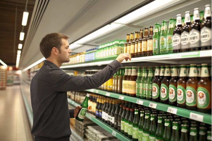
How much do color cues shape expectations?
Before anyone tastes the beer, bottle color already whispers something about style, origin, and quality. People have learned these cues over years of shopping and drinking.
Color cues are powerful. Many drinkers link brown with craft and freshness, green with imported crisp lagers, and clear with light or flavored beers, even when the liquid styles are similar.
Learned signals from the shelf
Most people do not read a full label first. They scan the shelf for rough signals:
- Amber/brown bottles often suggest craft, freshness, or seriousness.
- Green bottles suggest European origin or “imported premium” because of long-standing brands.
- Clear bottles often suggest easy-drinking, citrusy, or “fun” beers.
These associations are not rules, but they are strong enough that changing color can confuse regular buyers. A classic brown-bottle stout in clear glass would feel strange, even if the stout is unchanged.
If you want evidence that visual and container cues shape expectations, see research on how colour and glass type influence beer expectations 6 {#fnref6}.
Mapping style to color in the drinker’s mind
Here is a rough map of how many consumers read bottle colors:
| Bottle color | Common mental shortcut | Good fit styles | Risk if mismatch |
|---|---|---|---|
| Amber/brown | Craft, freshness, authenticity | Pale ales, IPAs, lagers, stouts, saisons | Less “flashy” on shelf if design is weak |
| Green | European, crisp, “import” | Pilsners, Euro lagers | Perceived as old-fashioned in some places |
| Clear/flint | Light, fruity, social, “see it” | Radlers, flavored lagers, low-alc drinks | Hop-forward beers seen as “cheap” or unstable |
As a brand, you either lean into these shortcuts or fight them on purpose. Both can work. But if you choose a color that fights the style and price point, you will need stronger storytelling and design to explain the choice.
Color, price, and trust
Bottle color also affects what price feels fair. A heavy, dark bottle with a tight crown and strong label often feels “worth more” than a lightweight clear bottle, even before tasting. If your price is above the norm, your color choice should not undercut that feeling.
So color is not just a technical choice. It is also part of the first promise you make to every buyer.
When are branding gains worth light-risk trade-offs?
Some of the most famous beer brands in the world use green or clear glass. They do it with full knowledge of light-strike risk. They rely on tight control, special brewing tweaks, and iconic looks.
Branding gains can justify green or clear glass when the beer style is less light-sensitive, the supply chain is well controlled, and packaging (sleeves, cartons) adds back protection. For delicate, hoppy, or aging beers, amber is still safer.
Weighing style, channel, and risk
Think through four questions:
-
How light-sensitive is this beer?
- Strong hop aroma and high hopping rates increase risk.
- Dark, malt-driven beers with low hopping are less sensitive.
-
How will it be sold?
- Cold, fast-turn bars and nightclubs expose beer to less UV than warm, bright supermarket shelves.
- Online and export channels increase time at risk.
-
What packaging supports the bottle?
- Full sleeves and closed cartons protect much better than a naked clear bottle.
-
What is the brand story worth?
- If clear glass is central to your identity, you may accept a tighter shelf-life window and more strict logistics.
Simple decision grid
Here is a quick scoring view:
| Scenario | Best color choice | Why |
|---|---|---|
| Highly hopped IPA in mixed retail | Amber only | Hops + bright stores = high light-strike risk |
| Classic malty lager in local dark pubs | Amber or green | Lower hop load and limited light exposure |
| Flavored light lager focused on pool parties | Clear with sleeve/carton | Style fits clear; must add strong secondary protection |
| Export beer with long sea freight and shelf time | Amber | Long chain needs maximum safety margin |
| Iconic “see the liquid” brand with TV campaigns | Clear, but tightly managed | Brand may justify risk with strong controls and processes |
If you want to push green or clear, two technical tricks can also help:
- Use light-stable hop extracts 7 {#fnref7} that are less prone to skunking.
- Shorten best-before dates and keep the cold chain stricter.
These do not make clear glass “as safe” as amber, but they support the brand choice and reduce the worst outcomes.
At the end of the day, bottle color is a negotiation between marketing and brewing. The brewer wants flavor integrity. Marketing wants recognition and shelf stand-out. The best designs respect both, and do not let color choices quietly destroy the beer you worked to perfect.
Conclusion
Beer-bottle color does not flavor beer directly, but it controls light exposure, and that makes the difference between bright hop aroma and a skunky, brand-damaging first sip.
Footnotes
-
Defines lightstruck flavour and why certain light wavelengths create “skunky” notes in beer. ↩ ↩
-
Explains MBT formation and the light range that triggers classic lightstruck character. ↩ ↩
-
Links key absorption near 445 nm to light exposure and lightstruck character development. ↩ ↩
-
Shows measured bottle transmission and how packaging type changes protection against light damage. ↩ ↩
-
Helps compare label coverage options, including full-body sleeves that can reduce light exposure. ↩ ↩
-
Research on how colour and glass type shape expectations before tasting. ↩ ↩
-
Overview of light-stable hop products used to reduce lightstruck risk in clear/green packaging. ↩ ↩


