Light feels abstract in meetings, but at the shelf it is brutal. The wrong bottle color can turn “premium” into “off-flavor” long before sell-by day.
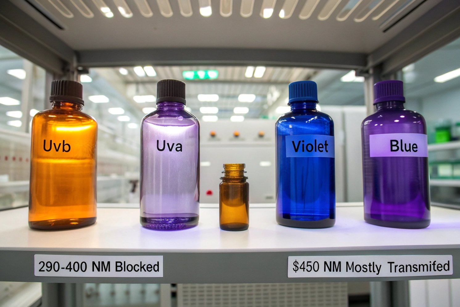
Standard amber bottles block almost all UVB and most UVA up to about 400 nm, keep transmission very low in the 400–450 nm violet/blue band, and then behave much closer to clear glass above roughly 450 nm.

In B2B projects, this simple sentence hides a lot of nuance. Cutoff shifts with colorant levels, wall thickness, and furnace conditions. Green and cobalt behave very differently. Supplier certificates can also look impressive and still hide gaps. So it helps to translate the spectrum into clear buyer language and clear test criteria.
What is amber’s typical cutoff across UV-A, UV-B, and visible bands?
Many specs just say “amber, light-resistant.” That sounds safe, but light works in bands, not marketing labels.
Typical amber for pharma and beverages shows near-zero transmission through UVB and most UVA (≈290–400 nm), stays under about 10% in the 400–450 nm violet/blue region, and then climbs toward clear-glass levels above ≈450 nm.

How the bands line up
First it helps to define the main regions:
- UVB 1: ~280–315 nm
- UVA 2: ~315–400 nm
- Violet/blue visible: ~400–450 nm
- Main visible (green to red): ~450–700 nm
“Light-resistant” container definitions in pharmacopeias 3 focus on 290–450 nm because that is where many APIs, vitamins, hops compounds and pigments are most sensitive. Spectral transmission tests for these containers scan exactly this band and often set a limit like “not more than 10% transmission at any wavelength.”:contentReference[oaicite:0]{index=0}
Typical amber cutoff in real tests
When we look at measured curves for standard amber bottle glass in this band, we usually see:
- 290–350 nm (UVB + part of UVA): often very close to 0% transmission for dark amber, and only a few percent for lighter amber.:contentReference[oaicite:1]{index=1}
- 350–400 nm (UVA): dark amber still usually below about 1%; light amber around 1–5%.:contentReference[oaicite:2]{index=2}
- 400–450 nm (violet/blue edge): many pharma-grade ambers stay under 10%, which matches the “light-resistant” spec; some lighter ambers sit in the 5–20% range so content is still visible.:contentReference[oaicite:3]{index=3}
- Above 450 nm: transmission rises fast into the 60–90% range across green, yellow, orange, red, which is why product color is still easy to see.:contentReference[oaicite:4]{index=4}
A simple way to picture this for a typical dark amber bottle wall:
| Band | Approx λ range | Typical %T for dark amber* | Protection level |
|---|---|---|---|
| UVB + part of UVA | 290–350 nm | \~0–1% | Very strong |
| UVA | 350–400 nm | <1% | Very strong |
| Violet / blue visible | 400–450 nm | \~1–10% | Strong to moderate |
| Green–red visible | 450–700 nm | 60–90% | Low (mostly for appearance, not protection) |
*Thickness around 2–3 mm; lighter amber will sit a bit higher, especially 400–450 nm.:contentReference[oaicite:5]{index=5}
Thickness and “light” vs “dark” amber
Colorants set where the glass absorbs. Thickness decides how much it absorbs along the path. As wall thickness grows, the same amber recipe pushes effective cutoff deeper into the violet/blue band and drags the whole curve down.:contentReference[oaicite:6]{index=6}
In practice:
- Thin sidewalls of light amber might still show some 400–450 nm leak.
- Thick shoulders and bases of the same bottle can be almost opaque to that band.
So when we talk about “what wavelengths amber blocks,” we always mean for a given thickness and shade. That is important when we start comparing to green and cobalt.
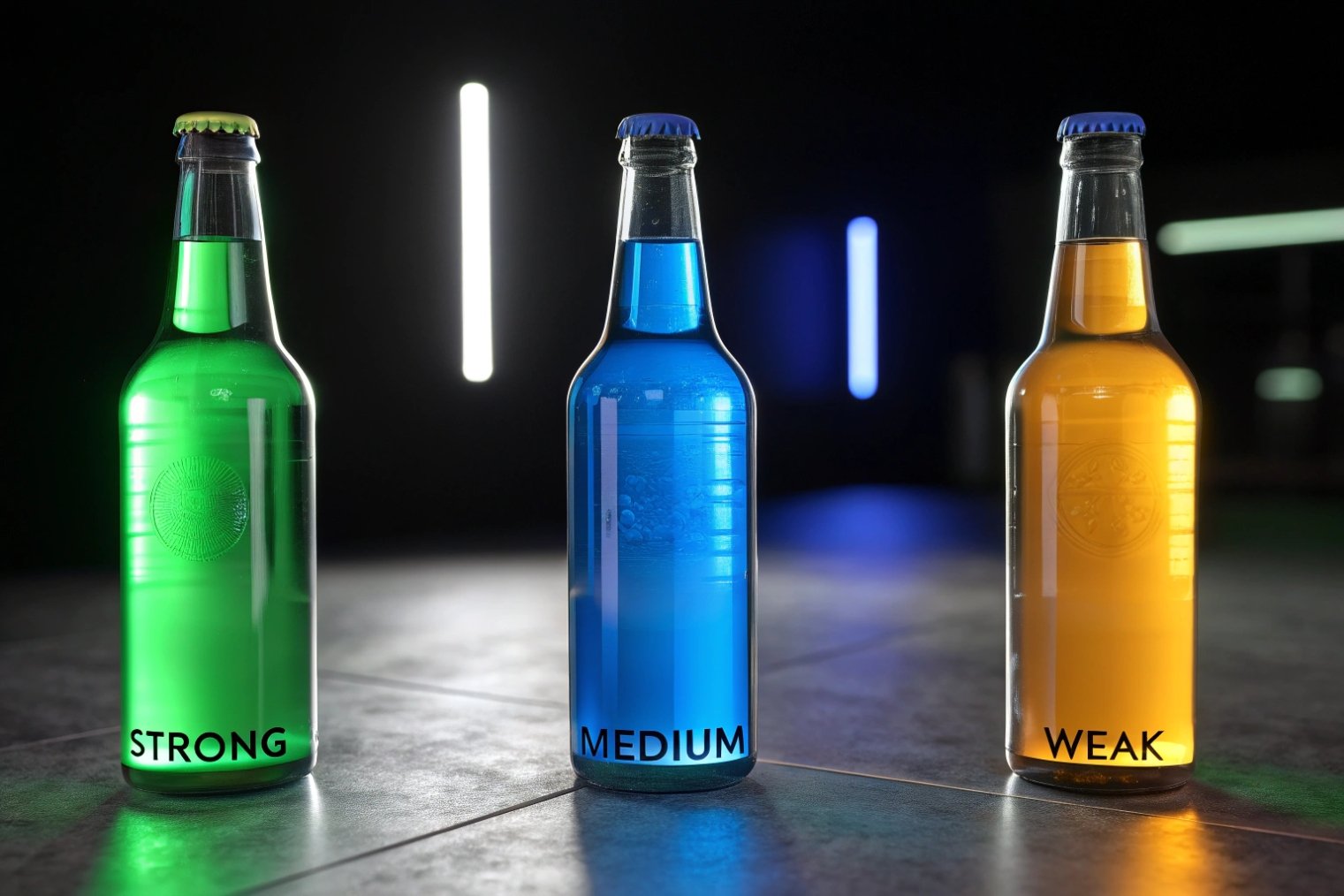
How does amber protection compare with green and cobalt for sensitive SKUs?
Glass buyers often hear: green is “OK”, cobalt is “better”, amber is “best”. That is true in general, but the spectrum is more interesting.
Against UV and violet/blue light, amber is the strongest practical color for most mainstream lines. Green gives only moderate UV protection, cobalt sits in between, and none of them match amber for very light-sensitive SKUs that must pass strict 290–450 nm limits.
Clear and green: good for marketing, weak in UV
Clear flint glass looks clean but gives very poor protection. Measurements on wine bottles show:
- Clear glass can transmit around 90% of light at 350 nm.
- Green glass does cut some UV, but at 370 nm still lets roughly 70% through in typical bottles.:contentReference[oaicite:7]{index=7}
That is fine for products that do not mind light much, or that live mostly in dark supply chains. It is risky for beer, delicate wines, essential-oil blends, and many actives.
Cobalt blue: strong color, mid-level UV shield
Cobalt blue 4 looks premium and signals “value” on shelf. UV-wise, it usually lands between green and amber:
- It contains colorants that absorb strongly in certain visible bands, which cut part of the violet/blue light.
- It often still transmits more UV than comparable amber at the same thickness.:contentReference[oaicite:8]{index=8}
Cobalt can work for SKUs that are moderately light-sensitive and where brand color is critical. For the most fragile formulas, it usually needs help from sleeves, coatings, or cartons.
Why amber stays the default for high-risk formulas
When we put standard bottle colors side by side at 2–3 mm wall thickness, the picture is simple:
| Color | UV 290–400 nm | 400–450 nm band | Typical use for sensitive SKUs |
|---|---|---|---|
| Clear (flint) | Very high transmission | Very high | Only with strong secondary protection |
| Green | Medium–high transmission | Medium | Less sensitive wines, some oils |
| Cobalt blue | Medium in UV, lower in blue | Medium–low | Cosmetics, some nutraceuticals |
| Amber | Very low / near-zero in UV | Low (often <10%) | Pharma, beer, essential oils, vitamins |
| Violet / black | Very low UV and much visible | Very low | Biotech, high-end botanical extracts |
So for sensitive SKUs, the order is clear: amber first, then cobalt if SKUs are not extremely fragile, with green and clear only when backed by strong secondary light barriers or when light risk is known to be low.
This is why pharmacopoeias and many packaging guides use “good quality amber glass” as the default example of a light-resistant container.:contentReference[oaicite:9]{index=9}
How can buyers verify amber spectral curves from suppliers’ certificates?
Supplier datasheets often show a glossy orange curve and some “UV block” wording. That is not enough for a light-sensitive SKU with real regulatory exposure.
A useful amber spectral certificate must show a 290–450 nm scan, clear %T values at key wavelengths, sample thickness, test method, and a pass/fail statement against your light-resistance limits. Buyers should cross-check this with their own or third-party UV–Vis testing.
What a good certificate should contain
When we qualify amber for sensitive products, a strong certificate has at least:
- Wavelength range and step: 290–450 nm, with data points every 1–20 nm.:contentReference[oaicite:10]{index=10}
- Geometry: panel cut-outs, bottle-wall sections, or whole-bottle method, plus how thickness was measured.:contentReference[oaicite:11]{index=11}
- Instrument: UV–Vis spectrophotometer 5 model, integrating sphere or sample holder used.
- Reference: air or reference standard used to set 100% T.
- Results: maximum %T in 290–450 nm and possibly a few headline values (e.g. at 320, 350, 400, 430 nm).
- Limit: clear statement like “meets USP/Ph. Eur. light-resistant requirement ≤10% anywhere 290–450 nm.”:contentReference[oaicite:12]{index=12}
A short overview:
| Element on certificate | Why it matters |
|---|---|
| 290–450 nm range | Matches light-resistance definitions |
| Sample thickness | Lets you compare with your bottle design |
| Max %T in band | Ties directly to your internal UV limit |
| Method and instrument | Shows test is robust and repeatable |
| Standard reference (e.g. USP) | Aligns with regulatory language |
How to sanity-check curves quickly
When a new supplier sends a spectral curve, a simple review saves time later:
-
Look at the axes
Confirm x-axis is in nm from 290–450 (and ideally into visible), and y-axis is % Transmission, not absorbance. -
Check the UV floor
For pharma-grade amber, 290–350 nm should sit near zero, often well below 1–2%.:contentReference[oaicite:13]{index=13} -
Check 400–450 nm band
This is where many borderline ambers fail. If anything goes above your 10% limit here, that color may not qualify as “light-resistant” for sensitive SKUs. -
Confirm thickness
Compare the stated thickness to your bottle’s thinnest wall. If the test used 3 mm coupons but your bottle panel is 1.4 mm, real-world %T will be higher than shown. -
Watch for smoothing
Real curves have some shape. A perfectly straight or oversmoothed line can hide peaks. Asking for raw data points at 10 nm intervals is a good habit.
Close the loop with lab verification
For critical launches or supplier changes, it is worth running your own UV–Vis check:
- Cut panels from received production bottles.
- Measure spectral transmission at representative locations.
- Compare curves and key %T points with the certificate.
Many teams then link this to routine QC: if thickness or color density drifts on the line, they trigger a re-check of spectral transmission before releasing high-risk fills.:contentReference[oaicite:14]{index=14}
In simple terms, the certificate gives the promise. Your UV–Vis test keeps that promise honest across real batches.
Are new amber formulations extending UV blocking without darkening?
Designers want clean, premium color. QA wants a flat line near zero in the UV. Classic amber can feel like a compromise between the two.
Yes. Newer amber strategies tune iron/sulfur ratios, add targeted colorants, and pair glass with coatings or violet/black hybrids to hold or extend UV blocking while keeping bottles visually lighter or more brand-aligned.
The limits of “classic” amber
Traditional amber recipes use combinations of iron, sulfur, and carbon to create strong absorption in the UV–blue region.:contentReference[oaicite:15]{index=15} At higher doses, these colorants drive UV transmission very close to zero but also:
- Darken the bottle, reducing product visibility.
- Shift the perceived hue toward brown or even near-black.
That is perfect for some pharma lines. It can feel too “heavy” for premium beverages or skincare that sell partly on appearance.
How formulators tweak amber today
Glass technologists have more tools now:
- Fine-tuning Fe²⁺/Fe³⁺ ratios 6 and sulfide levels to sharpen absorption in the most harmful wavelengths while not overshooting in the rest of the visible band.:contentReference[oaicite:16]{index=16}
- Using minor colorants to correct hue so the glass still reads as “amber” but not muddy, even as UV cut improves.
- Designing thickness distribution so visually critical areas (front panel) can be a bit thinner while shoulders and less visible zones carry more optical load.
Some high-barrier ambers now hit very low transmission through 290–430 nm at moderate thickness, while keeping the bottle lighter in look than old “medicine brown”.
Beyond amber: violet and hybrid systems
For very high-end botanicals and some nutraceuticals, the market has also moved toward violet and near-black glasses:
- These can block a wide range of visible light while allowing only a narrow slice of UVA and some infrared through, which some brands use as a “let beneficial light in” story.:contentReference[oaicite:17]{index=17}
- They clearly exceed standard amber in visible light blocking, at the cost of much darker appearance.
On the more mainstream side, we now see more hybrid systems:
- Lighter amber or even green/cobalt glass
- Plus UV-absorbing coatings, ceramic inks, or full-body sleeves
- Designed to hit the same 290–450 nm specs without turning the bare glass very dark
A quick view of options:
| Approach | UV 290–400 nm | 400–450 nm | Appearance | Typical fit |
|---|---|---|---|---|
| Classic dark amber | Near-zero | Very low | Dark brown, strong heritage look | Pharma, beer, essential oils |
| Optimized “lighter” amber | Very low | Low | Warmer, more transparent amber | Premium beverages, cosmetics |
| Violet / near-black glass | Very low | Very low | Deep purple / black | Biotech, high-end botanicals |
| Amber + coatings/sleeves | Very low | Very low | Flexible, driven by branding | Rebrands, retrofit protection upgrades |
The important point for buyers is simple: do not assume all amber is the same. Ask for spectral curves, sample bottles, and clear statements about how new formulations balance UV blocking, visible appearance, and thickness. That way, you get both the protection regulators expect and the shelf image your brand team wants.
Conclusion
When we see amber not just as a color but as a tuned UV filter, we can choose the right shade, verify the real spectral curve, and protect sensitive SKUs without guessing.
Footnotes
-
UVB radiation ranges from 280–315 nm and is responsible for significant chemical degradation in sensitive products. ↩ ↩
-
UVA rays cover 315–400 nm and can penetrate glass more easily than UVB, requiring specific filtration. ↩ ↩
-
Official publications containing lists of medicinal drugs with their effects and standards for light-resistant packaging. ↩ ↩
-
A deep blue pigment used in glass manufacturing to provide aesthetic appeal and moderate light protection. ↩ ↩
-
An analytical instrument used to measure the intensity of light as a function of its wavelength. ↩ ↩
-
The balance of iron oxidation states determines the color and UV-blocking efficiency of amber glass. ↩ ↩


