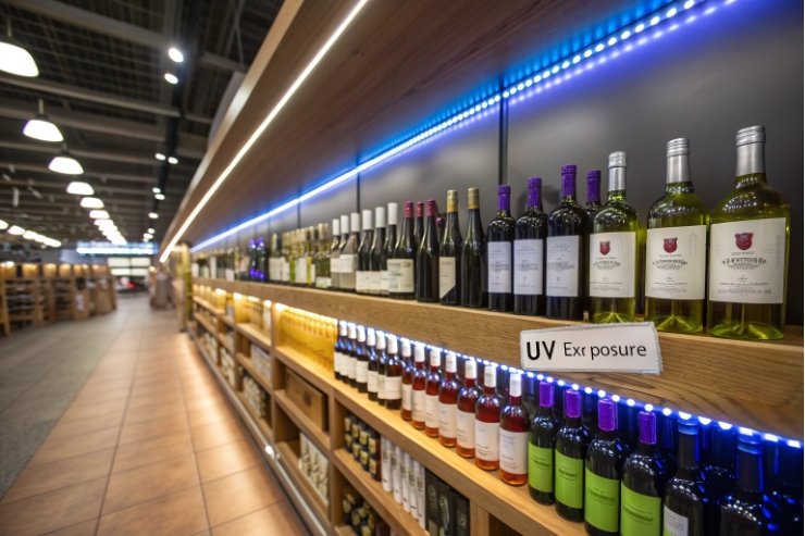
Light can ruin a wine faster than most people expect. A bright retail shelf, a sunny kitchen, or a warm delivery truck can push delicate aromas into “flat” and tired.
Amber (brown) wine bottles stay popular because they block far more damaging light than flint and often more than green, while also signaling cellar-aging, hiding small visual flaws, and supporting recycled-glass goals with fewer color surprises.

A bottle color is never only a color choice. It is product protection, brand messaging, and supply-chain reality in one decision. The best brands treat amber as a tool, not a trend.
Does amber glass offer superior UV protection for delicate wines?
A delicate white or rosé can look perfect at bottling, then taste muted after weeks under store lights. That is painful because the wine did nothing wrong. The packaging did.
Yes. Amber glass blocks more UV and short-wavelength visible light than flint, and it often outperforms many green tones, which helps reduce light-struck aromas in sensitive wines.
Why light damage happens in wine
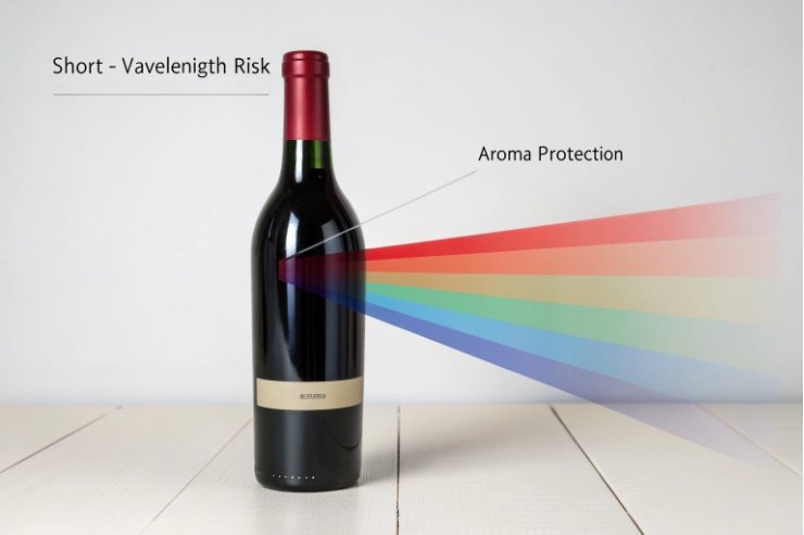
Wine contains compounds that react when exposed to light, a fault often described as light strike in wine 1{#fnref1}, especially UV and blue-violet wavelengths. Those reactions can shift aroma and flavor. The risk is higher for wines with subtle aromatics and lower phenolic protection. Many crisp whites, rosés, and sparkling styles fall into that group. Reds usually have more natural buffering from tannins and color compounds, but they are not immune. Light exposure can still dull fruit notes over time.
What amber does better than flint and many greens
Amber glass absorbs and blocks more of the high-energy part of the spectrum (see glass wine bottles and UV light 2{#fnref2}). In real life, that means less light reaches the wine when bottles sit under LEDs, fluorescents, or indirect daylight. Flint glass is the worst for protection because it is designed to show the wine. Green can be good, but “green” covers a wide range. Some greens protect well, some are more cosmetic than protective. Amber is the most consistent choice when protection is the priority.
Packaging guidance comparing clear and colored wine bottles 3{#fnref3} also shows why deeper hues are often chosen when shelf conditions are not fully controlled.
When the extra protection is worth it
Amber becomes a strong option when the wine is likely to face long retail display, mixed lighting, or warm climates with high ambient brightness. It also helps for low-SO₂ or minimal-intervention wines that aim to preserve delicate aromatics. A brand that ships far and wants stable taste across markets often benefits from amber.
| Bottle color | Light protection (typical) | Best for | Main trade-off |
|---|---|---|---|
| Flint (clear) | Low | Showcasing color, short shelf time | Higher light-struck risk |
| Green | Medium to high (varies) | Traditional reds, many whites | Protection depends on shade |
| Amber (brown) | High | Delicate whites, rosé, long display | Less wine color visibility |
How do tradition and cellar-aging cues influence buyer perception?
A wine can be technically perfect and still lose on the shelf. Buyers do not taste first. They judge first. Color cues shape that first judgment.
Amber bottles signal protection, heritage, and “cellar readiness,” so many buyers read them as careful, traditional, and trustworthy, even before they notice the label.
Amber feels like a “protective” choice
Many consumers have learned one simple rule from beer: brown glass protects light-sensitive products. That mental shortcut carries into wine. The bottle looks like it was chosen to guard quality, not to show off. For certain buyers, that feels premium. It says the producer expects the wine to be stored, not rushed.
Cellar-aging cues are mostly visual language
Wine packaging uses shared symbols. Dark glass, deep punts, long necks, and restrained labels all hint at aging and seriousness. Amber fits this language, especially when paired with natural paper textures, foil accents, or classic typography. It can also signal “old-world honesty,” even when the wine is new-world in origin. That is not about facts. It is about perception.
Why amber can feel “classic” without being boring
Amber has warmth. It can look artisanal in daylight and elegant under bar lighting. It also hides small cosmetic issues like minor scuffs, light sediment, or tartrate crystals. That keeps the bottle looking clean at the moment of purchase. In many markets, buyers interpret “clean look” as “well made,” even when the wine style naturally throws crystals.
The risk: mismatch with style expectations
Perception cuts both ways. For some consumers, amber can read like kombucha, beer, or pharmacy packaging. That is more likely when the label is modern-minimal and the bottle is light-weight. The solution is simple. If amber is chosen, the label and closure should match the intended cue.
| Cue buyers notice | What amber implies | How to reinforce it | When it can backfire |
|---|---|---|---|
| Dark protective tone | Careful handling, quality | Classic label, foil, strong capsule | Ultra-modern “clean” label may feel off |
| Warm brown tint | Heritage, craft | Natural paper, emboss, wax cues | Can look like non-wine categories |
| Less visible wine color | Less “show” and more “store” | Story about freshness and protection | Rosé shoppers may want to see color |
When should brands choose amber over green or flint?
Choosing bottle color should start with distribution reality, not with mood boards. The shelf, the route, and the buyer profile decide most of the answer.
Choose amber when light protection and stable taste matter more than showing wine color; choose green when tradition and balance are key; choose flint when color visibility is central and shelf time is short or controlled.
A simple decision frame that works in practice
Bottle color choice becomes easier when it is tied to risk. Light risk, time risk, and handling risk. If the wine will sit under bright lights for months, amber is a safe bet. If the wine is sold quickly through on-premise or direct-to-consumer with controlled storage, flint can work without major quality loss. Green sits in the middle and also carries strong wine-tradition signals in many regions.
When amber is the smartest move
Amber is a strong fit for:
- aromatic whites and delicate blends,
- rosé that will ship far and sit long,
- low-intervention wines that avoid heavy protective additions,
- export programs where storage conditions vary by distributor,
- and brands that want a unified “protect the wine” story across the portfolio.
When green is the better compromise
Green is often ideal for wines that need some protection but also want classic wine cues. Many reds and many whites do well in green, especially when the shade is deeper. Green is also widely accepted in wine channels, so it rarely creates category confusion.
When flint is still the right tool
Flint is valuable when the wine’s appearance is part of the sell. Think pale rosé, orange wine, or boutique styles where the color is a visual promise. Flint is also useful for tasting rooms and fast-turn retail. The key is to manage exposure. Secondary packaging, carton storage, and fast sell-through make flint safer.
| Wine + route reality | Best bottle color | Why it wins | Extra protection to consider |
|---|---|---|---|
| Long retail display, mixed lighting | Amber | Highest light shielding | Cartons, neck sleeves, fast replenishment |
| Classic red with tradition cues | Green | Accepted signal + decent protection | Deeper green for longer aging |
| Rosé sold by color | Flint | Color sells the bottle | UV-blocking label zones, boxed display |
| Export to hot/bright markets | Amber | More stability in unknown conditions | Strong closures, good cartons |
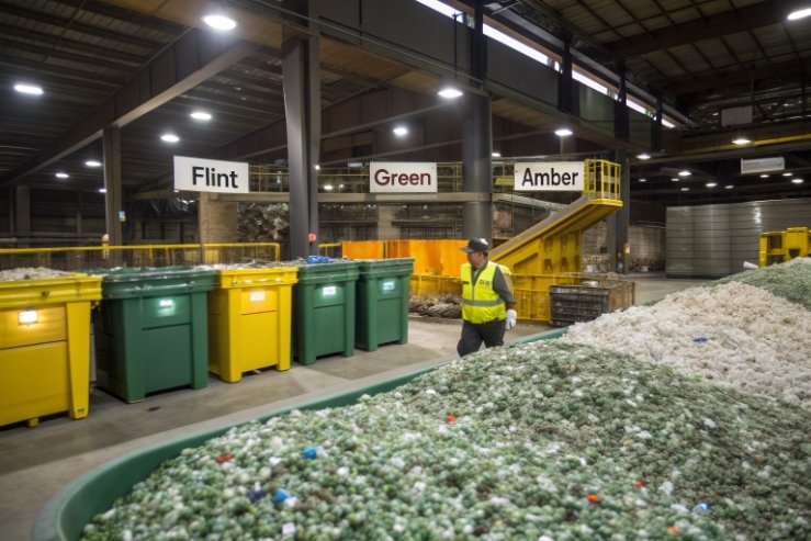
Do recycling streams and PCR content favor amber bottles?
Sustainability goals are real now. Buyers ask about recycled content. Brands want lower emissions. The bottle color choice can either help or complicate that plan.
Often yes. Amber can tolerate higher PCR variation without looking “dirty,” and amber cullet streams can be robust in many regions, but local recycling systems and supply contracts decide the real advantage.
Why color matters in recycled glass
Recycled glass (cullet) is not perfectly uniform. Small color shifts and trace contaminants show up most in flint. Flint needs strict sorting and often needs more control to keep a clean, water-white look. Green also needs sorting, but it can hide more variation than flint. Amber hides variation best because the target color is darker. That means a brand can often push higher PCR without customers noticing small shade drift.
A practical overview of maximizing recycled content in glass packaging 4{#fnref4} explains why darker colors can be more forgiving in real cullet streams.
Recycling streams are regional, not universal
In some markets, amber recycling is strong because beer and food jars create steady amber supply. In other markets, wine green dominates the stream. That affects price, availability, and lead times for PCR. This is why bottle color should be aligned with the local cullet reality of the production region. A perfect sustainability plan on paper can fail if the cullet supply is unstable.
If you need a benchmark for recycled content targets, regional reporting (for example, California’s 2024 minimum content report for glass containers 5{#fnref5}) can be a useful reality check for what “high PCR” looks like in practice.
PCR, ΔE control, and brand consistency
Higher PCR can increase color variation. For premium wine, color consistency still matters. Amber makes it easier to hold a tight look while using more recycled content. That supports both sustainability claims and shelf consistency. Still, a brand should set measurable targets and acceptance bands, including clear ΔE tolerances 6{#fnref7}. If ΔE drift becomes too visible, the pack looks inconsistent and buyers assume quality drift, even when the wine is identical.
Darker glass hides minor scuffs and small inclusions better. That can reduce cosmetic scrap rates in certain programs. Lower scrap means less waste and better yield, which supports sustainability in a practical way, not only in marketing language. More broadly, using cullet in new container glass can reduce energy and emissions (see how glass is recycled, from bin to bottle 7{#fnref6}).
| Goal | Amber advantage | Green position | Flint challenge |
|---|---|---|---|
| High PCR content with stable look | Strong | Medium | Harder |
| Masking small scuffs/sediment | Strong | Medium | Weak |
| Highest cullet value stream | Medium | Medium | Often highest value but strict |
| Brand shade consistency | Easier | Manageable | Tight control needed |
Conclusion
Amber bottles stay popular because they protect wine from light, communicate cellar trust, and often make recycled-content goals easier without sacrificing a premium shelf look.
Footnotes
-
Decanter explains light strike and why UV/blue light can create unpleasant sulfur aromas in wine. ↩︎ ↩
-
Technical PDF on how amber glass filters UV and visible light, helping reduce light-related wine faults. ↩︎ ↩
-
Wine packaging guidance comparing clear vs colored bottles, including typical UV transmission differences by glass color. ↩︎ ↩
-
BritGlass guide to maximizing recycled cullet content and its impact on energy, emissions, and supply constraints. ↩︎ ↩
-
California report with recent recycled-content averages for glass container production—useful for benchmarking PCR claims. ↩︎ ↩
-
X-Rite explains ΔE tolerancing—useful for setting accept/reject limits on amber shade consistency. ↩︎ ↩
-
Overview of glass recycling and why cullet use typically saves energy and CO₂ versus virgin raw materials. ↩︎ ↩


