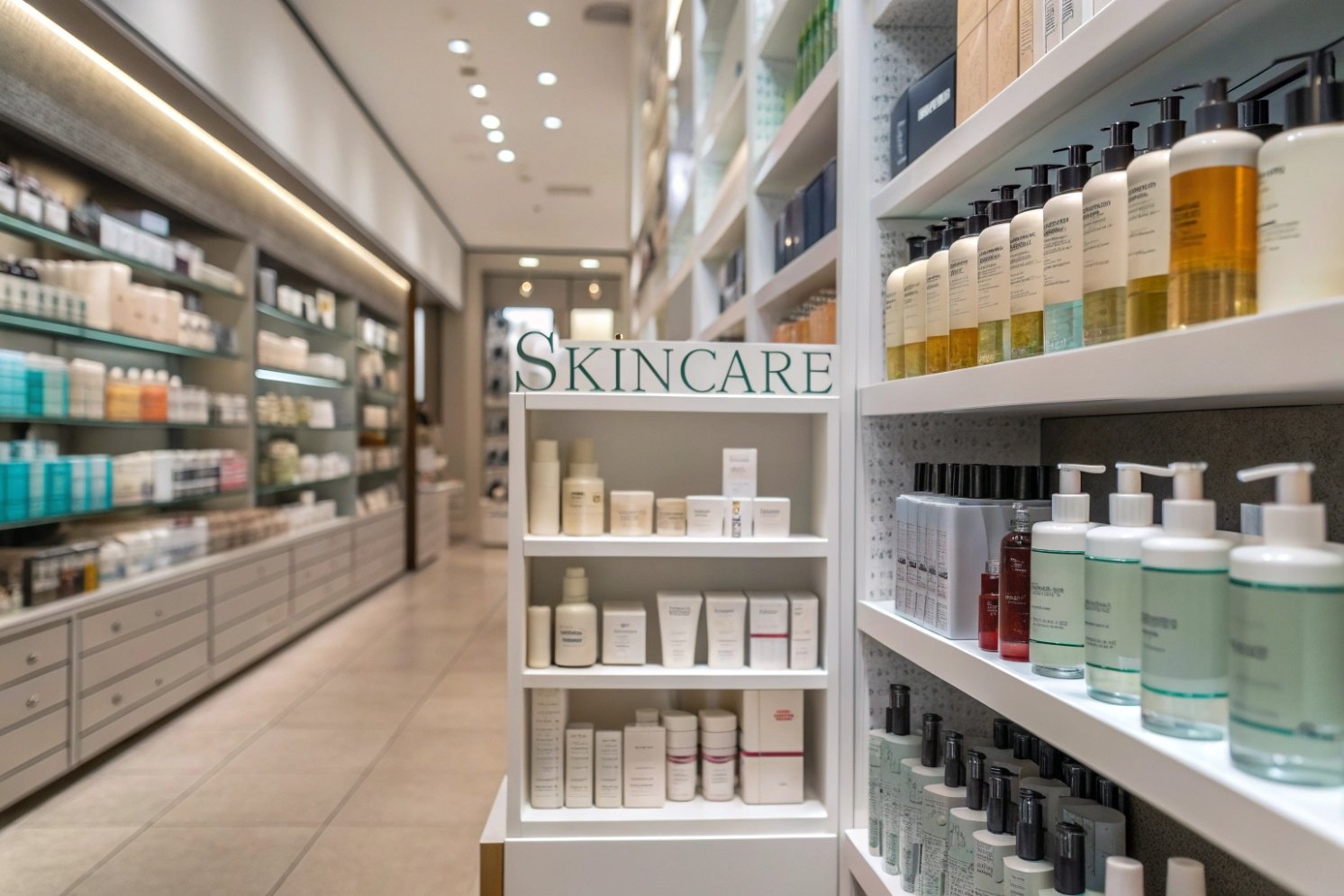
Skincare shelves look crowded and flat. Many packs feel “clean,” yet they blur together. When the look is weak, shoppers skip the product without reading.
Skincare packaging becomes more compelling when color, texture, and structure signal efficacy fast, while the label system stays readable and consistent across the line. Premium impact comes from control, not clutter.

Treat visual design like performance design
A skincare pack should do three jobs at once. The pack should stop the eye on shelf. The pack should explain the product in one scan. The pack should feel good in hand, so the buyer trusts daily use. When one job fails, the whole product feels weaker.
Build a clear hierarchy for fast scanning
A shopper’s eyes move fast. So the front panel needs a strict order. The brand name should be easy to find. The product type should be clear. One key benefit should sit in a stable place. Too many claims create noise. Noise looks like low confidence. A calm layout with whitespace looks like control, and control reads as efficacy. This is the practical role of visual hierarchy 1.
Use material cues to “prove” the promise
Glass clarity, weight, and a clean seam line can raise perceived quality. Frosting can signal purity. Matte coatings can signal modern performance. A tight-fitting cap can signal engineering. These cues work before the shopper reads any ingredient list.
Add trust cues without crowding the front
Anti-tamper seals, subtle holograms, or serialized marks can raise trust, especially in high-risk channels. These cues do not need to dominate the design. A small and consistent placement works better than a loud badge.
| Visual lever | What it signals in one glance | Where it works best | Common mistake |
|---|---|---|---|
| High contrast typography | Clinical clarity | Actives, derm-inspired lines | Too thin to read on curves |
| Matte + gloss contrast | Premium performance | Serums, retinol, peptides | Fingerprint-prone soft-touch |
| Frosted glass | Purity, stability | Sensitive skin, barrier care | Low contrast label that disappears |
| Minimal front claims | Confidence | Premium routines | Hiding product type too much |
| Subtle trust marks | Authenticity | Cross-border, marketplaces | Overuse of badges and icons |
A compelling look is not about adding more. It is about removing confusion and adding signals that match the claim.
The next sections go deeper into the four areas that decide shelf impact most often: color and finishes, print technique stacking, bottle family systems, and eco messaging that stays honest.
Which colorways, textures, and frosted finishes signal efficacy?
A product can be effective, yet the pack can look like a “pretty lotion.” When the pack does not signal results, shoppers assume the formula is basic.
Efficacy is signaled by disciplined color codes, high legibility, and controlled tactile finishes. Frosted and matte surfaces can feel clinical and premium, but contrast and durability must stay strong.
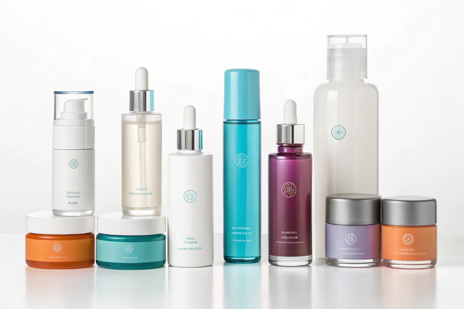
Build a color system with roles, not trends
A strong colorway is a system. The system has a base color, a benefit accent, and a rule for how much color appears. Neutral bases like warm white, soft gray, and sand can signal calm science. Cool accents like blue or teal can signal hydration and clinical care. Purple can signal renewal and night routines. Green can signal calming and barrier support. These signals work because they are consistent, not because they are “new.”
Texture gives the hand a reason to trust. Matte can feel modern and high-end. Gloss highlights can feel precise when they are used in small areas, like a logo or a key active. Embossing and debossing can add shadow and depth, which makes the pack look engineered. Still, every finish must survive real handling. Bathrooms are humid. Hands are wet. Bags cause abrasion. So coatings must be chosen for scuff resistance, not only for beauty.
Frosted glass should support the message, not hide it
Frosting can signal purity and stability. It can also reduce glare under store lights. Yet frosting can reduce readability if the label and ink are too light. A strong solution is to pair frosting with bold, dark typography and a simple icon set. A second solution is to keep frosting partial, like a frosted shoulder with a clear label window. If you want a durable, uniform surface effect, processes like acid-etching and frosting 2 are commonly used to create that premium matte feel.
| Design cue | Efficacy message | Best pairing | What to avoid |
|---|---|---|---|
| White base + navy text | Clinical and proven | Minimal icons, strict grid | Tiny font and low contrast |
| Sand base + green accent | Calm and gentle results | Soft matte, simple claims | Too many “natural” badges |
| Frosted + silver highlight | Lab-grade premium | One foil line or cap accent | Full-foil front that glares |
| Matte bottle + gloss logo | Modern performance | Spot gloss only on brand mark | Full soft-touch that scuffs |
| Micro-emboss texture | Technology and precision | Clean sans type and whitespace | Deep texture that looks messy |
Efficacy cues work when they stay consistent across the line and stay readable from a distance. The strongest packs feel calm, precise, and intentional.
The next step is to make sure the print and decoration methods support that precision, not fight it.
How should labels, silk-screen, and hot-stamping be combined?
A pack can look premium in a render and still fail in production. The failure often comes from mixing too many techniques without a clear plan.
The best combination assigns a role to each method: silk-screen for stable brand structure, labels for SKU flexibility, and hot-stamping for controlled premium highlights. One focal technique should lead the front panel.
Start with what changes and what stays
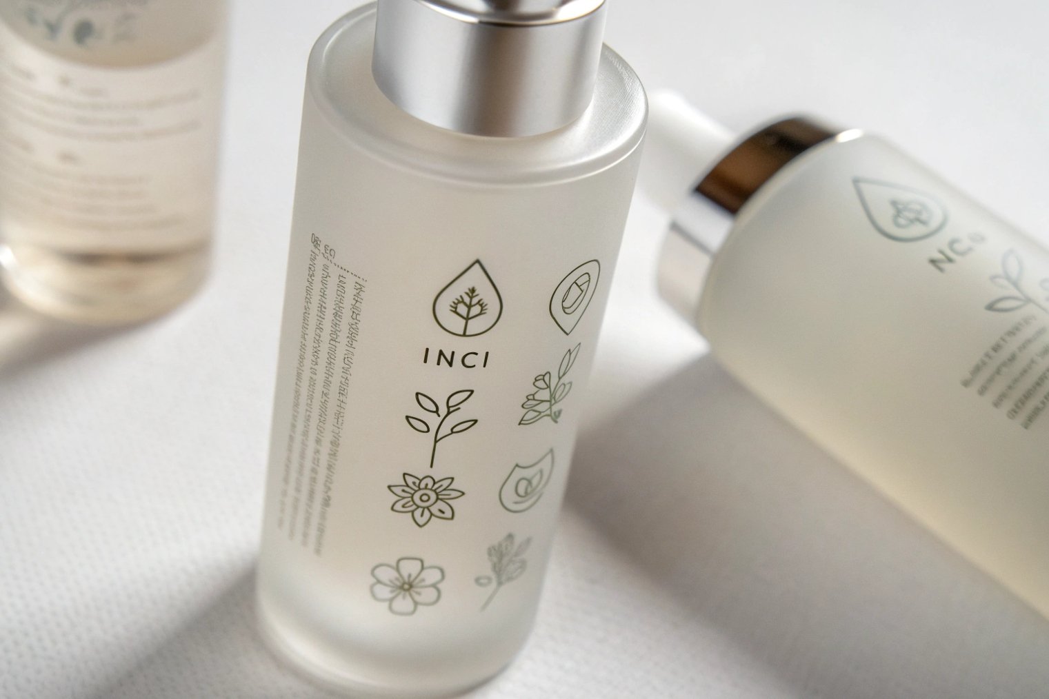
Silk-screen printing 3 works well for elements that should never move. The brand mark, a product family band, or a fixed grid can be screened directly on the bottle. This feels integrated, and it reduces the “sticker” look. Labels are better for elements that change by SKU, batch, or market. Product name, claims, INCI, and compliance text often need flexibility.
Use hot-stamping as a spotlight
Foil can lift perceived value fast. It can also look cheap when it is used everywhere. A high-end rule is simple: foil should highlight, not decorate. hot-stamping 4 works best on one small item, like a brand symbol, a serum strength mark, or a thin frame line. When foil covers large areas, glare increases and legibility drops.
Protect legibility on curved surfaces
Curves bend text and shrink perceived size. So label design must keep type larger and spacing wider. A clear hierarchy helps scanning in retail. The brand name and product type should stay bold. The benefit line should be short. Icons should be simple and consistent. Accessibility also matters—use a contrast checker 5 to confirm your text still reads under bright store lighting and on frosted or matte surfaces.
Plan durability, not only aesthetics
Silk-screen inks, foils, and labels face abrasion, oil, alcohol, and water. A supplier should test rub resistance and adhesion. A label adhesive should match the surface treatment. Some coatings need special adhesives. When these details are ignored, labels peel and hot-stamp scuffs.
| Technique | Best role | Strength | Risk if misused |
|---|---|---|---|
| Silk-screen | Brand structure | Premium and integrated | Less flexible for SKU updates |
| Label | Variable info + compliance | Fast changes and multi-market | Peeling if adhesive is wrong |
| Hot-stamping | Premium highlight | High impact with low ink | Scuffing if not protected |
| Spot varnish | Depth and focus | Subtle premium cue | Fingerprints on large glossy zones |
When these techniques are stacked with clear roles, the pack looks calm and expensive. Production becomes smoother, and line extensions become easier.
Next, the brand needs shelf power. That shelf power often comes from a cohesive bottle family, not a single hero SKU.
Do cohesive bottle families improve shelf merchandising?
A single beautiful bottle can still disappear at retail. Shelf shopping is fast. Families win because they form a block that the brain notices.
Yes, cohesive bottle families improve shelf merchandising because they create a recognizable “brand wall,” reduce confusion, and make routines easier to buy. Cohesion should come from shared architecture, not identical labels.
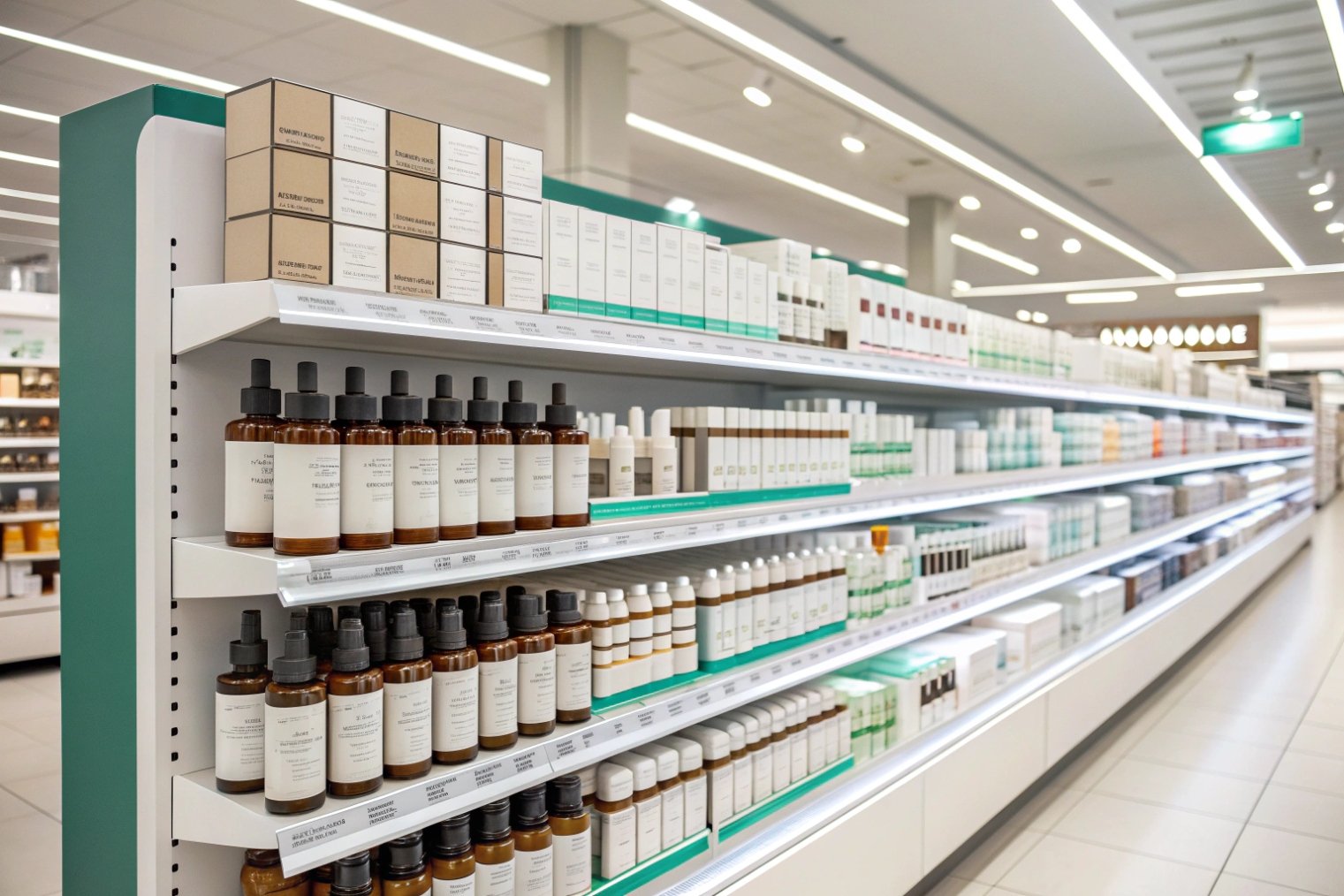
Shelf visibility comes from pattern recognition
Retail shelves reward repetition. When several SKUs share the same silhouette and label structure, the shopper’s brain reads them as one brand. That increases discovery. It also increases trust, because the line looks organized and intentional. This matters for routines, where the goal is to sell more than one item.
A family system needs fixed DNA and clear SKU coding
A good family keeps the same core elements:
- Bottle shape language and proportions
- Cap geometry and finish
- Logo placement and type rules
- A stable front-panel grid and whitespace
A good family also uses clear differences so people can choose quickly:
- One accent color per SKU
- Short product type labels that stay bold
- A step number system for routines
- Ingredient callouts that use a consistent format
Use structure to guide the hand
Bottle families should also feel coherent in use. If droppers feel one way and pumps feel another, the routine feels inconsistent. A stronger approach is to unify cap materials and tactile cues, even when the dispensing system changes. This is where premium brands earn loyalty, because daily use feels smooth.
Preview in planograms, not single mockups
A single hero render does not show shelf impact. A planogram view 6 shows if the family forms a strong block and if each SKU still reads fast. This simple check prevents many costly redesigns.
| Family element | Keep consistent | Vary by SKU | Benefit on shelf |
|---|---|---|---|
| Silhouette | Same “family” shape | Size scaling | Fast brand recognition |
| Cap language | Same finish and feel | Small color ring | Premium consistency |
| Typography | Same fonts and rules | Weight for product type | Faster scanning |
| Color system | Neutral base stays | One accent per SKU | Easy navigation |
| Icons | Same icon style | Benefit-specific icons | Instant understanding |
Cohesive families do more than look good. They make merchandising easier, photography easier, and reorders more predictable.
The last challenge is sustainability. Many brands want eco claims and premium cues. The risk is greenwashing. The solution is proof and restraint.
Eco claims can raise trust, yet they can also trigger doubt when they feel vague. Premium cues can raise price acceptance, yet they can also add waste when they are careless.
Eco and premium can work together when materials and structure show the claim, and when the claim stays specific and measurable. Premium should come from precision and tactility, not extra parts.
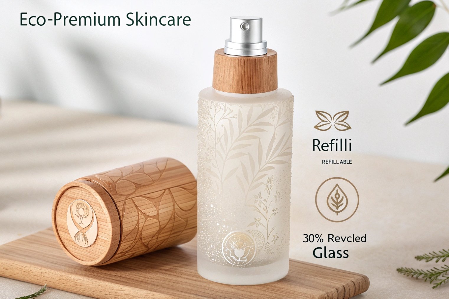
Make eco visible through design choices, not slogans
The most believable eco story is built into the pack:
- Fewer components and fewer mixed materials
- Refill systems with clear user steps
- Lightweighting that keeps strength and stability
- Recycled content that is stated as a number, not a feeling
A small claim with clear proof builds trust. A big claim without proof builds doubt. This is why the front panel should stay clean, and deeper proof can live on the side panel or behind a QR/NFC tap.
Premium does not need heavy overpacks and plastic shells. Premium can come from:
- Tight tolerances and clean seams
- High-quality print alignment and sharp edges
- Matte/gloss contrast used with restraint
- A stable bottle base and balanced weight
- A refillable architecture that feels engineered
These cues feel premium because they show control. Control is the real luxury signal.
Add digital engagement without clutter
NFC or QR can add tutorials, routine steps, sourcing proof, and loyalty programs. This keeps the front quiet and still adds depth for buyers who want details. It also supports compliance and transparency in different markets without redesigning the whole label.
Keep claims narrow and verifiable
Avoid broad words like “eco-friendly” when the pack uses mixed materials or hard-to-recycle pumps. Use specific language instead. State recycled content percent. State refill availability. Give simple disposal instructions. When you write claims, align with the FTC Green Guides 7 mindset: say what you can substantiate, qualify what depends on local facilities, and keep wording precise.
| Claim type | High-trust version | Low-trust version | Better packaging support |
|---|---|---|---|
| Recycled content | “30% PCR glass” | “Made from recycled materials” | Audit-ready supplier proof |
| Recyclable | “Bottle recyclable where facilities exist” | “100% recyclable” | Easy-to-separate components |
| Refillable | “Refill sold, steps shown” | “Refillable” with no refill | Refill SKU + clear instructions |
| Reduced plastic | “No outer plastic wrap” | “Plastic-free” with pumps | Paper seals and minimal parts |
Eco and premium fit together when the design stays honest and precise. The pack should feel like a smart tool, not like a marketing poster.
Conclusion
Visually compelling skincare packaging comes from disciplined hierarchy, efficacy-coded color and finish, smart print stacking, cohesive families, and specific eco proof that avoids greenwashing.
Footnotes
-
Explains how visual hierarchy guides attention for faster shelf scanning. ↩ ↩
-
Shows how acid-etching creates durable frosted effects and tactile “premium” feel on glass. ↩ ↩
-
Overview of glass decoration options, including silk-screen printing roles and trade-offs. ↩ ↩
-
Clear explanation of hot-stamping basics and how foil effects are created for packaging. ↩ ↩
-
Quick tool to verify readable color contrast before printing on curved or frosted surfaces. ↩ ↩
-
Defines planograms and how to use them to improve shelf visibility and product grouping. ↩ ↩
-
Official guidance on making environmental claims without misleading shoppers. ↩ ↩


