Before anyone smells your perfume, they judge the bottle and the box. That first look can lift your brand—or make you invisible—in one second.
Packaging design lifts brand value when every detail—shape, colour, finish, unboxing, and sustainability—speaks clearly to the right audience, supports your price tier, and turns each bottle into a shareable, giftable object.

In my daily work with fragrance clients, I see the same pattern. The juice can be beautiful, but the projects that really grow are the ones where the packaging does half the selling. Let’s break that into clear, practical choices you can apply on your next launch.
Which visual cues align with your target audience and price tier?
If the bottle says “drugstore” and the price says “luxury”, the customer feels a mismatch. That gap kills trust before the first spray.
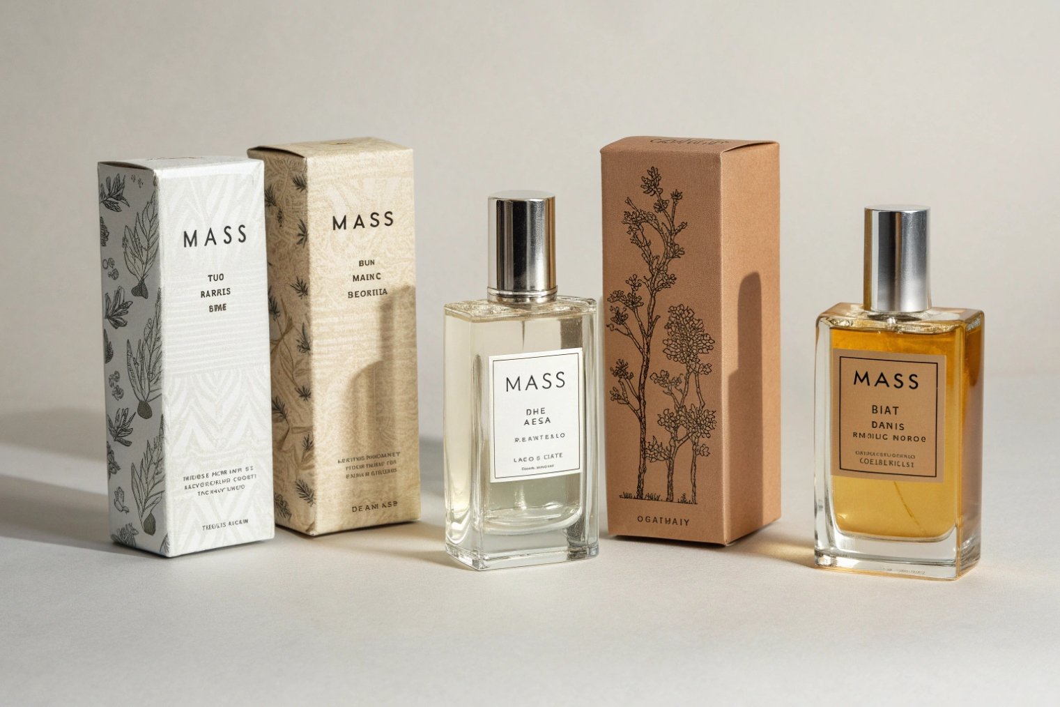
Visual cues must match your target buyer and price tier: mass needs simple clarity, premium needs refined detail, and niche needs distinctive storytelling shapes and textures.
Match price tier with visual language
Start with price-tier positioning 1. Then build the visual story around it.
For entry and masstige lines, buyers want clarity and ease. Clean cylinders, straight shoulders, simple caps, and clear labels work well. Colour blocks are bolder. Shapes are simpler. Graphics are more direct.
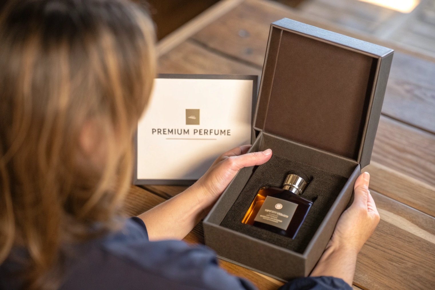
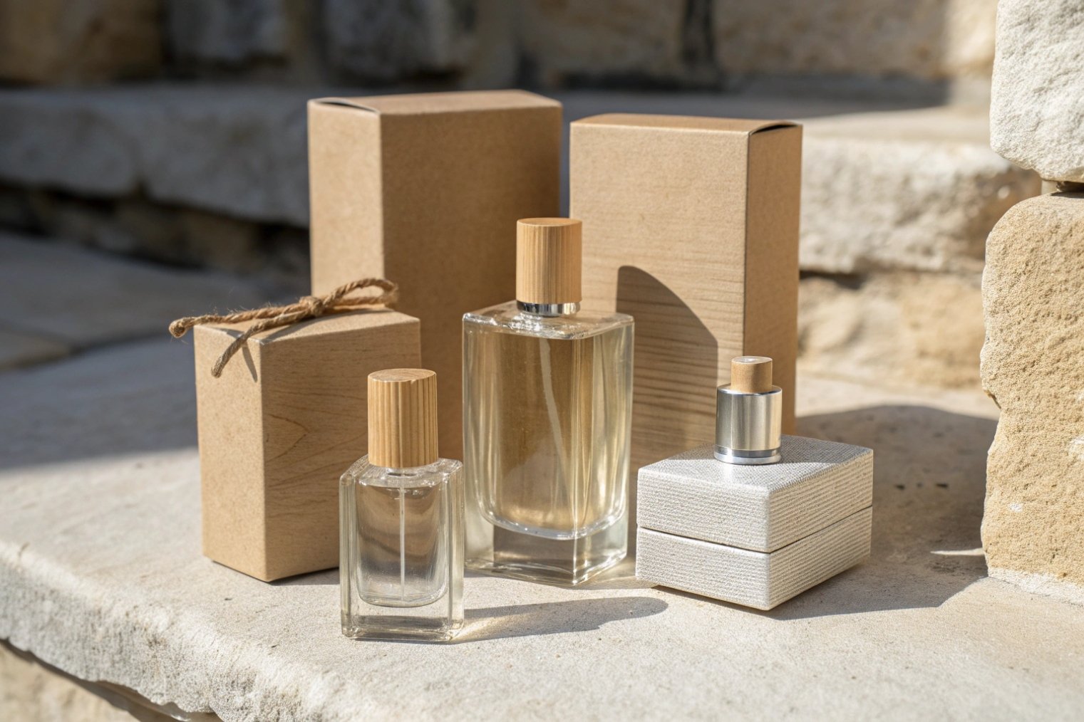
For premium and luxury, the expectations shift. People look for weight, glass thickness, precise printing, and subtle detail. Heavy bases, refined shoulders, and well-finished metal or wood caps all tell them, “this is worth more”.
For niche and artistic brands, the goal is “different but honest”. Asymmetrical forms, sculpted caps, and unusual colours can work if they still feel considered, not random. The bottle should look like a small art object that matches the story of the scent.
Read your audience before you design
Think about who will buy and how they shop:
- Young online buyers scroll fast. Strong silhouettes and simple, high-contrast graphics work better on screens.
- Classic buyers in stores spend more time with the object. They notice glass clarity, weight, and texture.
- Eco-focused buyers read material cues and claims. They do not like over-packaging but still want something that feels “kept” and special.
A simple way to map this is:
| Target / Tier | Visual cues that fit | Cues that often clash |
|---|---|---|
| Youth / entry | Bright colour, simple fonts, stock bottle, bold label | Over-complex shapes that raise price doubts |
| Premium mainstream | Thicker glass, metallic or wood cap, refined logo, soft palette | Very thin glass, cheap glossy plastic caps |
| Niche / artistic | Ownable silhouette, deep textures, unusual colour stories | Generic bottle with only a wild label |
| Eco-luxury | Natural tones, visible glass, minimal but strong structure | Heavy “wasteful” extras with no clear purpose |
When the visual language, target buyer, and price tag line up, your packaging stops fighting your positioning and starts reinforcing it every time someone looks at the bottle.
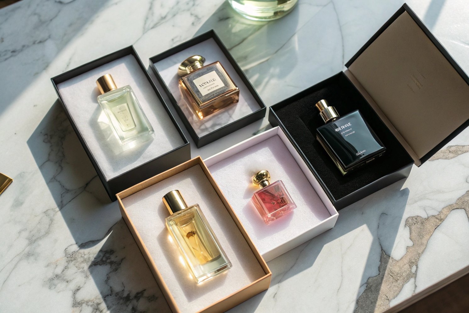
How do unboxing and gifting elements drive word-of-mouth?
Perfume is often bought for emotion and for gifting. A flat, boring unboxing kills that emotional peak. A good one makes people reach for their phone.
Thoughtful unboxing and gifting details turn your perfume into a small event: they spark photos, social posts, and recommendations that you do not have to pay for.
Make the first 30 seconds feel like a gift
Think about the first 30 seconds in the customer’s hands:
- How the outer box opens
- What they see first inside
- How easily they can reach the bottle without tearing or fighting inserts
Simple upgrades work well:
- A clean opening with a smooth tuck flap or magnetic closure
- A short message or brand line printed inside the lid
- A shaped pulp or cardboard insert that holds the bottle like a jewel, not like cargo
You do not need layers of plastic or complex ribbons. You need a clear sequence: open → reveal → lift → spray.
Unboxing culture 2 makes packaging part of the content itself, and shareable packaging can amplify organic word-of-mouth marketing 3.
Many people film or photograph the first opening. So ask yourself:
- Does the inside of the box look as good as the outside?
- Is there a detail worth sharing? A pattern, a colour pop, a small illustration?
- Does the bottle sit straight when the box is opened?
You can also think about gifting:
- Include a small blank card area or printed “to/from” panel.
- Make the box sturdy enough to survive a second giving if someone re-gifts a backup bottle.
- Keep branding visible but tasteful, so the box looks proud on a shelf.
Here is a simple guide:
| Element | Low-cost option | Higher-impact option |
|---|---|---|
| Interior print | Single brand line or logo | Pattern, quote, or short story fragment |
| Insert | Plain white die-cut | Coloured, embossed, or textured insert |
| Gifting touch | Printed ribbon graphic | Real ribbon or reusable band |
| Added story | QR to brand playlist or scent story page | NFC tag linking to exclusive digital content |
When unboxing feels like a small ritual instead of a chore, people are much more likely to talk about it, recommend it, and keep the box instead of throwing it away on day one.
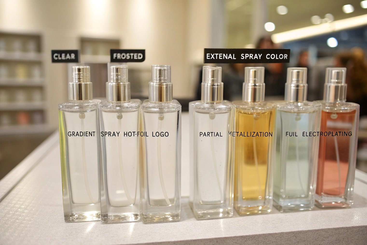
Which finishes (frosting, hot foil, electroplating) scale well?
A finish can look amazing on a lab sample and then become a nightmare in mass production. The trick is to match the effect you want with a process that scales cleanly.
Frosting, hot foil, and spray coatings usually scale well; full electroplating and very complex special effects need careful planning, higher budgets, and tighter process control.
Understand what each finish really does
Let’s look at common finishes used in perfume:
- Acid etch / frosting: creates a matte, soft-touch surface on glass. Good for premium feel and hiding fingerprints.
- Spray coating: adds colour or gradients. Works inside or outside; outside is more common and flexible.
- Hot foil stamping: adds metallic logos or lines on glass or box (process details matter—see hot stamping and foil transfer 4).
- Electroplating / full metallization: gives a mirror or metal-look surface. Very striking, but more complex and less forgiving (planning basics: electroplating process constraints 5).
From a scale point of view:
| Finish type | Scalability | Typical use |
|---|---|---|
| Frosting (acid / mask) | High | Luxury, soft-touch, hiding small defects |
| Spray coating | High | Colour, gradients, seasonal shades |
| Hot foil on box | Very high | Logos, borders, seals |
| Hot foil on glass | Medium–high | Logos, simple graphics |
| Partial metallization | Medium | Windows, bands |
| Full electroplating | Lower, needs tight QA | Mirror-effect, bold statement bottles |
The more surface you cover with metal, the tighter your process needs to be. Small defects that nobody sees on a clear bottle become obvious on a mirror finish.
Plan finish choices for cost and flexibility
If you want a strong look and flexible line extensions, think in layers:
- Use a core glass shape and one or two scalable finishes like frosting and spray colour.
- Add hot foil for logos and small metallic details.
- Reserve full electroplated pieces for caps, collars, or special editions.
This lets you:
- Launch a core line in one main colour.
- Add flankers with new spray colours and foils, without changing molds.
- Keep decoration vendors and QC routines simple and repeatable.
Also check how finishes interact with your formula and transport:
- Some coatings need certain cure times before filling.
- Very dark or full-metal finishes heat up faster under strong light. You may need to adjust your packing or storage conditions.
When a finish is chosen with scale, budget, and QC in mind, you get the impact you want on day one and the consistency you need on day one thousand.
How do you balance sustainability claims with luxury aesthetics?
Many brands want bottles that feel rich and heavy, yet also want to talk about sustainability. If the design is not careful, those messages look fake side by side.
You balance sustainability and luxury by choosing honest materials, smart weight, refillable or recyclable systems, and decorations that look rich without blocking recycling.
Make “less” feel like “better”
Sustainable packaging does not have to look cheap. It just has to look intentional.
Good moves:
- Use recycled or high-cullet glass 6 with a clean shape and strong silhouette.
- Keep the bottle elegant but avoid pointless extra thickness. Weight should support stability and feel, not just be there for show.
- Choose caps in wood, aluminum, or thoughtfully designed plastic that can be separated from inserts.
On the box side:
- Use uncoated, textured boards with simple foil or blind emboss instead of heavy plastic laminates.
- Keep inserts in moulded pulp or smart folded board instead of expanded foam.
The eye reads texture, balance, and detail as “luxury” even when the structure is simple.
Design for end-of-life and reuse
If you talk about sustainability, think about what happens after the last spray:
- Can the bottle be easily recycled? Heavy laminates, glued-on metal shells, and mixed materials on glass make this hard.
- Can you offer refillable packaging systems 7 or in-store refilling to reuse the main pack?
- Can the cap and bottle look good enough to keep as a decorative object or upcycled container?
You can also be transparent on pack or online:
- State recycled content in the glass.
- Explain why you chose certain materials or removed others.
- Show how to separate the pump and bottle for recycling.
A quick design checklist:
| Area | Luxury feel | Sustainability support |
|---|---|---|
| Bottle | Clear silhouette, solid base | Recycled flint, no heavy full-body laminates |
| Cap | Wood, metal accent, or quality resin | Separable inner core, reduced weight |
| Box | Thick, textured board | Minimal plastic, recyclable inks and foils |
| System | Strong unboxing, neat fit | Refill options, clear recycling cues |
When the pack looks premium and your material choices are honest and easy to explain, customers feel good emotionally and ethically. That feeling may matter as much as the top notes in the long run.
Conclusion
When perfume packaging aligns visuals, touch, finishes, and sustainability with your audience and price tier, the bottle stops being a cost and starts working as a powerful, silent marketer for your brand.
Footnotes
-
Positioning basics that explain why packaging must match the role and price tier you want to own. ↩ ↩
-
Explains unboxing as a social behavior and why “reveal moments” influence perception. ↩ ↩
-
Overview of word-of-mouth and why shareable packaging can create unpaid recommendations. ↩ ↩
-
Technical overview of hot stamping/foil transfer so you can judge feasibility, detail limits, and scale. ↩ ↩
-
Explains electroplating complexity and why mirror finishes demand tighter QA and process control. ↩ ↩
-
Defines cullet and why higher recycled-glass content can reduce impact while affecting appearance and process. ↩ ↩
-
Refillable container concepts to help plan refills that reduce waste while keeping a premium experience. ↩ ↩


