Sometimes a product feels “wrong” in clear glass, even before we talk about shelf life. That instinct is usually about light, tradition, and brand story.
Colored glass bottles are most popular when products need UV protection, stronger shelf impact, clearer category signals, or tougher reuse performance than plain clear glass can offer.

When I help pick bottle colors, I look at three things: how sensitive the formula is to light, how and where the product will be displayed, and what message the brand wants the color to send. After that, the choice between amber, green, cobalt, black, or flint becomes much easier.
When are amber and green glass bottles the practical choice?
A lot of “mystery” around brown and green bottles is just physics. UV light hurts some products, and colored glass works like a built-in filter.
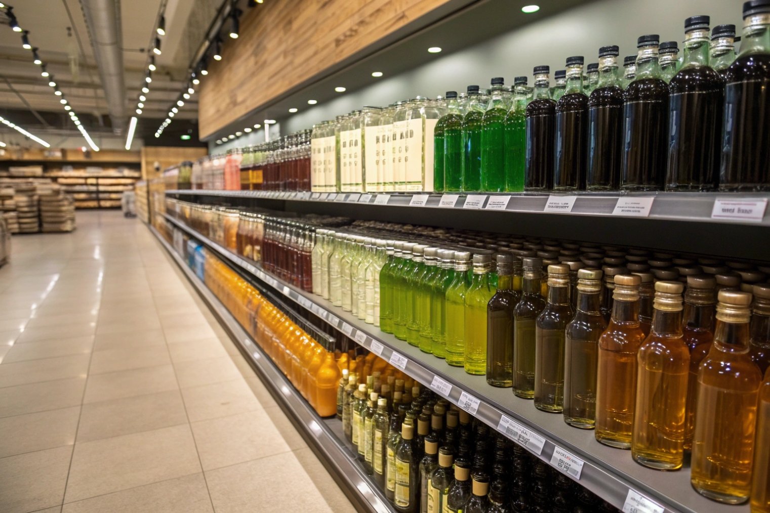
Amber bottles are the first choice for light-sensitive oils, beers, kombucha, syrups, and many drugs because they block most UV and blue light, while green gives moderate protection and strong style cues, especially in wine and beer.
Short answer: if the product changes with light, amber is your friend. Brown glass can block around 95–98% of harmful UV for beer and similar beverages, while green and clear glass let much more light through and allow the lightstruck off-flavor 1 (“skunking”) or oxidation to happen faster. :contentReference[oaicite:0]{index=0}
How amber and green bottles protect the product
Amber glass uses iron, sulfur, and carbon in the melt to create that deep brown tone. Those same colorants absorb harmful UV rays and blue light wavelengths under 450 nm 2 that start many light-driven reactions in oils and beverages. Studies and industry data show that amber glass is far better at blocking UV than green or clear bottles, which is why breweries and pharmacists have stuck with it for decades. :contentReference[oaicite:1]{index=1}
Green glass is more of a compromise. It filters some light, but not as strongly as amber. Brands still love it because certain greens are deeply linked with wine regions and beer styles. A Rhine-style wine in flint or amber would feel wrong to many buyers, even if it survived light better in theory.
Here is a simple way to think about it:
| Color | UV / blue protection (relative) | Typical categories | Main reason it is chosen |
|---|---|---|---|
| Amber | Very high | Beer, kombucha, essential oils, meds, syrups | Real light protection + trusted tradition |
| Dark green | Medium | Wine, some beers, olive oil | Heritage, variety cues, moderate protection |
| Light green | Low–medium | Niche wines and beers | Strong style, weak protection |
| Flint (clear) | Very low | Spirits, sauces, premium waters | Visibility and color show |
In practice, I see amber and green used most when:
- The product sits on open shelves with sunlight (front windows, outdoor bars, markets).
- The liquid has oils, hops, herbal extracts, or vitamins that break down under light.
- The category already has strong color traditions (brown beer bottles, green wine bottles).
If a formula is very light-sensitive and cannot live in amber or green (for branding reasons), then the brand usually relies on secondary packaging: cartons, sleeves, or display units that block light while still letting the glass tell the story at unboxing.
Cobalt blue and deep black bottles almost never come from technical necessity. They come from emotion. They look special on a shelf before the label even speaks.
Cobalt and black glass are chosen mainly for premium or niche positioning in cosmetics, spirits, and specialty foods, and only secondarily for light protection, so stability tests and secondary cartons still need to back up the visual story.
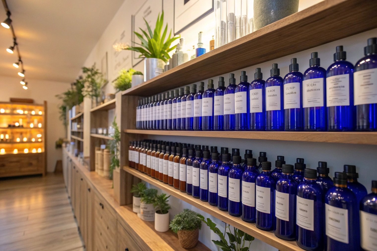
If a brand wants “pharmacy chic”, rich cobalt blue works very well. For “mysterious luxury”, matte or glossy black is the shortcut. In both cases, the bottle color signals that the product is not a basic commodity.
How cobalt and black glass work in real projects
Cobalt glass uses tiny amounts of cobalt oxide as a colorant 3. It gives a strong blue tone even at low levels. The glass still lets some light through, so protection is better than flint but usually weaker than dark amber at the same thickness. In many essential-oil and aromatherapy lines, cobalt bottles sit next to amber bottles with almost the same formulas. That tells you brands are trading some light protection for style and differentiation.
Black glass can be made in two ways:
- True black glass with high colorant levels, which blocks most visible and UV light.
- Very dark “almost black” amber or green, which still lets a bit of light through in thin areas.
From a user view, both look opaque. That gives a strong premium and “mysterious” signal for:
- Niche spirits and liqueurs.
- High-end skincare, serums, and retinoids.
- Limited-edition condiments and oils.
A simple mapping:
| Color choice | Typical product types | Brand message it sends |
|---|---|---|
| Cobalt blue | Aromatherapy, bath and body, craft sodas | Clean, apothecary, artistic, niche |
| Deep black | Luxury skincare, niche spirits, rare sauces | High value, mysterious, “don’t compare me” |
| Smoke / charcoal | Modern waters, minimal cosmetics | Design-driven, cool, understated |
From a technical side, I always remind teams that:
- Cobalt and black glass may not meet “light-resistant” specs by default. For pharma, standards like USP and various pharmacopoeias define tight transmission limits for a light-resistant container 4, and amber glass is the usual workhorse there. Colored containers must pass specific light-transmission tests, especially when they claim protection. :contentReference[oaicite:2]{index=2}
- In cosmetics and food, regulations rarely force a specific color, but they do expect the product to meet its shelf-life claims. So real stability tests under light are still needed, even for very dark bottles.
So cobalt and black are best used when the product has medium sensitivity and the brand really needs that visual drama. If the formula is very fragile, I tend to pair these colors with strong secondary packaging or accept amber as the safer hero.
How do glass colorants affect recyclability and MOQ in wholesale?
Color always looks “free” on mood boards, but it is not free in a furnace. Every tint interacts with cullet streams, batch recipes, and demand volumes.
Amber, green, and flint bottles all recycle well in their own color streams, but special colors like cobalt and solid black often have weaker recycling channels and higher MOQs, because glass plants need enough volume to justify dedicated color runs.
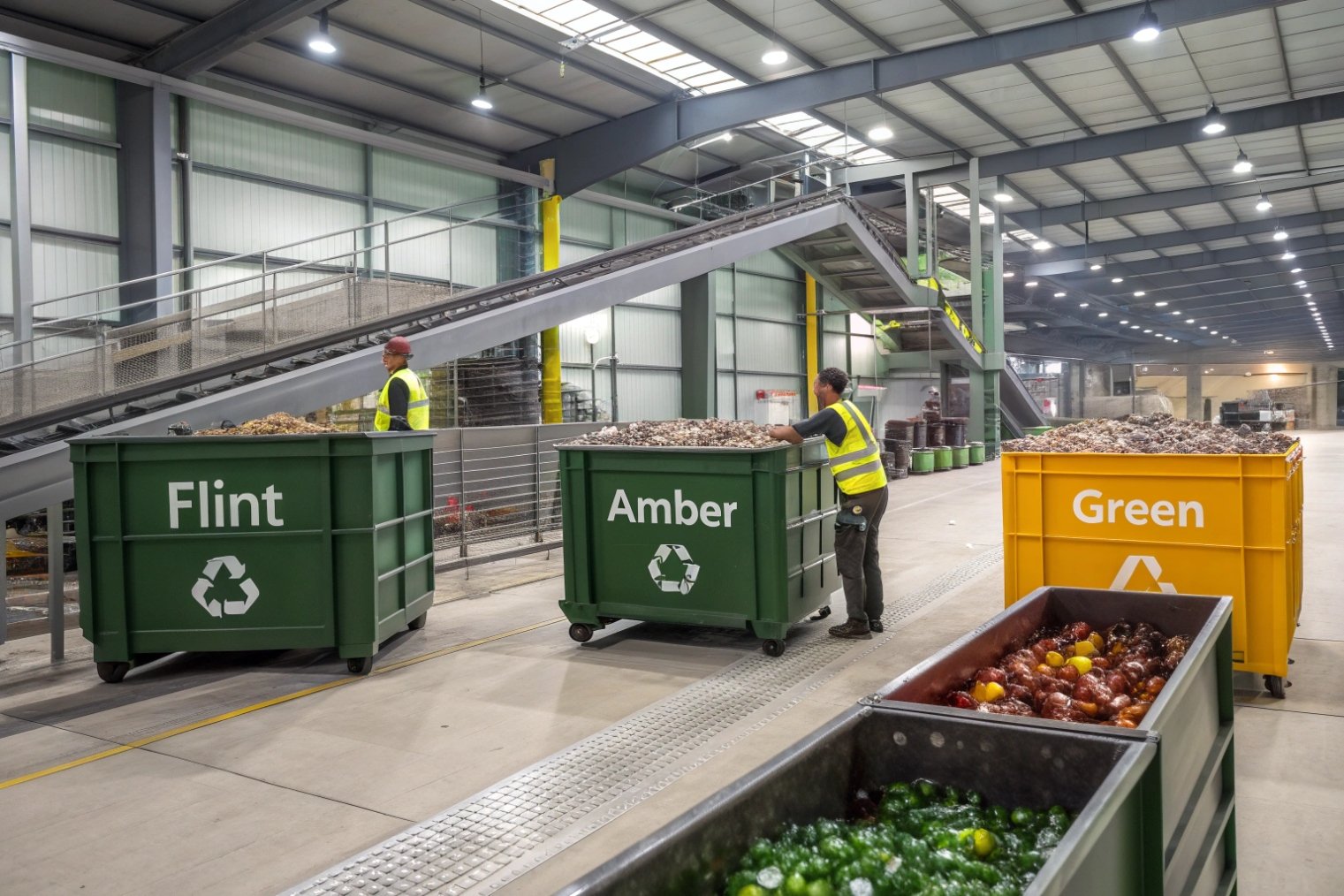
At furnace scale, glass makers want consistent cullet (recycled glass) streams. Flint, amber, and green are the three big families. Many plants separate them and can recycle each endlessly without losing quality, as long as the color streams stay clean. :contentReference[oaicite:3]{index=3}
When mixed cullet from many colors arrives, recipes get tricky. Some technologies can fold mixed cullet into amber melts more easily than into flint, because amber color chemistry tolerates more variation. But this still needs careful control of colorant levels. :contentReference[oaicite:4]{index=4}
Recyclability and MOQ in practice
Here is how color affects recycling and order planning:
| Color family | Recycling situation | MOQ / supply impact at wholesale |
|---|---|---|
| Flint (clear) | Strong recycling stream in most regions | Many stock molds, lowest MOQs |
| Amber | Very strong stream; can absorb some mixed cullet | Many stock beer, pharma, and food designs |
| Green | Strong in wine/beer markets, weaker elsewhere | Good stock options where demand exists |
| Cobalt, black, special tints | Technically recyclable but often not separated | Often custom runs, higher MOQs and prices |
Recycling systems in Europe and North America usually sort glass by flint, amber, and green, often aligned with identification codes like GL 70/71/72 5. “Off” colors like cobalt or opaque black often end up in mixed cullet streams or are down-cycled, because there is not enough volume per color to justify separate processing at every plant. :contentReference[oaicite:5]{index=5}
On the production side, each furnace color change costs time and money. So glass plants strongly prefer:
- Long runs in standard flint, amber, or green.
- Large, predictable orders for special colors.
This flows straight into MOQ:
- Standard flint or amber stock bottles can be ordered in small pallet quantities.
- Custom cobalt, charcoal, or opaque black often require large minimum batch sizes, especially if the color is in the glass, not just on the surface.
If a brand wants both a special color and strong sustainability claims, a good compromise is:
- Use flint or amber glass (with very strong recycling channels).
- Add drama through labels, sleeves, or coatings that can be simplified or removed in recycling-friendly designs.
For refill and reuse systems, darker glass does have one sustainability plus: it hides scuffs and minor staining better than flint, so each bottle can stay in circulation longer before it looks “tired”.
If you want a concise summary of the “core colors” recyclers prioritize, FEVE notes that flint, amber, and green bottles can be infinitely recycled in a closed loop 6. And at the system level, Close the Glass Loop describes how plants prioritize separating glass by colour 7 to protect quality.
Which regions and regulations favor UV-blocking packaging?
No big regulator says “You must use amber bottles for this product” in simple food and beverage categories. Instead, rules speak in terms of light-resistant containers and stability, especially in pharma.
Pharmaceutical and healthcare regulations worldwide push strongly toward UV-blocking packaging for light-sensitive drugs, often using amber glass that meets formal “light-resistant” tests, while food and beverage rules rely more on stability data than on a specific bottle color.

In pharma, reference documents like USP general chapters and various pharmacopoeias define what a light-resistant container is: a container that either blocks specified ranges of light by itself (typically amber or red glass) or becomes light-resistant when wrapped in an opaque outer package. Light transmission must stay below certain percentages in the 290–450 nm range. :contentReference[oaicite:6]{index=6}
That is why you see so many amber vials, dropper bottles, and syrup bottles in Europe, North America, and many Asian markets. The color is not only tradition; it is a direct answer to those light-resistance tests. Even Type III soda-lime bottles used for some non-injectable drugs are often offered in amber as the “light-protective” option. :contentReference[oaicite:7]{index=7}
In food and beverage, rules usually say:
- You must keep the product safe and stable through its shelf life.
- You must support claims with stability data, including light exposure when relevant. :contentReference[oaicite:8]{index=8}
So there is more flexibility. However:
- Beer and similar drinks are known to “skunk” under light. Brown glass is widely recognized as best practice in many regions, which has become a de facto standard even without an explicit color law. :contentReference[oaicite:9]{index=9}
- For olive oil and some specialty oils, guidelines and trade groups in Europe and elsewhere recommend dark or opaque packaging to protect flavor and nutrition, and some retailers set their own technical requirements.
In cosmetics and personal care, there is usually no hard rule on bottle color, but:
- Brands selling retinol, vitamin C, and other light-sensitive actives often choose amber, smoke, or opaque bottles to match both science and consumer expectations of potency.
So when you ask “Which regions favor UV-blocking packaging?”, the honest answer is:
- Globally in pharma, amber and other light-resistant containers are strongly favored by pharmacopoeial standards.
- Across beer and some oils worldwide, practice and retailer rules push toward brown or dark bottles to protect flavor.
- In cosmetics, there is a soft but strong trend toward darker glass for high-active formulas.
In every region, the common theme is the same: where light can damage the product, colored glass becomes more than decoration. It becomes part of the product’s safety and quality system.
Conclusion
Colored glass is most popular when it does two jobs at once: quietly protecting what is inside from light and reuse wear, and loudly telling shoppers what kind of product and story they are about to experience.
Footnotes
-
Defines lightstruck (“skunky”) flavor and why brown glass protects better than green/clear. ↩ ↩
-
Explains why amber glass blocks UV/blue light and protects light-sensitive products. ↩ ↩
-
Details how cobalt oxide is used to color glass blue in bottle and filter-glass production. ↩ ↩
-
USP guidance on spectral transmission limits for light-resistant pharmaceutical containers (290–450 nm). ↩ ↩
-
Official EU glass packaging identification codes, including GL 70 (clear), GL 71 (green), GL 72 (brown). ↩ ↩
-
Shows flint, amber, and green bottles can be infinitely recycled in a closed loop. ↩ ↩
-
Roadmap covering color sorting streams and challenges with “other” glass colors at scale. ↩ ↩


